When visitors scroll to your page’s end, your footer isn’t just the graceful “goodbye”, it’s a last (and lasting) chance to engage, inform, and guide your users. The best footer design for website UX provides utility, builds trust, and reinforces brand experience. As websites strive for more meaningful engagement and conversion, crafting an effective, modern footer is just as crucial as your hero or header.
In this blog, you’ll learn what makes great website footers, see 12 inspiring footer design for website use, and walk away with best practices for building high-performing digital experiences in 2025.
1. Etsy
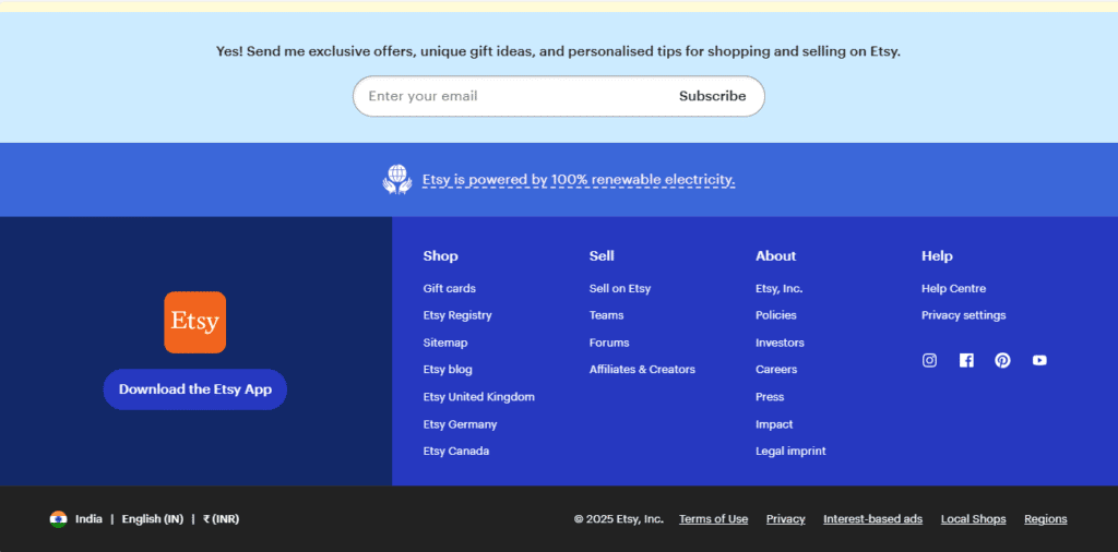
Website: etsy.com
Etsy’s footer groups help, shop, and company info using collapsible columns (on mobile) and accessible contrast. Country selection, payment methods, and social icons are neatly organized for ease of use.
2. Airbnb
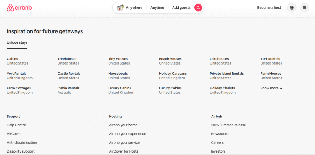
Website: airbnb.com
Modern and pared back, Airbnb’s footer organizes hundreds of links into expandable categories. Key legal and trust links sit at the bottom, and language/currency pickers aid global users.
3. Apple

Website: apple.com
Apple’s iconic simple footer features vertically stacked navigation, subtle dividers, and slim legal disclaimers. It echoes their minimalist ethos while giving easy access to core links.
4. Mailchimp
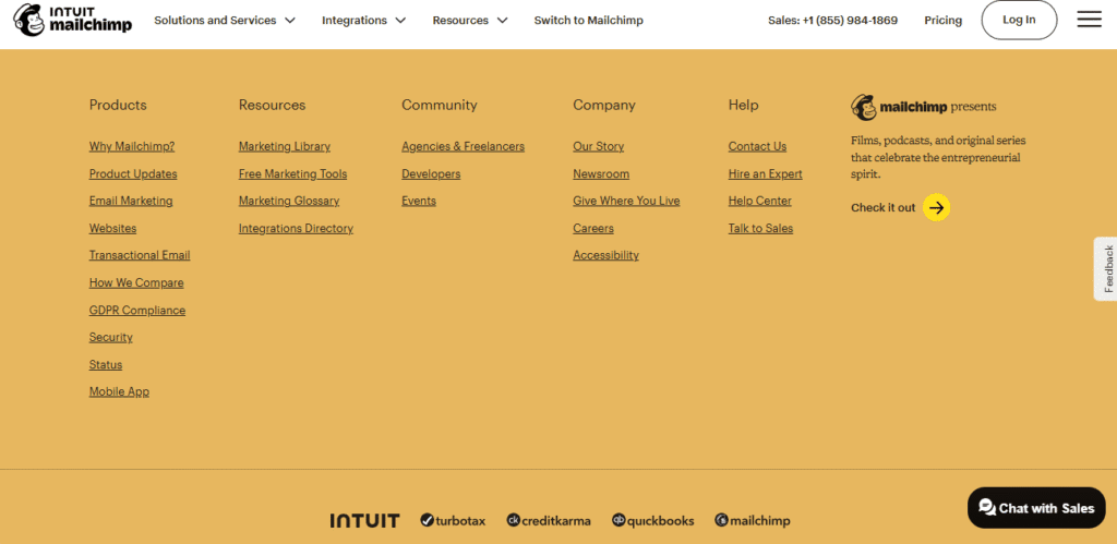
Website: mailchimp.com
A visual treat: playful illustrations, “banana yellow” brand elements, clear CTAs, and help links. Their email signup sits above the legal line, maximizing engagement.
5. Shopify
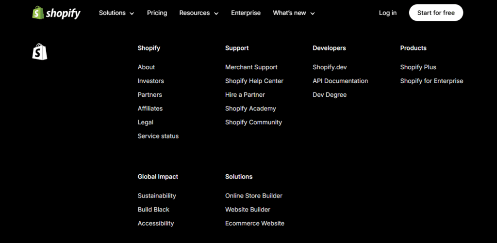
Website: shopify.com
A multi-column structure provides resource links, company details, support, and a prominent newsletter signup. Clean, concise, and highly functional, everything’s a click away.
6. Dribbble

Website: dribbble.com
Bright, centric, and fun. Social icons and trending tags are integrated, while clear labels and a single newsletter CTA invite community engagement.
7. IBM
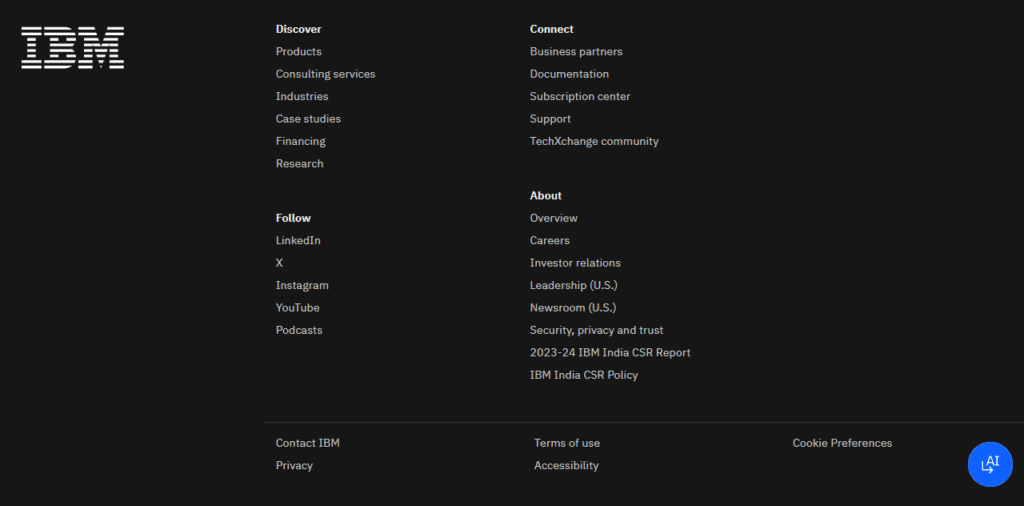
Website: ibm.com
Ultra-minimal, focusing on key locations, policies, and accessibility. Discrete icons and muted tones mesh seamlessly with the brand’s modern professionalism.
8. Typeform
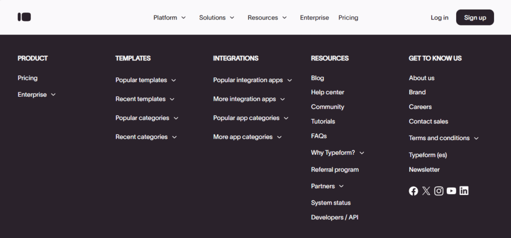
Website: typeform.com
Staggered columns with expressive icons, bold font pairings, and colorful accents. CTA for careers and support are featured, mirroring the fun, user-centric brand voice.
9. Holly Oddly
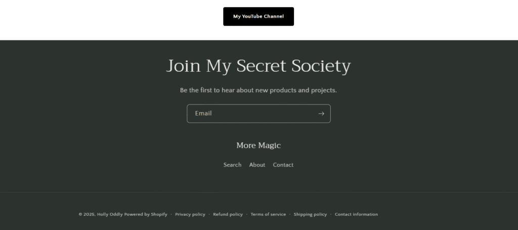
Website: hollyoddly.com
A clean footer with five well-organized sections, including navigation, about info, and copyright notice. The clarity and simplicity ensure all essential information is easily found without distraction.
10. Henning Larsen
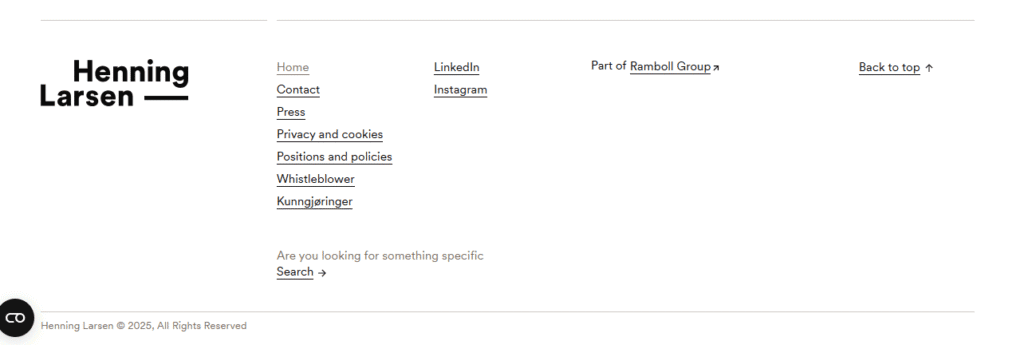
Website: henninglarsen.com
This client-friendly footer incorporates a world clock, clear navigation, and social media icons. It enhances global usability, showing the brand’s reach and attention to detail for international users.
11. Chobani
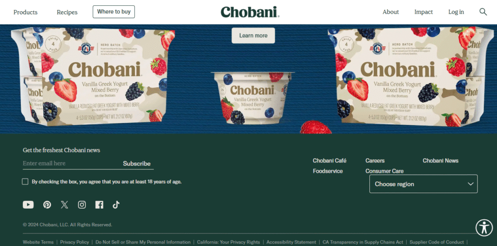
Website: chobani.com
A minimalist approach with brand-coordinated colors, the footer succinctly organizes newsletter signup and social links. Functional, clean, and visually harmonious, it reflects Chobani’s brand values.
12. Manoverboard

Website: manoverboard.com
An iconic, minimalist layout features certifications, contact details, social network links, a newsletter form, and even interactive typography. It balances information with unique brand personality and engagement.
What Goes Into an Effective Website Footer?
A modern footer design for website projects often includes:
- Contact information & address
- Navigation shortcuts (sometimes site map)
- Social media icons
- Newsletter sign-up or offers
- Trust marks (certifications, payments, awards)
- Legal links (privacy, terms, accessibility)
- Brand/mission statements
Great footers don’t overwhelm; they provide next steps and build credibility as users near the end of their journey.
What Makes a Great Footer Design for Website Projects?
- Hierarchy and Clarity: Use columns, headings, and spacing to group related links and prevent clutter.
- Consistent Branding: Carry your color palette, fonts, and personality through to the site’s end.
- Utility-Focused: Highlight actions users may need last (contact, join, follow, download).
- Mobile Responsiveness: Collapsible menus and touch-sized tap targets are a must.
- Accessible: Ensure strong color contrast, easy-to-read fonts, and keyboard navigation support.
Footer Design Trends in 2025
- Minimalist, full-width layouts with generous white space
- Sticky (always-show) or reveal-on-scroll footers for persistent access
- Micro-animations on hover, icons, or form fields
- Integrated social proof: reviews, partner logos, or awards
- Personalized footers: recently viewed sections, location-aware info
FAQs: Footer Design for Website
What should I always include in a website footer?
Contact info, legal pages, navigation to key sections, and social media links are best practice. Brand statements or newsletter CTAs are popular, too.
Should a footer be minimal or comprehensive?
It depends on your site’s size. For large sites, group links and use clear columns or expandable menus. For smaller sites, simple and clear is best.
How do I keep my footer user-friendly on mobile?
Use collapsible columns, vertical stacking, and ensure that links are large enough to tap.
Work With Us
Ready to create a footer design for website excellence? Our expert team crafts modern, conversion-driven footers that enhance usability and support your brand, right down to the last detail. Let’s collaborate to make your website’s ending as powerful as its welcome. Contact us today for a footer that works!


