Red and black is a bold and powerful color combination. It can make a website look strong, modern, and creative. Many brands use these colors to stand out and create a strong visual style. In this blog, we will show you 10 amazing websites from around the world that use red and black in smart and stylish ways. These websites come from different industries like tech, fashion, sports, art, and more. They are all live in 2025 and offer great design inspiration. Let’s take a look!
1. NUEVA.Tech
Website: nueva.tech
Location: USA
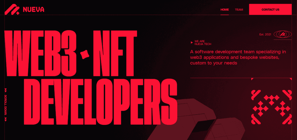
NUEVA.Tech is a Web3 development studio. Its website uses a bold black background with bright red highlights. The design immediately grabs attention with its black-and-red color scheme, and red is used on key buttons and lines to make important information stand out. This striking palette creates an energetic, modern feel that reflects the company’s tech focus.
2. RAYTH (Estonia)
Website: rayth.ee
Location: Estonia
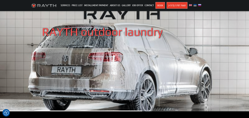
RAYTH is a luxury car care service in Tallinn, Estonia. Its website uses a clean white layout with vivid red accents. Bright red details (in headers and graphics) stand out on the light background, drawing the eye to important parts like service features and customer testimonials. This use of red looks elegant and guides visitors smoothly through the content.
3. Diesel
Website: global.diesel.com
Location: Italy
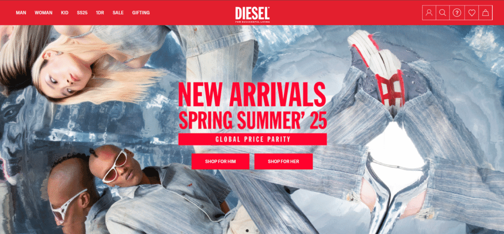
Diesel’s fashion site has a sharp, edgy look with black, white, and red. Red is the primary color (in the logo, text highlights, and buttons) on the white and black background. The black sections keep the page sleek while the red accents really pop on sale items and navigation. The result is visually appealing and easy to navigate, giving a modern, bold style that matches Diesel’s brand identity.
4. Helly Hansen
Website: hellyhansen.com
Location: Norway
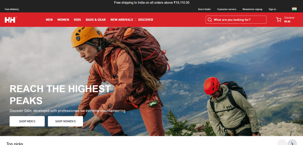
Helly Hansen is an outdoor clothing brand. Its website features the bright red “HH” logo on a mostly dark interface. The site uses red only on key elements (for example, the menu and buttons) to draw attention. The black backgrounds make the red stand out, giving the site a clear, professional look that fits Helly Hansen’s modern style.
5. Hatchet

Website: hatchet.com.au
Location: Australia
Hatchet, a digital agency based in Perth, Australia, showcases a modern and clean website design that emphasizes user experience and functionality. The site employs a minimalist aesthetic with a predominantly white background, complemented by subtle accents of red and black. These color choices are strategically used to highlight key elements such as call-to-action buttons, headings, and interactive features, ensuring they stand out without overwhelming the user. The design focuses on clarity and ease of navigation, reflecting Hatchet’s commitment to creating intuitive and engaging digital experiences. Overall, the website’s color scheme and layout effectively convey the agency’s professional and innovative approach to web development and design.
6. Twenty Twenty Two
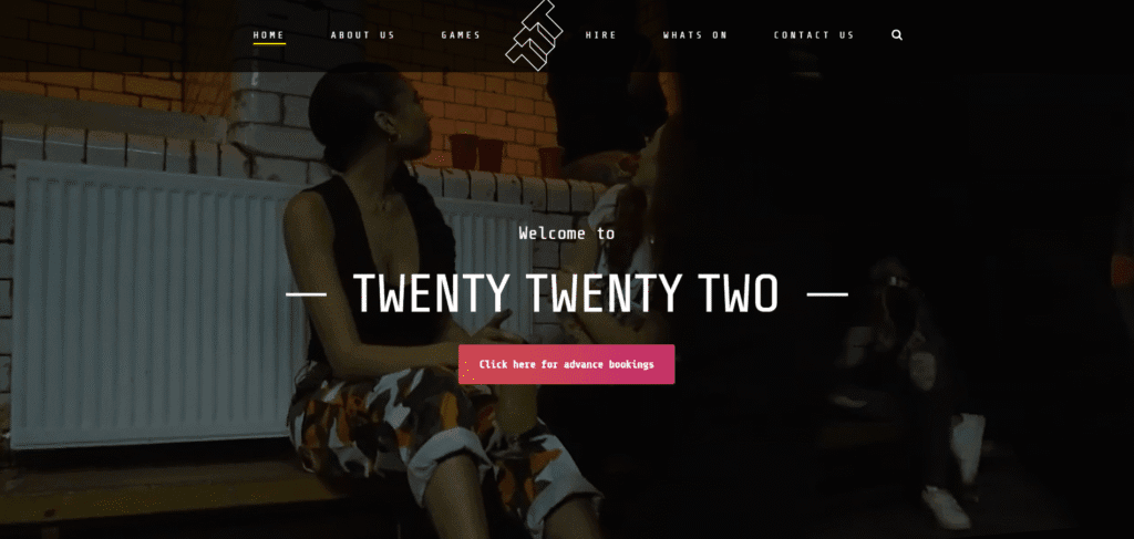
Website: twentytwentytwo.co.uk
Location: United Kingdom
Twenty Twenty Two is a bar and event space that uses black and red as its primary colors. The website’s design reflects the venue’s energetic personality, featuring a black background with red accents in the logo, headlines, and images. Bold typography and interactive elements contribute to a lively user experience.
7. Lusion
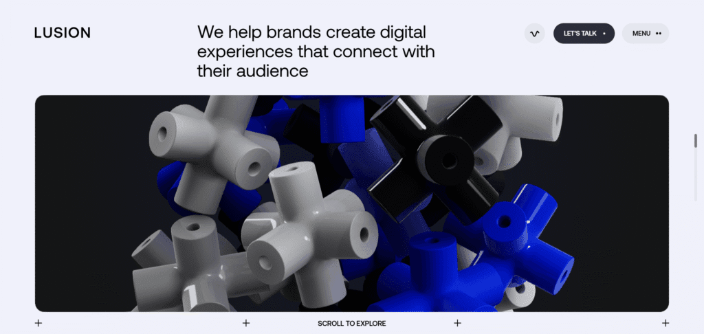
Website: lusion.co
Location: United Kingdom
Lusion is a digital production studio that employs a minimalist and edgy design. The website features a black background contrasted with red elements such as the logo, titles, and links. This combination creates a sense of passion and disruption, aligning with the company’s innovative vision. The use of modern typography and multimedia elements enhances the user experience.
8. Metallic Inc.
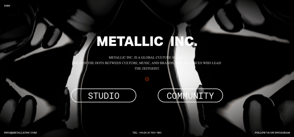
Website: metallicinc.com
Location: United States
Metallic Inc., a global culture studio, presents a minimalist and edgy website design. The black background is offset by red elements such as the logo, titles, and links, signifying passion and disruption. Modern typography and multimedia content create a stunning and impactful user experience.
9. Contrastly
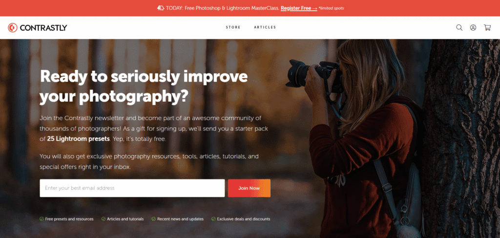
Website: contrastly.com
Location: United States
Contrastly is an online magazine and store for photographers, featuring a simple and user-friendly design. The black background is contrasted with red elements like the logo, menu, and links, creating a sense of urgency and curiosity. Clear typography and visual content provide an informative user experience.
10. Tiny Giant
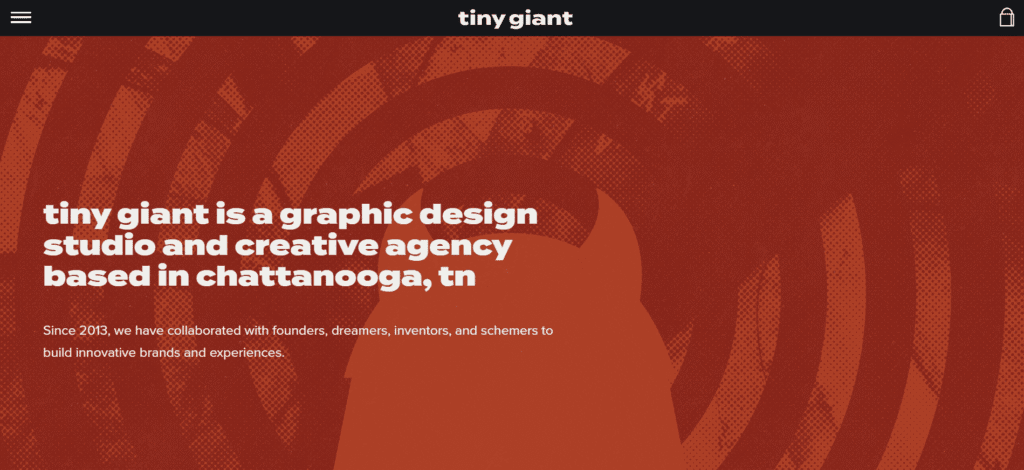
Website: madebytinygiant.com
Location: USA
Tiny Giant is a graphic design studio and creative agency based in Chattanooga, Tennessee. Established in 2013, they specialize in collaborating with founders, dreamers, inventors, and schemers to build innovative brands and experiences. The website employs a minimalist aesthetic, focusing on clarity and ease of navigation. While it doesn’t strictly adhere to a red and black color scheme, it utilizes a predominantly white background complemented by subtle accents of red and black.
Red and Black website not right for your business?
Check out one of these:


