Looking for a place to rent? A great website can make the search fun and easy! In this blog, we’ve rounded up nine of the best rental website examples from around the world, ranked for their stunning designs and user-friendly features. From sleek apartment platforms to inspiring vacation rental sites, each one offers something special. Whether you’re a renter, a designer, or just curious, join us as we explore what makes these websites shine and how they could be even better!
Why Design Matters for Rental Websites
A well-designed rental website does more than just look pretty. It helps users find what they need quickly, whether it’s a cozy apartment in New York or a beach house for a weekend getaway. Good design means clear navigation, beautiful visuals, and features like filters or maps that make searching easy. These websites are leaders in their markets because they combine functionality with style, making the rental process feel effortless.
Our Top 13 Rental Website Examples
Below, we dive into nine rental websites that shine in design and usability. Each one includes its name, website URL, target market, what we love about its design, and a few ideas for improvement. Let’s get started!
1. Zillow

- Website: zillow.com
- Location: United States (global reach)
- What We Like: Zillow is a household name in the US, and its design shows why. The homepage greets you with a stunning photo and a simple, intuitive search bar that makes starting your rental search a breeze. The color scheme—blues, whites, and grays—feels calm and professional, perfect for a stressful process like finding a home. Property pages are packed with high-resolution images, and the interactive map lets you see exactly where rentals are located. According to DesignRush, Zillow’s minimalist design creates a “serene interface” that’s easy to navigate, with a 2023 redesign adding a magazine-style layout for photos and 3D tours.
- What Should Be Improved: While Zillow’s design is sleek, it can feel a bit too simple at times. Adding more personalized features, like recommendations based on your search history, could make it more engaging. Some users might also enjoy subtle animations or unique visual elements to give the site more personality.
2. Apartments.com
- Website: apartments.com
- Location: United States
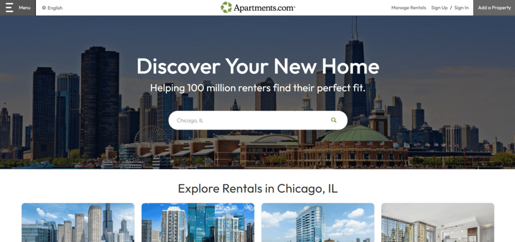
- What We Like: Apartments.com is all about rentals, which makes its design super focused. The homepage has a clear search bar with detailed filters, like pet-friendly options or specific amenities, making it easy to narrow down your choices. Property pages are well-organized, with high-quality photos and clear details about price, location, and features. The site’s straightforward layout is perfect for renters who want to browse quickly and efficiently, and it attracts over 81 million visitors monthly, according to Houzeo.
- What Should Be Improved: The design can feel a bit plain, lacking the wow factor of some competitors. Adding interactive elements, like 3D tours or virtual staging, could make listings more exciting. A splash of color or more dynamic visuals might also help the site stand out.
3. Rightmove

- Website: rightmove.co.uk
- Location: United Kingdom
- What We Like: Rightmove is the UK’s top property platform, advertising over one million properties, as noted on Trustpilot. Its design is professional and packed with useful features, like average rental prices by area, which helps users plan their budget. The search filters are detailed, and property listings are clear and easy to read, with photos and key details upfront. The site’s trustworthy look makes it a go-to for UK renters.
- What Should Be Improved: Some users find the layout cluttered, especially on mobile devices, as mentioned in Trustpilot reviews. Simplifying the interface and improving mobile responsiveness would help. Adding lifestyle images or virtual tours could also make rentals feel more inviting.
4. Daft.ie
- Website: daft.ie
- Location: Ireland
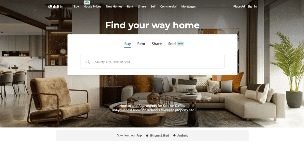
- What We Like: Daft.ie is Ireland’s leading rental platform, and its design is all about simplicity. The homepage puts the search bar front and center, with filters that let you sort by price, location, or property type. Property pages are straightforward, clearly showing key details like amenities and availability. The no-nonsense design feels reliable, which is exactly what renters need when searching for a home.
- What Should Be Improved: The design looks a bit dated compared to newer platforms. A modern refresh with more high-quality photos or interactive maps could make it more engaging. The mobile version could also be smoother, as it sometimes feels slow or clunky.
5. 99acres
- Website: 99acres.com
- Location: India
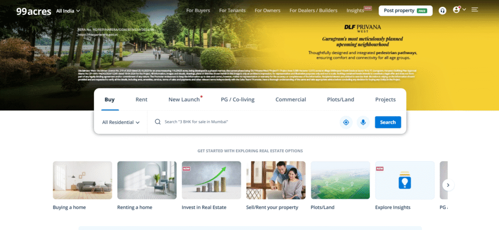
- What We Like: 99acres brings a vibrant, colorful design that matches India’s lively rental market. The homepage features a prominent search bar and filters for budget, location, and more. Property pages are detailed, with photos, virtual tours for some listings, and neighborhood insights, as highlighted by Jugyah. The site feels welcoming and user-friendly, perfect for first-time renters in India.
- What Should Be Improved: The site can feel overwhelming with so much information on the page. Streamlining the layout to highlight key details first would help. The mobile app could also be faster, as some users report lag, according to user feedback.
6. Airbnb

- Website: airbnb.co.in
- Location: Global
- What We Like: Airbnb’s design is all about inspiration, with stunning photos that make you want to book a vacation rental instantly. The homepage is clean, with a simple search bar and filters for dates, location, and property type. Property pages feel like stories, with host profiles, reviews, and high-quality images that create a personal connection, as noted by SmarterTravel. The modern, fun design stands out in the rental world.
- What Should Be Improved: The focus on host stories and reviews can make the search process feel cluttered. Offering a streamlined search option for quick bookings would help. Clearer pricing, with fees shown upfront, would also improve the experience.
7. Booking.com

- Website: booking.com
- Location: Global
- What We Like: Booking.com isn’t just for hotels—it’s a great platform for vacation rentals, too. The design is clean and professional, with an intuitive search bar and filters. Property pages combine maps, photos, and reviews in one place, making it easy to explore rentals. Fun touches like the “Genius” loyalty program add personality, as mentioned in SmarterTravel.
- What Should Be Improved: Rentals can get lost among hotel listings, so a dedicated rental section would make them easier to find. The mobile app could also load photos faster to improve the browsing experience.
8. Immowelt

- Website: immowelt.de
- Location: Germany
- What We Like: Immowelt’s modern design is both functional and stylish, with a clear search bar and detailed filters for price, location, and property type. Property pages feature high-quality photos and 360-degree tours for some listings, making it easy to visualize rentals. The clean layout feels professional and trustworthy, perfect for Germany’s rental market.
- What Should Be Improved: The site could add more interactive features, like virtual staging or lifestyle images, to make listings more appealing. Mobile responsiveness could also be better, as the layout sometimes feels cramped on smaller screens.
9. Funda
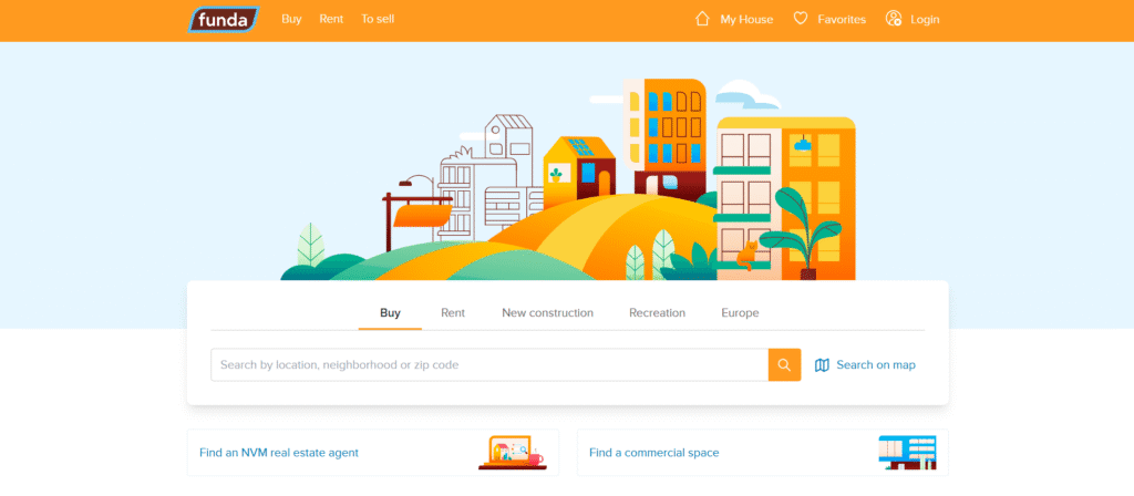
- Website: funda.nl
- Location: Netherlands
- What We Like: Funda is the top rental platform in the Netherlands, and its design is super intuitive. The homepage features a large interactive map for searching properties, which is a standout feature. Property pages are detailed, with floor plans, energy labels, and other key information, making it easy for Dutch renters to make informed decisions, as noted by its popularity in the market.
- What Should Be Improved: The data-heavy layout can feel overwhelming at times. Highlighting key details first and adding more high-quality photos could make rentals more inviting and easier to browse.
10. Vrbo
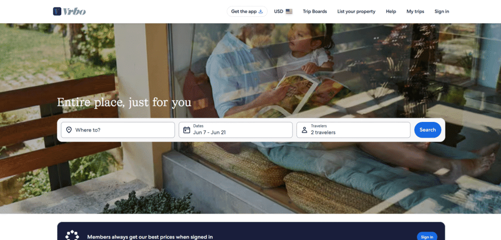
- Website: vrbo.com
- Location: Global
- What We Like: Vrbo, short for Vacation Rental By Owner, specializes in larger vacation rentals like houses and villas, with about two million listings worldwide, as noted by Kiplinger. Its design is clean and inviting, with a simple search bar for location, dates, and guest numbers. Property pages use high-quality photos and clear layouts, with trust features like host verification and fraud checks to ensure safety. The design feels warm and focused on family-friendly rentals.
- What Should Be Improved: The site could improve its mobile responsiveness, as some users report slow loading times on the app. Adding more interactive elements, like virtual tours or 3D maps, would make listings more engaging.
11. Stay One
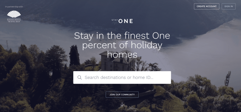
- Website: stayone.com
- Location: Global
- What We Like: Stay One caters to luxury travelers with ultra-premium vacation homes, and its design reflects that exclusivity. The homepage immerses users with stunning high-resolution visuals and a sleek, minimalist layout. Bold call-to-action buttons and curated property sections create a memorable browsing experience, as highlighted by Mediaboom. The use of whitespace and elegant fonts adds a touch of sophistication.
- What Should Be Improved: The focus on exclusivity can make the site feel less accessible for budget travelers. Simplifying the search process and adding more budget-friendly filters could broaden its appeal. The mobile version could also load faster.
12. Blueground

- Website: theblueground.com
- Location: Global
- What We Like: Blueground focuses on flexible, long-term furnished apartment rentals, and its design is clean and professional. The homepage features a robust booking engine with filters for city, stay length, and amenities, ensuring tailored results. Captivating visuals and intuitive navigation make browsing effortless, with a mobile-friendly experience that shines, according to Mediaboom. The modern layout feels polished and user-focused.
- What Should Be Improved: The site could add more lifestyle images or virtual tours to make listings feel more personal. Highlighting unique property features, like rooftop views, could also enhance engagement.
13. Lodgis

- Website: lodgis.com
- Location: France (Paris-focused)
- What We Like: Lodgis specializes in furnished apartment rentals in Paris, and its design is elegant and user-friendly. The homepage features a clear search bar with filters for budget, location, and rental duration. Property pages include high-quality photos and detailed descriptions, with a focus on international renters, as noted by Technavio. The soft color palette and clean layout create a welcoming experience.
- What Should Be Improved: The design could benefit from more interactive features, like 360-degree tours or neighborhood guides. The site’s mobile version could also be optimized for faster loading and smoother navigation.
Rental website not appropriate for your company?
Check out our roundups of different aesthetics for unique website designs:
- Media Company Website Examples
- Biotechnology Website Examples
- Clean and Renewable Energy Website Examples
Work with Us
Are you excited about design, technology, or the rental website designs? At Easify Technologies, we’re always looking for creative people to join our team. Whether you’re a web designer, developer, or just passionate about creating amazing user experiences, we’d love to hear from you.


