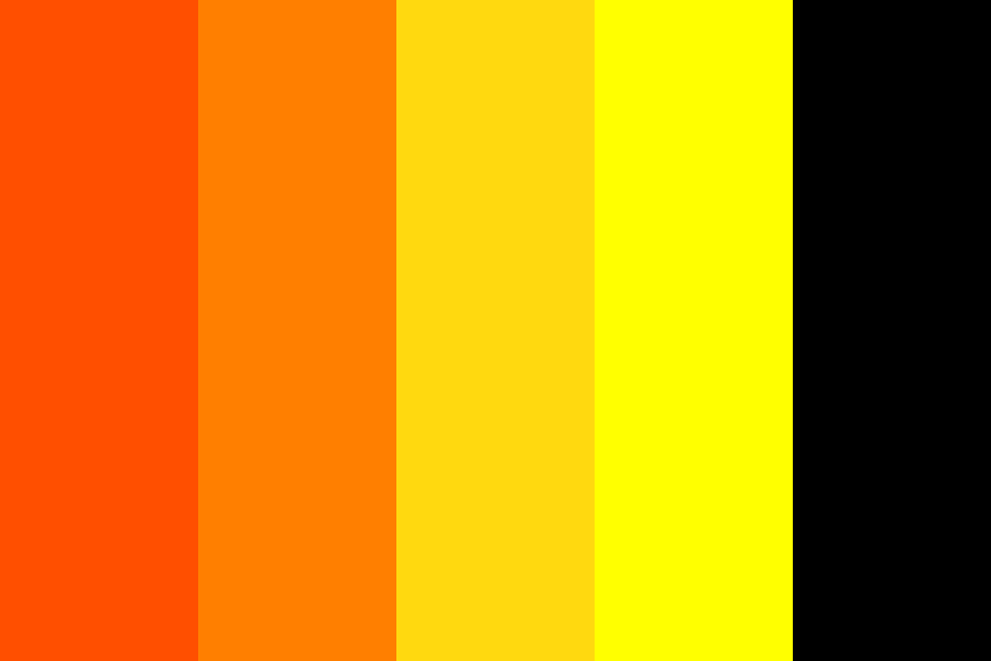
Black and orange is a powerful color combination in web design. Black gives a modern and strong look, while orange adds energy and warmth. When used together, these colors can make a website look bold, creative, and easy to remember.
In this blog, we’ve picked 15 amazing websites from all over the world that use black and orange in smart and beautiful ways. Some are creative agencies, others are personal portfolios or product websites—but all of them use these colors to grab attention and create a great user experience.
Let’s explore how each of these websites uses black and orange to stand out!
1. Firewatch
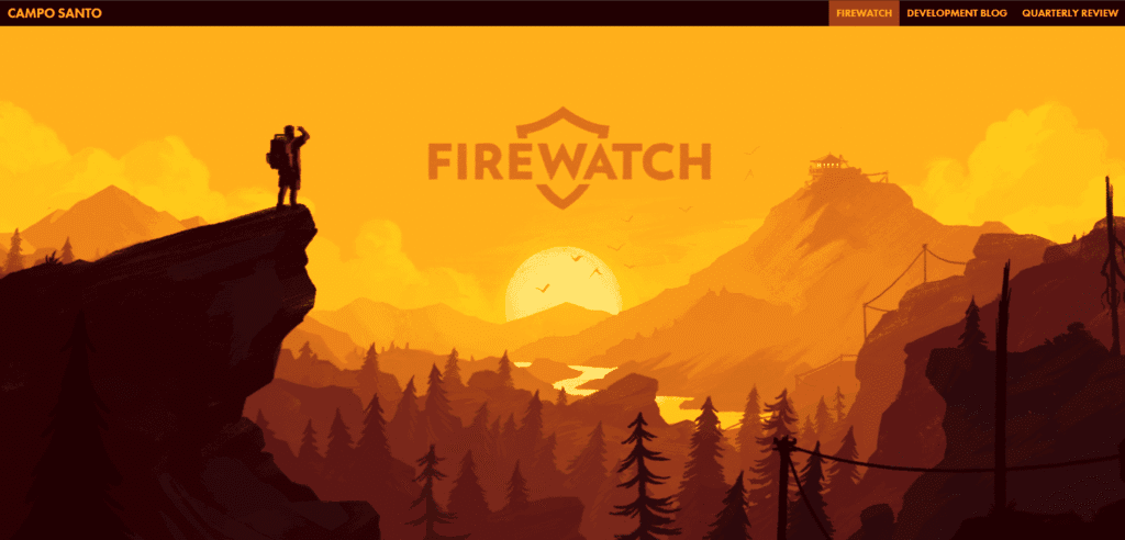
Website: firewatchgame.com
Firewatch is the official site for the Firewatch game. It uses a black background with orange highlights and illustrations. The design feels like a story that begins at dawn, because of the warm orange glow against the dark background. The black and orange colors together make the site feel like an adventure story.
2. Clique Studios

Website: cliquestudios.com
Clique Studios is a creative agency site. It uses black and white as the base, with bright orange buttons and accents. The orange stands out sharply on the dark theme, giving a modern and lively feel. As one review notes, they use contrasting colors and simple animations to keep the design fresh and user-friendly.
3. Jason Pontin
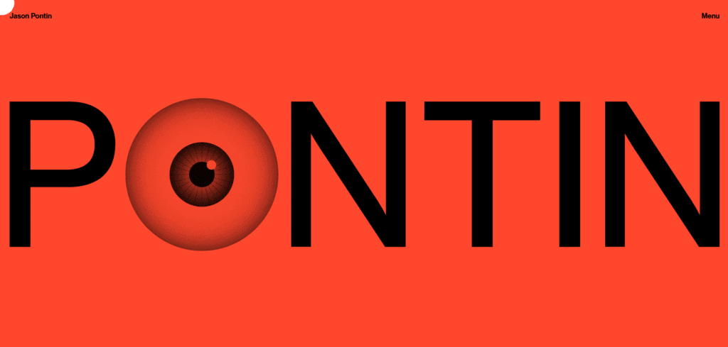
Website: jasonpontin.com
Jason Pontin is a personal portfolio site. It features deep black backgrounds and a very bright orange color (almost a hot red-orange) for text and highlights. This strong orange on black is bold and eye-catching, and even the mouse cursor is customized. The bright orange really keeps the visitor’s attention.
4. A-Andrea

Website: a-andrea.it
Andrea is an art/design portfolio. It looks like a fun game: the page moves with game-like animations. The backgrounds are mostly black, and the text and details use vivid orange. This contrast makes the site feel playful and keeps people interested as they scroll.
5. IdeaRocket

Website: idearocketanimation.com
Idea Rocket is an animation studio website. It uses a bright, almost neon orange color on a dark theme. The site balances the colors well so that the orange highlights add energy without overwhelming the viewer. In other words, the orange elements don’t overpower the design, making the look stylish and not too loud.
6. Humbleteam

Website: humbleteam.com
Humble Team is a design agency site. It alternates between white, black, and orange section backgrounds. The orange and black are used as blocks of color, with simple line-drawing icons and animations in orange. This clean use of color makes each section stand out and gives the site a friendly, creative feel.
7. MicDrop Agency

Website: micdropagency.com
MicDrop Agency is a sports marketing agency. Its site starts with a fast-motion intro animation. It then uses black and orange (and a little blue) in pictures and effects. The black backgrounds with orange accents and duotone photo filters look energetic. This sharp color combo makes the site feel exciting and high-tech.
8. Clou
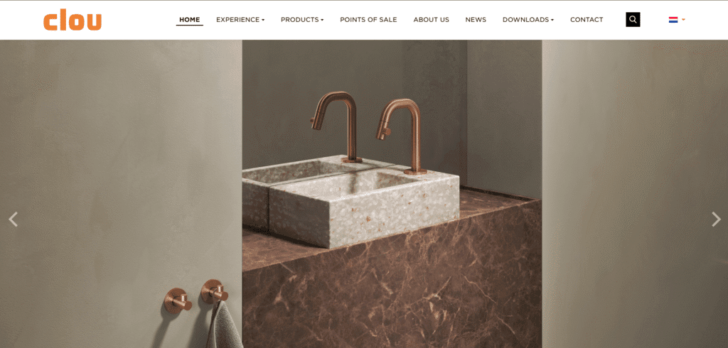
Website: clou.nl
Clou is a user experience agency site. It mostly has a simple white background and black text. Orange is used sparingly to draw attention. For example, important words or menu items appear in bright orange. In this way, the orange makes the design more lively without stealing the show.
9. Normand PLLC
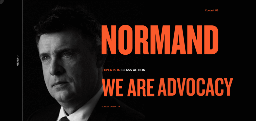
Website: normandpllc.com
Normand PLLC is a law firm’s site. It uses black and white text, with a bright orange accent color for headlines and buttons. The orange adds energy and optimism to a formal site. As one article explains, the bold orange conveys energy and is balanced by the black-and-white design, giving the whole page a confident but balanced look.
10. Bathtub Gin NYC
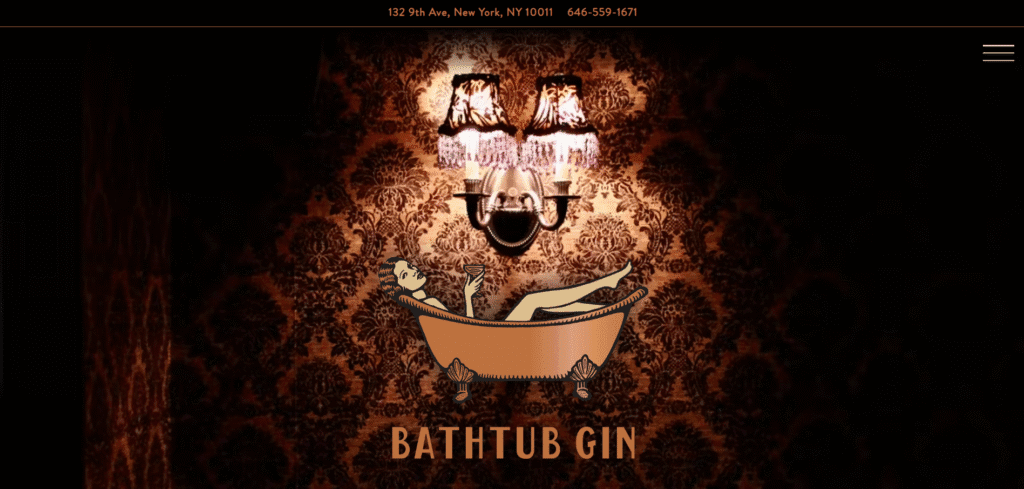
Website: bathtubginnyc.com
Bathtub Gin NYC is a speakeasy bar website. It has a rich black background and uses amber-orange decorations as you scroll. The orange ornaments and text on black give a warm, luxurious feel, matching the upscale vintage theme. The deep black with amber highlights feels mysterious and classy.
11. OH! Media
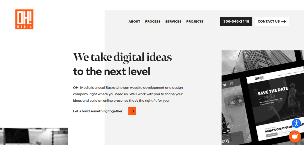
Website: ohmedia.ca
OH Media is an online magazine site. It mostly uses black and white for text and pages, but it adds bright orange for buttons and interactive elements. The orange buttons and hover effects make the interface more engaging. This careful use of orange on a monochrome base makes the site look clean and modern.
12. Tekrevol

Website: tekrevol.com
TekRevol uses black and orange to create a strong, modern, and tech-focused look. The background is mostly black or dark gray, which makes the orange highlights really pop. The orange is used for buttons, icons, and important text, so visitors quickly see what to click or read. This bright orange color adds energy and excitement to the site. The layout is clean and easy to follow, with smooth animations and bold text.
13. SoundCloud

Website: soundcloud.com
Sound Cloud is a very popular music-streaming site. It is known for its bright orange logo and icons on a darker interface (often black or dark gray). The orange play buttons and logo stand out clearly against the dark parts of the page. This color pairing is very recognizable and gives the site a modern, music-focused vibe.
14. Armadillo
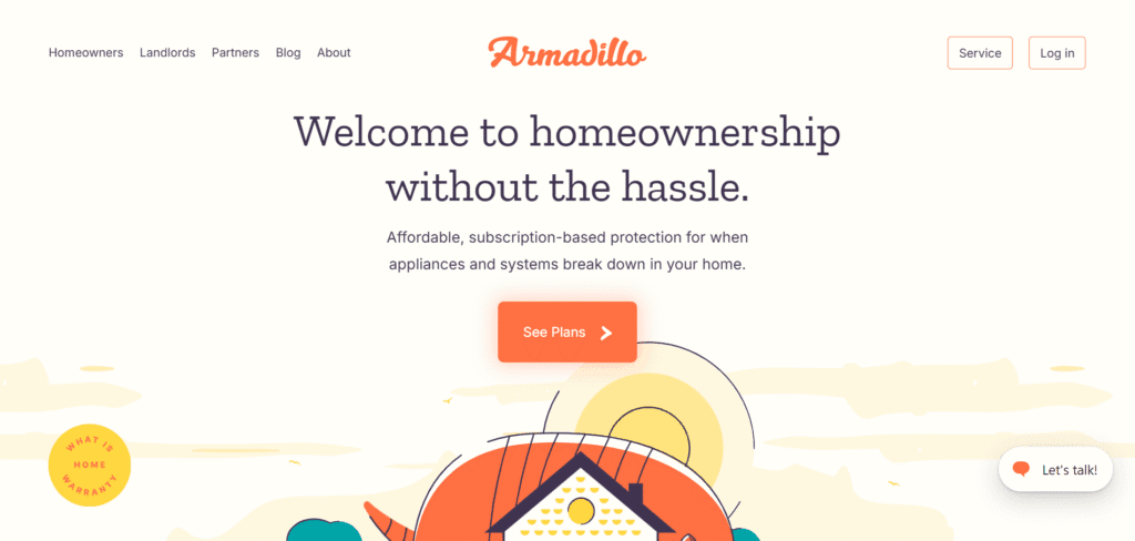
Website: armadillo.one
Armadillo is a creative agency. Its homepage uses a very vibrant orange color scheme. The background and highlights are bright orange mixed with other bold colors like yellow and green. While not strictly black, the site’s large orange areas create a fun and playful look. The orange here makes the design feel energetic and lively.
15. Fanta
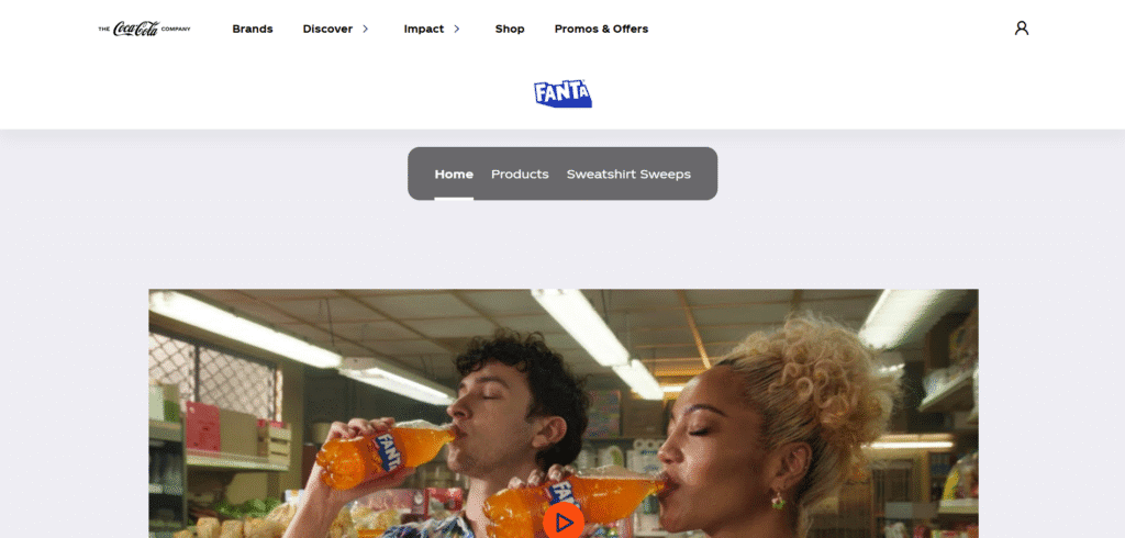
Website: fanta.com
Fanta is the official site of the Fanta soda brand. It uses orange heavily (matching the orange-flavored theme) on dark backgrounds or on gradients. Large orange areas and orange fruit images make the site look fun and juicy. The strong orange color on dark and blue backgrounds really grabs attention and feels very vibrant.
Each of these websites uses black and orange in a different way. But in every case, the bright orange pops against the dark backdrop, making buttons, text, and images really stand out. This high-contrast palette can look modern, creative, or energetic, depending on how it’s done. The examples above mix these two colors in simple, clean designs that feel friendly and engaging, just as described in the sources.
Black and Orange website not right for your organization?
Check out one of these:


