In the fast-evolving landscape of online learning, a compelling edtech website design is essential for capturing attention, building trust, and driving engagement. Whether you’re an edtech startup, a school, or a global education platform, your website is the digital front door to your brand. The best edtech website designs blend intuitive navigation, modern visuals, and interactive features to create a seamless user experience for students, educators, and parents alike.
This blog showcases 12 outstanding edtech website design examples, each analyzed for their strengths, areas for improvement, and what makes them a source of inspiration for anyone looking to elevate their digital learning presence.
1. Grammarly
- Website: grammarly.com
- Location: San Francisco, California, USA
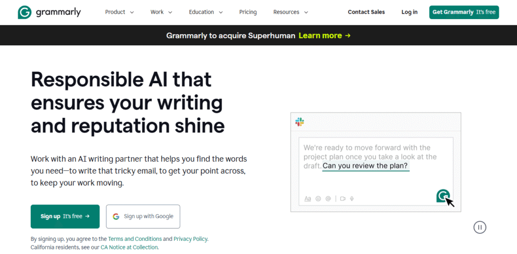
- What We Like: Grammarly’s edtech website design is a masterclass in clarity and professionalism. The homepage features a clean white-and-green palette, prominent calls-to-action, and concise explanations of product features. The intuitive navigation and comprehensive help center make it easy for users to sign up, explore features, and find support. The site’s accessibility and responsive design ensure a seamless experience across all devices, reinforcing Grammarly’s reputation as a trusted writing assistant.
- What Could Be Improved: While the design is clean, some users may find the homepage a bit text-heavy, especially first-time visitors unfamiliar with the product. Incorporating more video demos or interactive onboarding could help new users quickly grasp Grammarly’s value. Additionally, a more prominent showcase of real-world success stories or testimonials could further build trust and encourage sign-ups.
2. Padlet
- Website: padlet.com
- Location: San Francisco, California, USA
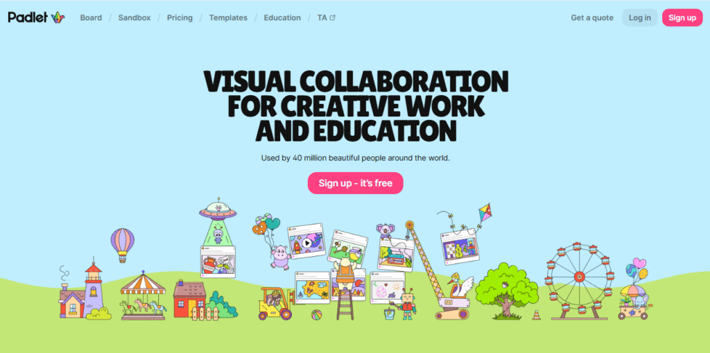
- What We Like: Padlet’s edtech website design is vibrant and playful, using bold colors and engaging visuals to showcase its collaborative canvas tools. The homepage immediately demonstrates the platform’s capabilities with live previews and easy sign-up options. The user-friendly language, strong social proof, and clear navigation make it approachable for educators and students alike, fostering a sense of creativity and community.
- What Could Be Improved: The playful design, while engaging, can sometimes feel overwhelming for users seeking specific information. Streamlining the homepage and providing clearer pathways to pricing, case studies, or support resources would improve usability. Enhancing accessibility features, such as high-contrast text and keyboard navigation, would also make the site more inclusive.
3. Khan Academy
- Website: khanacademy.org
- Location: Mountain View, California, USA
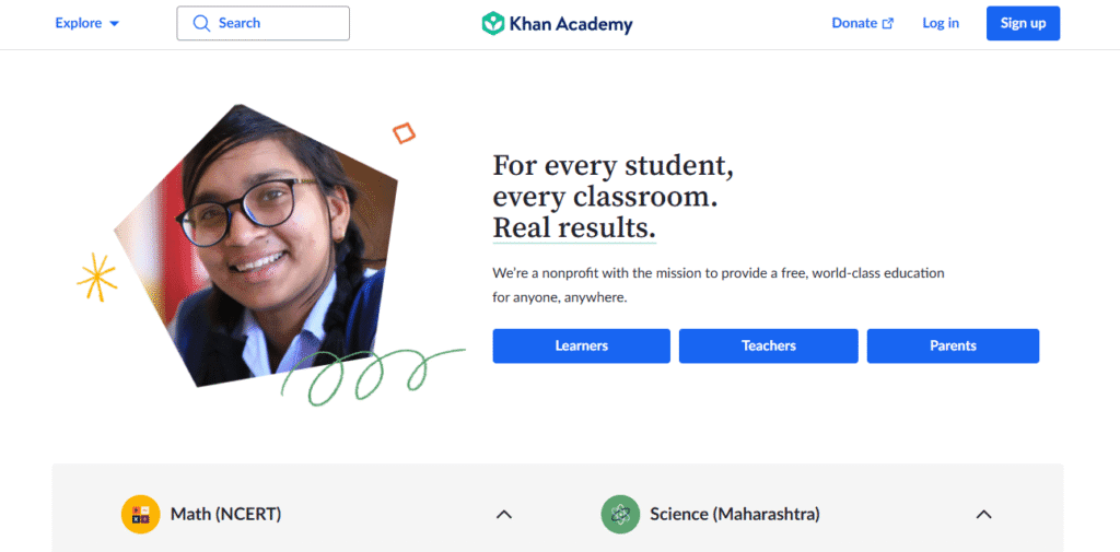
- What We Like: Khan Academy’s edtech website design is approachable and student-focused, with a calming blue palette and clear emphasis on free, accessible education. The homepage features intuitive navigation, personalized learning paths, and easy access to resources for students, parents, and teachers. The site’s commitment to inclusivity and global reach is evident in its multilingual support and adaptive content.
- What Could Be Improved: Some users may find the breadth of content overwhelming, especially when searching for specific topics or grade levels. Improving the search functionality and adding more visual cues for different user groups could streamline the user journey. More interactive elements, like course previews or gamified progress tracking, would further enhance engagement.
4. Coursera
- Website: coursera.org
- Location: Mountain View, California, USA
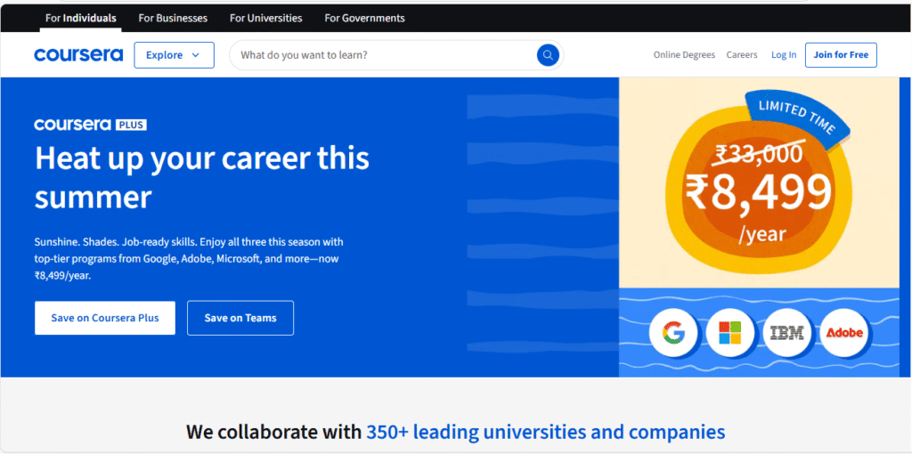
- What We Like: Coursera’s edtech website design is sleek and professional, blending modern visuals with effortless usability. The homepage uses adaptive learning paths, subtle animations, and a soothing color palette to guide users to relevant courses. The clean layout, personalized recommendations, and clear calls-to-action make it easy for learners to explore, enroll, and succeed.
- What Could Be Improved: The site’s vast course catalog can make navigation challenging for new users. Introducing more guided onboarding or interactive course finders would help visitors quickly discover content tailored to their goals. Additionally, more prominent student testimonials and outcome stories could boost confidence in the platform’s effectiveness.
5. EdX

- Website: edx.org
- Location: Cambridge, Massachusetts, USA
- What We Like: EdX features a modern, university-backed edtech website design with bold imagery and clear calls-to-action. The intuitive course search, detailed program pages, and responsive design ensure a seamless experience across devices. The site’s credibility is reinforced by university partnerships and transparent course information, making it a top choice for lifelong learners.
- What Could Be Improved: While the design is visually appealing, some users may find the navigation menus dense, especially when searching for specific programs or credentials. Simplifying menu structures and adding more visual course previews could enhance usability. More interactive elements, such as student forums or live chat support, would further enrich the learning experience.
6. The Walker School
- Website: thewalkerschool.org
- Location: Marietta, Georgia, USA
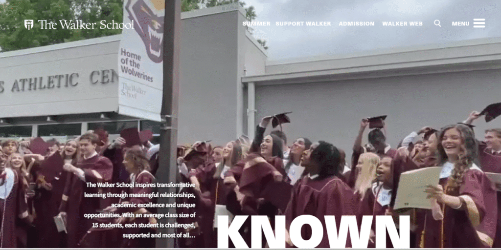
- What We Like: The Walker School’s edtech website design is bold and immersive, using horizontal scrolling, interactive visuals, and compelling storytelling to engage prospective families. The site’s modern layout and student-centered content make navigation enjoyable, while the use of video and photography brings the school’s community to life. The design balances tradition with innovation, appealing to both parents and students.
- What Could Be Improved: The horizontal scrolling, while visually impressive, may confuse users accustomed to traditional navigation. Providing alternative navigation options and clearer section markers would improve accessibility. Additionally, optimizing load times for media-rich pages would enhance the overall user experience.
7. Greenhill School
- Website: greenhill.org
- Location: Addison, Texas, USA
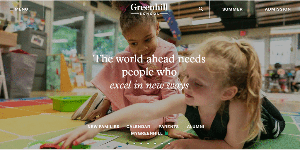
- What We Like: Greenhill’s edtech website design stands out with its “then vs now” slider, modern navigation takeovers, and rich media content. The visual storytelling and innovative features set it apart, offering a dynamic way to explore the school’s history and values. The site’s clean design and strong branding create a memorable impression for prospective students and families.
- What Could Be Improved: The abundance of interactive features may slow down performance on older devices or slower connections. Streamlining animations and offering a simplified version for accessibility would ensure all users have a smooth experience. More concise content in some sections would also improve readability.
8. StuDocu
- Website: studocu.com
- Location: Amsterdam, Netherlands
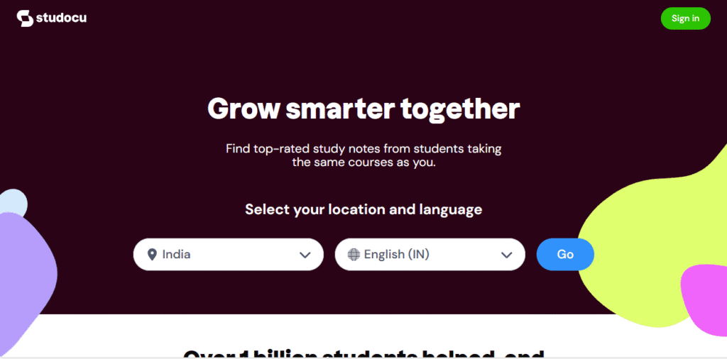
- What We Like: StuDocu’s edtech website design is simple and functional, focusing on usability and content. The search-driven interface and minimal color palette keep the focus on finding and sharing study resources. The site’s straightforward layout and responsive design make it easy for students to access materials on any device.
- What Could Be Improved: The minimalist design, while efficient, may feel too sparse for some users. Adding more visual cues, such as icons or featured resources, would enhance engagement. A more robust onboarding process for new users could also help them get started quickly.
9. Edubin
- Website: edubin.netlify.app
- Location: Template (Global)
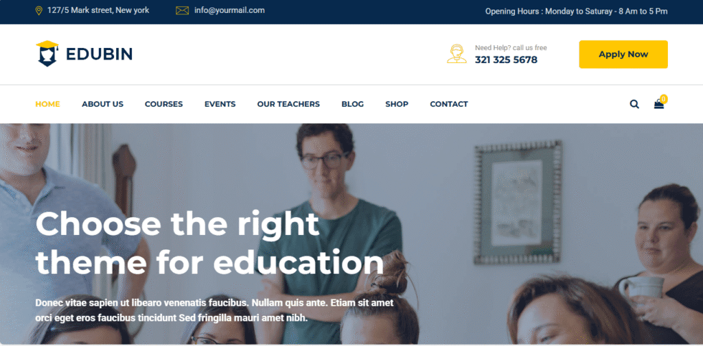
- What We Like: Edubin is a versatile edtech website design template, ideal for learning management systems, training centers, and online courses. It features multiple homepage variations, event pages, and a responsive design that adapts to any educational institution’s needs. The clean layout and customizable features make it easy to create a professional online presence.
- What Could Be Improved: As a template, Edubin may lack the unique branding elements needed for some organizations. Providing more guidance on customization and integration with popular edtech tools would help users maximize its potential. Enhanced documentation and support resources would also benefit non-technical users.
10. Parisian American Academy
- Website: parisamericanacademy.fr
- Location: Paris, France
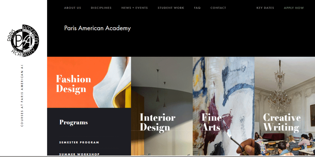
- What We Like: The Parisian American Academy’s edtech website design is visually bold, using parallax effects, striking graphics, and interactive elements to create a modern, immersive experience. The layout is creative and easy to navigate, reflecting the school’s commitment to artistic innovation and global education.
- What Could Be Improved: The heavy use of parallax and animations may impact performance on older devices. Offering a simplified version and optimizing media files would improve accessibility. More detailed program information and alumni success stories would further enrich the site’s content.
11. Byju’s
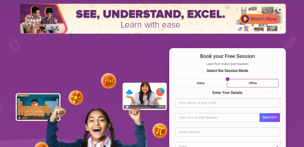
- Website: byjus.com
- Location: Bengaluru, India
- What We Like: Byju’s edtech website design is vibrant and highly interactive, with a strong focus on animated visuals, testimonials, and learning outcomes. The homepage features clear navigation to exam prep, school learning, and live classes. The design is mobile-first, catering to India’s massive mobile learning audience, and the platform’s brand identity is consistently reinforced through color and iconography.
- What Could Be Improved: The homepage can feel busy, with multiple banners and offers. Streamlining the layout and providing clearer learning paths for different age groups would enhance usability. More transparent pricing and a simplified sign-up process would also benefit new users.
12. Unacademy
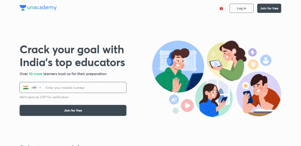
- Website: unacademy.com
- Location: Bengaluru, India
- What We Like: Unacademy’s edtech website design is vibrant and engaging, with a focus on live classes, top educators, and exam preparation. The homepage highlights trending courses, upcoming sessions, and testimonials from successful learners. The platform’s interactive features, such as live chat and quizzes, foster community and engagement. The design is mobile-friendly, making it ideal for India’s fast-growing online learning market.
- What Could Be Improved: Some users may find the homepage busy, with multiple banners and calls-to-action competing for attention. Simplifying the layout and providing clearer navigation to key sections, such as subject categories or educator profiles, would enhance usability. More detailed course previews and transparent pricing information would also benefit prospective learners.
Key Features of Effective EdTech Website Design
- User-Centered Navigation: Intuitive menus and clear calls-to-action guide users to resources, sign-ups, and support.
- Modern Visuals: Clean layouts, bold imagery, and consistent branding build trust and engagement.
- Mobile Responsiveness: Seamless experience across all devices is essential for today’s learners.
- Interactive Elements: Gamified quizzes, sliders, and video content boost retention and enjoyment.
- Accessibility: High-contrast colors, alt text, and keyboard navigation ensure inclusivity for all users.
EdTech Website Design Trends for 2025
- AI-Powered Personalization: Adaptive interfaces and smart content recommendations.
- Micro-Animations: Subtle motion guides users and highlights key actions.
- Immersive Storytelling: Video, parallax scrolling, and interactive content bring learning to life.
- Community Features: Forums, testimonials, and social integration foster connection and trust.
- Sustainability & Transparency: Showcasing eco-friendly initiatives and transparent business practices.
Final Thoughts
The edtech website design examples featured here prove that great digital experiences can inspire learning, build trust, and drive engagement. By prioritizing modern visuals, intuitive navigation, and interactive features, your edtech website can become a powerful tool for growth and impact. As the education sector continues to evolve, investing in high-quality edtech website design will be essential for standing out and achieving your mission.
EdTech website not appropriate for your company?
Check out our roundups of different aesthetics for unique website designs:
Work With Us
Ready to elevate your edtech platform’s digital presence? Our team specializes in modern, high-performing edtech website design that drives results. Whether you need a new site or a redesign, we’ll help you craft a digital experience that’s inviting, user-friendly, and uniquely yours. Contact us today to start your edtech website design journey!


