Private Equity Website Design: 9 of the Best PE Firm Websites

These are nine private equity firm websites, from Blackstone, KKR and Apollo to Thoma Bravo and EQT, with what each does well and what we would change.
A private equity site serves readers who arrive with a specific question. Limited partners and their consultants are checking strategy, team and governance. Founders and management teams want to know how the firm behaves as an owner. Advisers and bankers want sector focus and deal size so they know what to send. The best sites answer each of them in a few clicks and keep fund information behind the right gate. A checklist for your own firm’s site follows the examples.
1. Carlyle Group - Investment Excellence

- Website: carlyle.com
- Location: Washington, D.C., USA
- What we like: The website creates a dynamic experience with engaging videos and high-quality images, such as staircases and windmills, that reflect global operations. Its extensive navigation includes links to annual reports, ESG reports, and global insights, making it easy to explore their $453B in assets across 29 offices on 4 continents. The clean layout and bold statistics build trust and showcase scale effectively.
- What should be improved: Design consistency across pages could be enhanced, as some sections feel visually disconnected. Video integration needs optimization to ensure smooth playback across devices, especially for users with older browsers. Adding more interactive elements, like hover effects on key stats, could boost engagement.
2. Apollo Global - Financial Impact

- Website: apollo.com
- Location: New York, USA
- What we like: The site is highly informative, featuring detailed case studies (e.g., Air France-KLM, Concord) that highlight successful investments with implied visuals for impact. Clear navigation through sections like “About Apollo” and “Sustainability & Our Impact” ensures ease of use. Interactive buttons like “Learn More” encourage exploration, and the professional tone aligns with the firm’s reputation.
- What should be improved: The design could adopt a more modern aesthetic with vibrant colors and dynamic layouts to stand out. Incorporating animated transitions or infographics for case studies would enhance visual appeal and make complex data more digestible.
3. KKR Strategic - Investment Success

- Website: kkr.com
- Location: New York, USA
- What we like: The website is well-organized, with a clear focus on investment success stories like Marmic Fire & Safety and Bushu Pharma. The navigation is intuitive, with sections like “Institutional Investors” and “Global Wealth Solutions” clearly labeled. A prominent call-to-action for subscribing to insights fosters user engagement, and the design feels polished and professional.
- What should be improved: Adding dynamic content, such as interactive infographics or animated timelines of investments, could make the site more engaging. The visual style, while clean, could benefit from bolder colors or multimedia to create a more memorable experience.
4. Thoma Bravo - Tech Investment

- Website: thomabravo.com
- Location: Chicago, Illinois, USA
- What we like: The website prominently displays key achievements, such as ~$184B in assets under management, which conveys authority. Navigation is user-friendly with a back-to-top link and clear sections like “Europe Fund” and “Firm News & Updates.” The focus on tech investments is well-articulated, making it appealing to targeted investors.
- What should be improved: The design feels slightly dated and could benefit from a modern overhaul with sleeker fonts and layouts. Incorporating more visible images or interactive elements, beyond tracking pixels, would enhance engagement and align with the firm’s tech-focused identity.
5. EQT Sustainable - Investment Focus

- Website: eqtgroup.com
- Location: Stockholm, Sweden
- What we like: The site is highly detailed, with well-organized sections on investment areas like Private Capital and Infrastructure. A newsletter sign-up encourages ongoing engagement, and implied visuals for projects like the Nyx orbital vehicle add intrigue. Clear headings and a professional layout make information easy to access.
- What should be improved: The design could incorporate more interactive elements, such as sliders or animated charts, to bring data to life. A bolder color scheme and modern typography would enhance visual appeal and make the site feel more dynamic.
6. Blackstone Global - Investment Leader

- Website: blackstone.com
- Location: New York, USA
- What we like: The website features a clean, professional design with intuitive navigation, making sections like “Private Wealth” and “EARNINGS” easy to find. A form for updates encourages user interaction, and headers like “Unmatched scale” convey authority. The minimalist aesthetic aligns well with the firm’s global reputation.
- What should be improved: The site lacks multimedia elements, such as videos or interactive charts, which could make it more engaging. Adding dynamic visuals or animations to highlight key metrics would elevate the user experience and make the site more memorable.
7. TPG Diverse - Investment Portfolio

- Website: tpg.com
- Location: Fort Worth, Texas, USA
- What we like: The website clearly presents key information, like $251B in total AUM, with a background image that adds visual emphasis. Accessibility features, such as the “Skip to main content” link, make it user-friendly for diverse audiences. The straightforward layout ensures quick access to essential details.
- What should be improved: The mobile experience could be optimized for smoother navigation and faster load times. Adding interactive elements, like clickable investment portfolios or animated stats, would make the site more engaging and align with modern web standards.
8. Bain Capital - Growth Expertise

- Website: baincapital.com
- Location: Boston, Massachusetts, USA
- What we like: The site is well-structured, with clear headings like “Stewardship & sustainability” that guide users effectively. The “Meet our people” section adds a personal touch, fostering trust. The professional layout and concise content make it easy to understand the firm’s expertise and offerings.
- What should be improved: The repeated header across pages feels redundant and disrupts the visual flow. A redesign with varied header styles or more dynamic visuals, like images or subtle animations, would improve the overall aesthetic and user experience.
9. Warburg Pincus - Investment Legacy

- Website: warburgpincus.com
- Location: New York, USA
- What we like: The website is straightforward, with bold text and bullet points under “The Stats” highlighting $120B+ invested and 1000+ companies. The simple layout ensures key information is easy to find, and the focus on the firm’s long history builds credibility.
- What should be improved: The design lacks visual engagement due to minimal use of images or infographics. Adding multimedia elements, such as project visuals or interactive timelines, would make the site more appealing and help convey the firm’s legacy more dynamically.
Work with us
Need a private equity website that answers LPs, management teams and advisers?
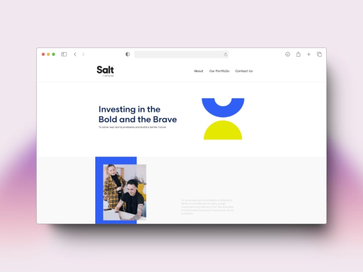
Send us your current site, your strategy and the audiences that matter most, and tell us whether any of it needs to sit behind an investor gate. We designed the website for Salt Ventures, a UAE venture capital firm, and work at €25 to €45 an hour with a €1,000 minimum. We reply within one business day.
What a good private equity website needs
- Investment criteria stated plainly. Sectors, geographies, deal types and the size range you invest in, so advisers can qualify a deal before they call.
- A portfolio you can filter. Current and realised investments by sector, fund and year, each with a line on what the firm did, not just a logo.
- Team pages that hold up in diligence. Every partner and deal professional with role, sector focus and board seats. LPs read these closely.
- A secure route to the investor portal. LP reporting lives with the fund administrator or a portal provider. The site links to it and never hosts fund documents on public URLs.
- Gating and disclaimers that match the rules. Fund information for professional investors only, with a jurisdiction and investor-type check where the marketing rules (AIFMD in Europe, the SEC marketing rule in the US) require one.
- Responsible investment reporting. Policy, reports and any required sustainability disclosures, kept current.
- A dated record of deals. Acquisitions, exits and news in one place, which is often the most-read page after the portfolio.
Private Equity website not appropriate for your business?
Check out our roundups of different aesthetics for unique website designs:


