Mining Website Design: 15 Examples and What They Get Right

This is a gallery of 15 mining and metals company websites, from majors such as BHP and Rio Tinto to mid-tier producers and a streaming company, with what each one does well and what it could do better.
A mining company’s website has more audiences than most. Investors and analysts want results, reserves statements and announcements. Communities and regulators want environmental and safety performance and a contact for each operation. Customers want product and logistics information, and the company is nearly always hiring. If you are commissioning one, the job is to give each of them a clear route in without burying the disclosures they rely on.
1. South32

- Website: south32.net
- Location: Perth, Australia
- What We Like: South32’s mining website design stands out for its clean, modern interface and engaging video content. Interactive maps and a well-organized layout make it easy for users to explore the company’s global operations. The responsive design ensures seamless viewing on any device, while the use of bold visuals and concise storytelling draws users into the company’s narrative. The site’s strong branding and clear calls-to-action make it a benchmark for mining website design excellence.
- What Could Be Improved: While the homepage is visually appealing, some secondary pages are content-heavy and could benefit from more visual hierarchy. Streamlining the navigation and adding more interactive elements such as project timelines or sustainability dashboards could further enhance user engagement and accessibility.
2. Sumitomo Metal Mining

- Website: smm.co.jp/E/
- Location: Tokyo, Japan
- What We Like: This mining website design is simple, professional, and highly focused on sustainability. Information is broken down into digestible sections, making the user experience seamless. The site uses a restrained color palette and clear typography to communicate transparency and reliability, which is essential for a global mining company.
- What Could Be Improved: The design, while clean, could be enhanced with more dynamic visuals or interactive infographics. Incorporating video content or virtual tours of mining sites would make the site more engaging and provide a deeper look into the company’s operations.
3. Fortescue Metals Group

- Website: fmgl.com.au
- Location: Perth, Australia
- What We Like: Fortescue’s mining website design features a unique layout, visually engaging “Fast Facts” section, and concise storytelling. The homepage immediately draws users in with immersive visuals and easy access to key information. The site’s navigation is intuitive, and the responsive design ensures accessibility across devices.
- What Could Be Improved: Some users may find the navigation slightly overwhelming due to the number of sections. Simplifying the menu structure and adding more interactive project showcases could further enhance the user journey and keep visitors engaged for longer periods.
4. Ivanhoe Mines

- Website: ivanhoemines.com
- Location: Vancouver, Canada
- What We Like: Ivanhoe Mines’ mining website design is visually striking, with dynamic animations, interactive menus, and bold color choices. The site effectively communicates the company’s innovative spirit and commitment to transparency. The use of infographics and interactive maps makes complex information accessible and engaging.
- What Could Be Improved: While the animations are impressive, they can slow download times on some devices. Optimizing performance and offering a “lite” version for slower connections would improve accessibility for all users.
5. BHP

- Website: bhp.com
- Location: Melbourne, Australia
- What We Like: BHP’s mining website design combines appealing graphics, solid colors, and welcoming imagery to create a positive, accessible experience. The site’s structure highlights BHP’s mission, sustainability initiatives, and community engagement, making it easy for users to find relevant information.
- What Could Be Improved: The homepage can feel crowded due to the volume of content. Streamlining the layout, using more whitespace, and prioritizing key messages would help users focus and improve overall engagement.
6. Polyus

- Website: polyus.com
- Location: Moscow, Russia
- What We Like: Polyus’s mining website design is straightforward and professional, with interactive elements and a clear operational map. The site’s clean layout and concise content make it easy to navigate and find information about the company’s gold mining projects.
- What Could Be Improved: The site could benefit from more visual storytelling, such as video tours or interactive timelines. Enhancing the mobile experience and adding more investor resources would also improve usability.
7. Kinross Gold

- Website: kinross.com
- Location: Toronto, Canada
- What We Like: Kinross Gold’s mining website design features a user-friendly layout, segmented homepage, and custom imagery. The site highlights responsible mining practices and career opportunities, making it appealing to both investors and potential employees.
- What Could Be Improved: Some deeper pages are text-heavy and could be enhanced with more visuals or infographics. Streamlining the application process for careers would also improve the user experience.
8. Ma’aden

- Website: maaden.com.sa
- Location: Riyadh, Saudi Arabia
- What We Like: Ma’aden’s mining website design is highly readable, with interactive buttons and a strategic layout that enhances engagement. The site’s strong branding and focus on sustainability are evident throughout, and the responsive design ensures accessibility on all devices.
- What Could Be Improved: The navigation could be further simplified, and more multimedia content such as video interviews or project walkthroughs would make the site more dynamic and informative.
9. Wheaton Precious Metals

- Website: wheatonpm.com
- Location: Vancouver, Canada
- What We Like: Wheaton’s mining website design is minimalist and modern, with a featured documents section and a clean, uncluttered aesthetic. The site’s clear calls-to-action and easy access to reports make it highly functional for investors.
- What Could Be Improved: The site could incorporate more interactive features, such as real-time stock updates or interactive project maps. Adding case studies or video testimonials would also enhance engagement.\
10. Vedanta Resources

- Website: vedantaresources.com
- Location: London, UK
- What We Like: Vedanta’s mining website design uses natural colors, exceptional photography, and smooth animations to create a calm, innovative atmosphere. The site’s content is well-organized, making it easy to learn about the company’s global operations and sustainability efforts.
- What Could Be Improved: Some sections are content-heavy and could be streamlined for easier reading. Introducing interactive dashboards or infographics would help break up text and provide a more engaging user experience.
11. Rio Tinto

- Website: riotinto.com
- Location: London, UK
- What We Like: Rio Tinto’s mining website design features bold visuals, interactive graphics, and a strong focus on innovation and environmental responsibility. The site’s immersive experience draws users into the company’s global projects.
- What Could Be Improved: The site’s interactive elements can be resource-intensive, impacting load times on mobile devices. Optimizing performance and providing alternative navigation options would improve accessibility.
12. Newmont Corporation

- Website: newmont.com
- Location: Denver, USA
- What We Like: Newmont’s mining website design highlights sustainability with detailed reports, a responsive layout, and clear navigation. The site’s focus on community and investor relations is evident, making it a valuable resource for stakeholders.
- What Could Be Improved: Some pages are dense with information and could benefit from more visuals or summary sections. Enhancing the search functionality would also help users quickly find specific content.
13. Hecla Mining

- Website: hecla-mining.com
- Location: Coeur d’Alene, USA
- What We Like: Hecla Mining’s website design is classic, with bold visuals, clear navigation, and a focus on investor and sustainability information. The site’s layout is straightforward, making it easy for users to access reports and company updates.
- What Could Be Improved: The site could be modernized with more interactive features, such as virtual mine tours or real-time data dashboards. Improving mobile responsiveness would also enhance the user experience.
14. Lundin Mining

- Website: lundinmining.com
- Location: Toronto, Canada
- What We Like: Lundin Mining’s website design features a modern layout, bold color palette, and clear project showcases. The site’s focus on operations, community, and investor resources makes it comprehensive and user-friendly.
- What Could Be Improved: Some sections could be enhanced with more multimedia content, such as video case studies or interactive maps. Streamlining navigation would also improve the overall user journey.
15. Teck Resources

- Website: teck.com
- Location: Vancouver, Canada
- What We Like: Teck Resources’ mining website design is professional, with interactive features, sustainability highlights, and a clean, organized layout. The site’s focus on innovation and environmental stewardship is clear throughout.
- What Could Be Improved: Some pages are text-heavy and could be improved with more visuals or infographics. Enhancing the mobile experience and adding more interactive project showcases would further engage users.
Work with us
Need a website that serves investors, communities and recruits at once?
Send us your current site, where you operate and list, and what the site has to carry, from exchange announcements to project maps and sustainability reports. We design and build corporate and multi-language sites from Budapest for clients in 12+ countries, at €25–45 an hour. We reply within one business day.
Recent builds
EU College Group · Education
Website Redesign for an International Education Consultancy
- Web design
- Web development
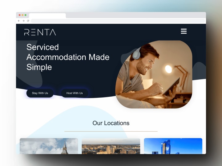
Renta Properties · Property
Website Redesign for a UK Property Management Company
- Web design
- Web development
Beanburg · E-commerce
E-commerce Website for a Specialty Coffee Brand
- Web design
- Web development


What a good mining website needs
- An investor centre that is never out of date. Results, presentations, reserves and resources statements, exchange announcements and AGM material, ideally fed from the filing service rather than uploaded by hand.
- Operations and projects on a map. One page per site with commodity, stage, ownership and guidance, linked from an interactive map that also works as a plain list.
- Sustainability reporting people can find. Tailings disclosures, emissions, water and safety data and the annual sustainability report, in HTML as well as PDF.
- A community and grievance route for each operation. Local contacts, community investment and a grievance mechanism, in the languages spoken where you operate.
- Careers for remote and rotational roles. Rosters, site locations and graduate programmes, connected to your applicant tracking system rather than a PDF list of vacancies.
- Disclosure-safe publishing. A CMS workflow where announcements go live at the right moment and nobody can edit a past filing by accident.
- Pages that load on a weak connection. People read the site from remote operations and on mobile data, so heavy video headers need a lightweight fallback.
Mining website not appropriate for your business?
Check out our roundups of different aesthetics for unique website designs:


