Blue and yellow are a timeless color combination in web design. Blue conveys trust and professionalism, while yellow adds energy and warmth. Together, they create a vibrant and balanced aesthetic that captures attention and guides users effectively.
In this blog post, we’ve curated 16 stunning examples of websites from around the world that masterfully utilize blue and yellow in their designs. These examples showcase how this dynamic duo can be employed across various industries to create engaging and memorable user experiences.
Whether you’re a designer seeking inspiration or a brand considering a color palette refresh, these websites demonstrate the versatility and impact of blue and yellow in web design.
Here is a curated list of 16 outstanding websites from around the world that creatively use blue and yellow in their designs. These examples showcase how this color combination can convey trust, energy, and creativity.
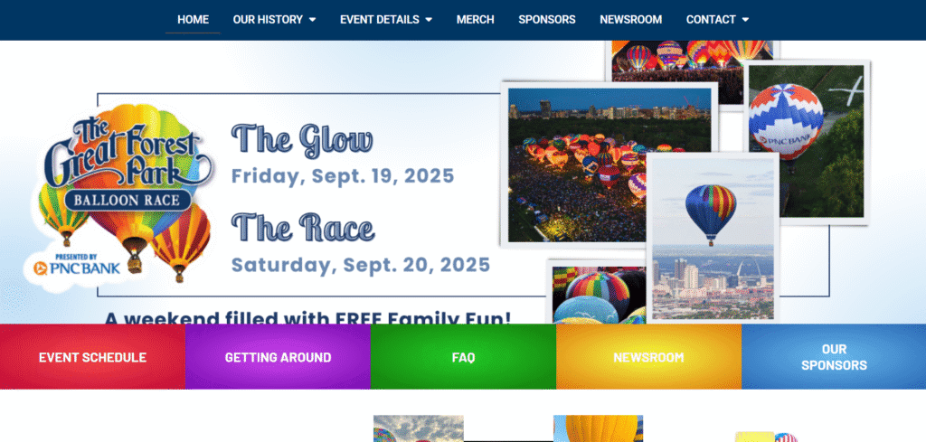
1. The Great Forest Park Balloon Race in St. Louis, MO
- Website: greatforestparkballoonrace.com
- Description: This website uses a cheerful blue and yellow palette to highlight the event’s history, photos, and notable figures. The colors create a fun and inviting atmosphere, perfect for a community balloon race event.
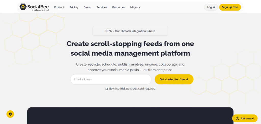
2. Social Bee
- Website: socialbee.com
- Description: Social Bee employs a vibrant yellow background with blue accents for interactive features. This lively color scheme aligns with their mission to create buzz and engage audiences effectively.
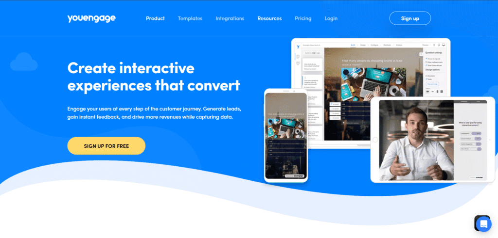
3. Youengage
- Website: youengage.me
- Description: YouEngage helps create interactive experiences that convert, assisting clients in engaging their customers at every step of their journey. This colorful website is attractive, consistently displaying light blue and white as the secondary colors. Several animated icons stand out over the homepage’s plain white and light blue background, engaging users in their colorful display.
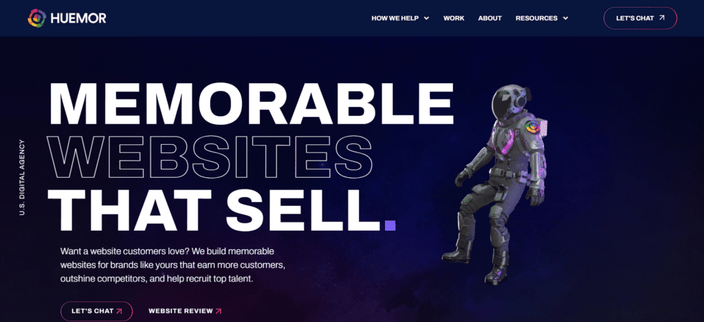
4. Huemor
- Website: huemor.rocks
- Description: Huemor uses light, modern, cheerful colors, including blue and likely yellow, balanced with white space for a professional yet fun vibe.
5. MOSCOT Eyewear
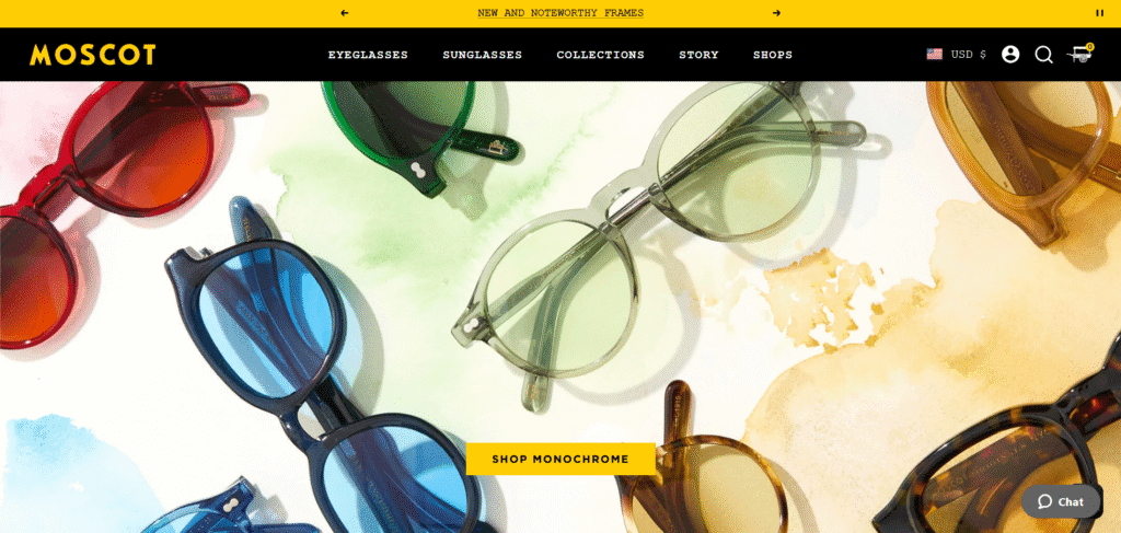
- Website: moscot.com
- Description: MOSCOT’s site showcases a classic yellow and black theme, with subtle blue elements enhancing the overall aesthetic. The design reflects the brand’s heritage and commitment to quality eyewear.
6. Immieats
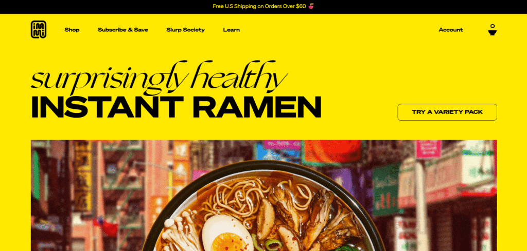
- Website: immieats.com
- Description: Immi’s website features a dominant bright yellow palette, exuding energy and warmth. Black text and imagery provide contrast, making the content stand out while maintaining a cohesive and inviting design.
7. IKEA
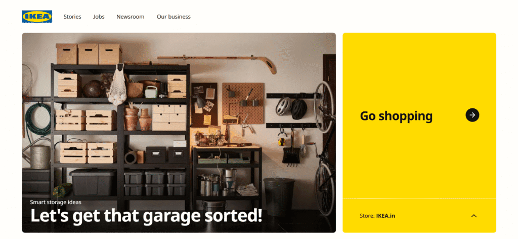
- Website: ikea.com
- Description: IKEA, a globally recognized leader in home furnishings, extends its iconic blue and yellow branding far beyond its logo, integrating these colors prominently throughout its website and mobile application design. The deep blue, specifically identified as #0057AD, is deployed to convey a strong sense of trust, reliability, and stability. This choice aligns seamlessly with IKEA’s brand promise of providing dependable and affordable home furnishings, establishing a solid and reassuring visual foundation for visitors.
8. PreK4sa
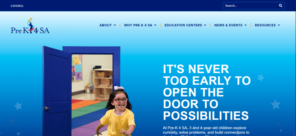
- Website: prek4sa.com
- Description: The Pre-K 4 SA website, dedicated to early childhood education, primarily uses blue as its dominant color, but strategically incorporates bright “pops” of yellow throughout its design. The extensive use of blue provides a stable, trustworthy, and calming feeling, which is an incredibly important emotional anchor for parents considering a school for their children. This foundational blue communicates reliability and a safe environment.
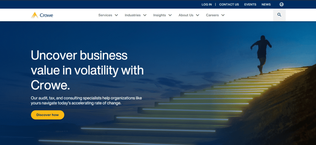
9. Crowe
- Website: crowe.com
- Description: Crowe, a prominent financial advisory firm, employs a sophisticated and professional combination of “gold and blues” in its website design. This choice reflects a deliberate strategy to convey specific brand attributes essential for a financial institution. The various shades of blue, ranging from sky blue to deep navy, are utilized to communicate trust, reliability, clarity, and depth. These qualities are absolutely crucial in the finance industry, where client confidence and perceived expertise are paramount.
10. Grand One 14

- Website: grandone.fi
- Description: The design embraces a magical world built of simple shapes, bold colors, and moving textures. The color palette includes bright and saturated hues, creating an energetic and engaging atmosphere. The use of animations and illustrations adds depth and interactivity, enhancing the user experience.
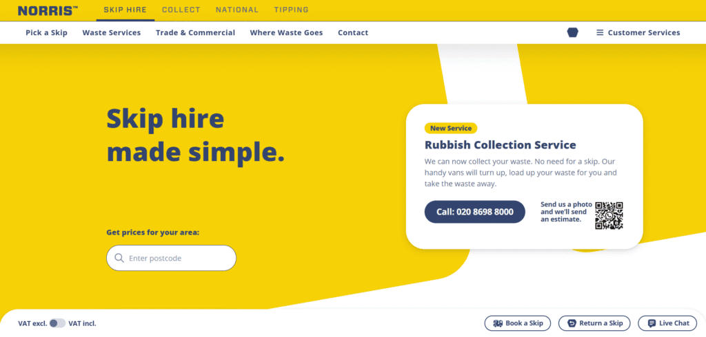
11. Norris
- Website: norris.co.uk
- Description: A waste removal company’s site uses yellow and blue to symbolize responsibility. The colors make the brand recognizable and approachable for customers.
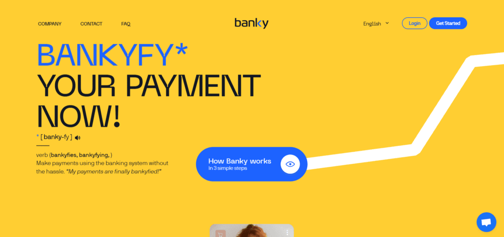
12. Banky
- Website: banky.io
- Description: Using yellow (#FFCE32) and Prussian blue (#1D63FF), this site conveys optimism and trust, ideal for finance or education sectors with a professional yet approachable design.
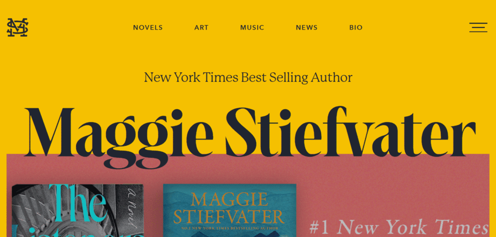
13. Maggie Stiefvater
- Website: maggiestiefvater.com
- Description: This bestselling author’s site uses a creative yellow palette, likely with blue accents, to reflect her artistic brand. The design is clean and engaging.
14. Ritual
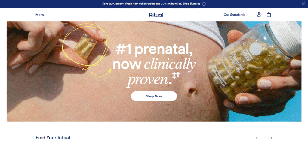
- Website: ritual.com
- Description: A vitamin product site with a yellow and white palette, possibly accented with blue for trust. The design is transparent and professional, aligning with the brand’s motto.
15. Stamped.io
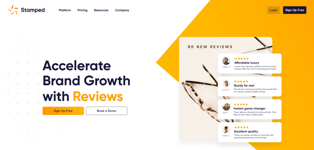
- Website: stamped.io
- Description: An eCommerce platform with a yellow palette, likely complemented by blue for contrast. The modern design engages tech-savvy users effectively.
Blue and Yellow website not right for your organization?
Check out one of these:


