As the world shifts toward a more sustainable future, clean energy companies are stepping up not only with innovative solutions—but also with compelling digital presences. A well-designed website can educate, inspire, and drive action. In this post, we’ve rounded up 12 standout clean and renewable energy website examples that combine strong messaging, striking visuals, and seamless user experience. Whether you’re looking for design inspiration or best practices in the green energy space, these examples are sure to spark ideas.
1. Iberdrola
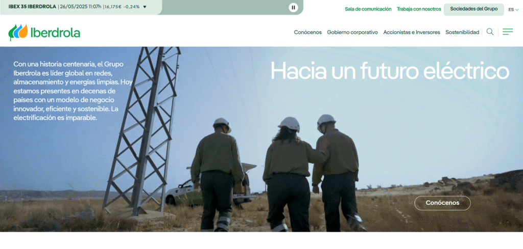
- Website: iberdrola.com
- Location: Bilbao, Spain
- What We Like: The website features clear section headings like “Latest News” and “About Iberdrola,” making it easy to navigate. It provides specific financial data, such as 2024 results, and links to regional websites, showing a global presence. Accessibility features like reCAPTCHA and privacy policies are included, and engagement is boosted with newsletter subscriptions and detailed reports.
- What Should Be Improved: Some content is repeated, which might confuse users. Adding charts or graphs for financial data would make it more engaging. More interactive elements, like videos or quizzes, could enhance the experience, and mentioning how often the site is updated would add clarity.
2. NextEra Energy

- Website: nexteraenergy.com
- Location: Juno Beach, Florida, USA
- What We Like: The design has a clear structure with headings and subheadings, paired with appealing visuals like images of solar and gas plants. It includes specific data, such as a 72 GW operating portfolio, and clear calls to action (CTAs) like “Explore Investor Resources.” The layout is professional and easy to follow.
- What Should Be Improved: A search bar or site map would improve navigation. Some messaging feels repetitive, and images lack alt text, which affects accessibility. Adding videos or infographics and citing data sources would make the site more engaging and credible.
3. Enel
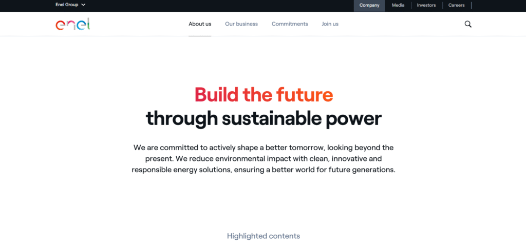
- Website: enel.com
- Location: Rome, Italy
- What We Like: The site uses clear headers like “Build the Future” and icons for quick navigation to subtopics. It includes specific data, like “206.9 TWh produced in 2024,” and strong CTAs like “Discover More.” The design is clean and user-friendly, with a focus on sustainability.
- What Should Be Improved: Adding a search bar or site map would help users find information faster. The site relies heavily on external links, which can disrupt the flow. More visuals, like graphs, and inline details about products would improve engagement, as would visible contact information.
4. Ørsted
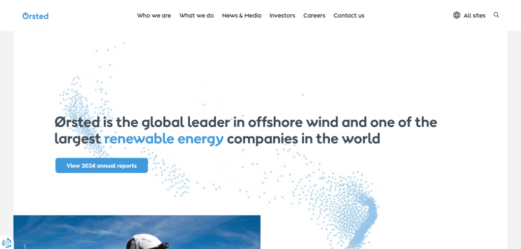
- Website: orsted.com
- Location: Fredericia, Denmark
- What We Like: The modern, clean design emphasizes sustainability with interactive elements like an energy calculator. Comprehensive project information and visuals, such as maps and photos, make the site engaging and informative.
- What Should Be Improved: Mobile responsiveness could be better for smaller screens. Adding visual storytelling, like videos or customer testimonials, would enhance engagement. Simplifying navigation for quicker access to key sections would also help.
5. Vestas Wind Systems
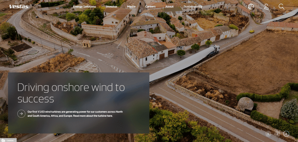
- Website: vestas.com
- Location: Aarhus, Denmark
- What We Like: The clean, professional design includes detailed product information and a focus on innovation. Case studies highlight real-world applications, and the site is well-organized for easy access to key content.
- What Should Be Improved: Navigation could be simpler for new users. Adding interactive content, like 3D turbine models or energy simulations, would make the site more engaging. Improving search functionality would also help users find specific information.
6. Siemens Gamesa Renewable Energy
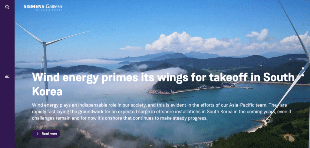
- Website: siemensgamesa.com
- Location: Madrid, Spain
- What We Like: The site is informative and well-organized, with a global focus and strong use of multimedia, like videos and infographics. The sustainability reporting section is clear, with detailed data and visuals.
- What Should Be Improved: Mobile optimization could be improved, as some sections feel cramped on smaller screens. Adding customer testimonials would build trust, and faster load times would enhance the user experience.
7. Goldwind Science and Technology
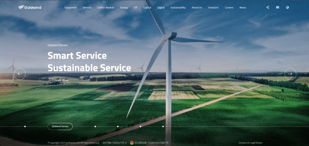
- Website: goldwind.com
- Location: Beijing, China
- What We Like: The site offers a detailed product catalog with technical specifications, ideal for industry professionals. It highlights global markets and includes a strong corporate social responsibility section.
- What Should Be Improved: The English translation could be clearer for non-Chinese speakers. Adding interactive features, like a turbine simulator, would boost engagement. A more modern visual design would also enhance appeal.
8. RWE
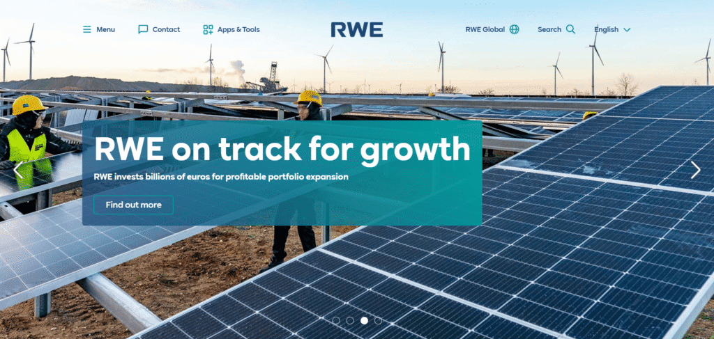
- Website: rwe.com
- Location: Essen, Germany
- What We Like: The user-friendly navigation and focus on energy transition are strong points. Interactive maps and data visualizations make complex information accessible, and the investor section is comprehensive.
- What Should Be Improved: More details on specific renewable projects would be helpful. Improving search functionality and mobile responsiveness would enhance usability for all users.
9. EDP – Energias de Portugal
- Website: edp.com
- Location: Lisbon, Portugal
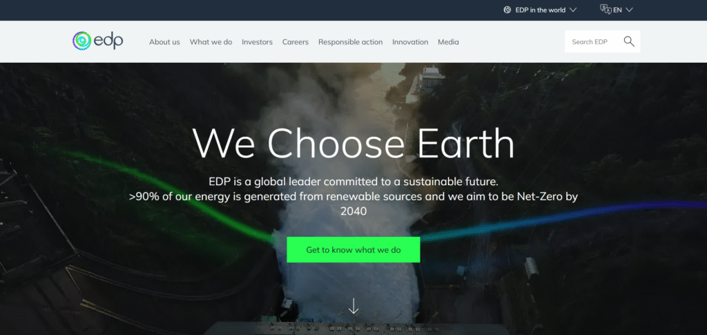
- What We Like: The sleek, modern design emphasizes sustainability with interactive reports and infographics. The site effectively highlights global projects, making it engaging and informative.
- What Should Be Improved: More detailed project information would benefit users. Navigation could be easier for non-Portuguese speakers, and adding accessibility features like alt text would improve inclusivity.
10. Canadian Solar
- Website: canadiansolar.com
- Location: Guelph, Ontario, Canada
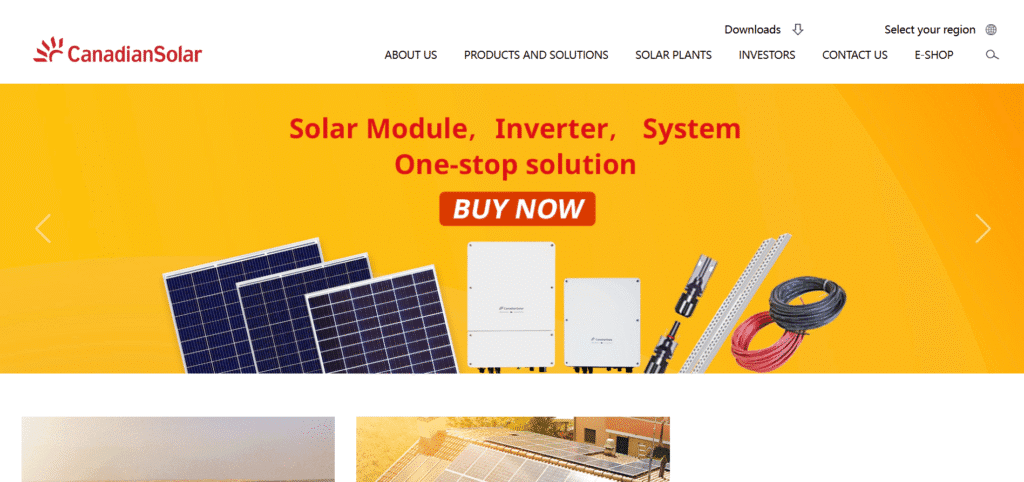
- What We Like: The professional design includes detailed product information and a focus on innovation. The customer support section is well-organized, and case studies add real-world context.
- What Should Be Improved: More visual content, like product videos, would enhance engagement. Better mobile optimization and improved search functionality would make the site more user-friendly.
11. Eagle Crest Energy
- Website: eaglecrestenergy.com
- Location: Desert Center, California, USA
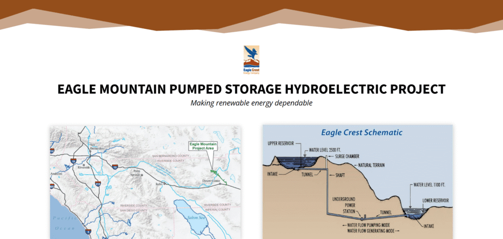
- What We Like: The focused design provides detailed information on the Eagle Mountain Pumped Storage Project. Visuals like project maps and clear CTAs make the site informative and engaging.
- What Should Be Improved: More company background information would provide context. Better navigation and improved mobile responsiveness would enhance the user experience.
12. Better Energy
- Website: betterenergy.com
- Location: Copenhagen, Denmark
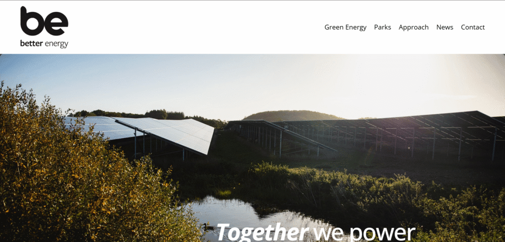
- What We Like: The user-friendly design focuses on green energy solutions with strong business case presentations. Case studies and visuals make the content engaging and accessible.
- What Should Be Improved: More technical details would appeal to industry professionals. Improved search functionality and a more modern visual design would enhance the overall experience.
Clean and Renewable website not appropriate for your organization?
Check out our roundups of different aesthetics for unique website designs:
- Sustainability Website Examples
- Biotechnology Website Examples
- Agriculture and Agritech Website Examples
Work with Us
If you’re excited about clean energy and want to help build a sustainable future, we offer exciting opportunities in project management, research, and more. Our team specializes in creating accessible, modern sites that are easy to use for everyone. We build clean and renewable websites that highlight your innovations and guide visitors clearly through your content.


