Blue and white are among the most timeless color combinations in web design. Blue evokes trust, calm, and professionalism, while white offers clarity, simplicity, and space. Together, they create sleek, engaging, and user-friendly websites across industries—from SaaS to design portfolios and wellness brands.
We’ve compiled 13 impressive websites that use this pairing in creative and effective ways. Each design showcases a different approach, from bold blue hero sections to soft gradients and whitespace. Let’s dive into these blue and white website designs inspiration.
1. User Testing

- Website: usertesting.com
- Description: The site uses a clean white background with strong blue highlights for buttons, headings, and callouts. The layout is open and accessible, reinforcing the brand’s commitment to ease of use and human-centered design.
2. Blocksy

- Website: creativethemes.com/blocksy/
- Description: A modern white layout sets the stage for electric blue buttons and hover interactions. The clean contrast gives a fresh, innovative feel, perfect for a WordPress theme builder targeting creative developers.
3. Stripe
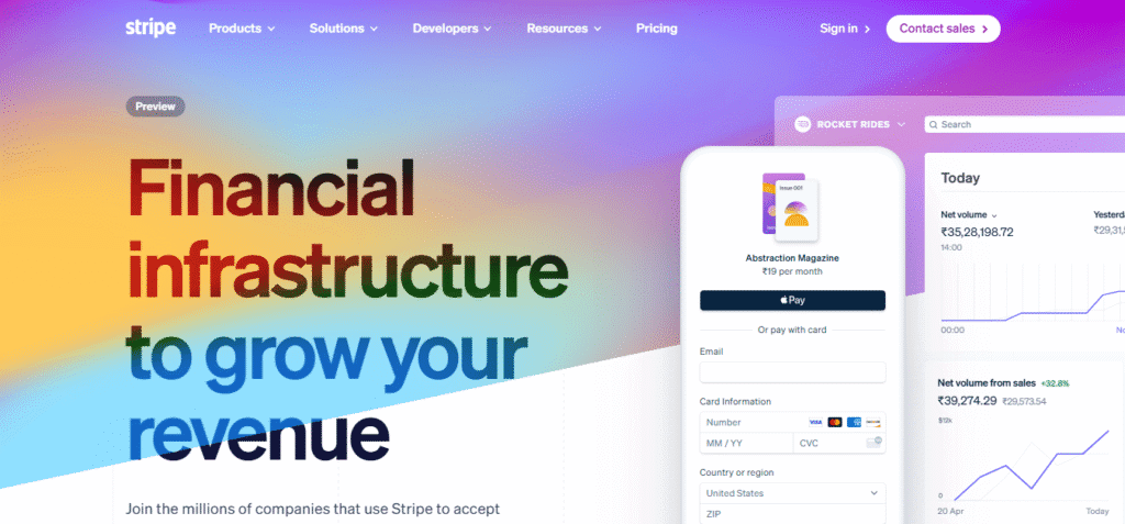
- Website: stripe.com
- Description: This global fintech brand embraces a blue and white palette with soft gradients, subtle animations, and generous use of whitespace. It communicates clarity and trust while offering a tech-forward vibe.
4. Valeria Monis
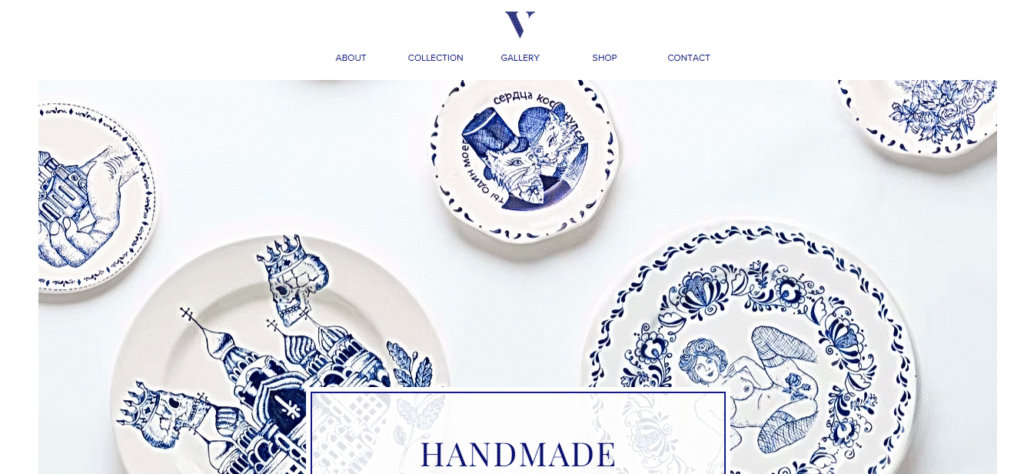
- Website: valeriamonis.com
- Description: Minimalistic and professional, this portfolio features dark navy blue elements on a white canvas. It uses hover animations and bold typography to highlight individual projects elegantly.
5. Ahrefs

- Website: ahrefs.com
- Description: This SEO software site relies on a bright blue navigation and accent elements contrasted with white backgrounds and graphics. It reflects the brand’s data-driven approach in a sleek, approachable way.
6. Xero

- Website: xero.com
- Description: Xero blends video content with clean blue overlays and white text to give a high-end, modern feel. Its vibrant tones add energy to an otherwise minimalist layout, ideal for engaging professional users.
7. Fresh Prints
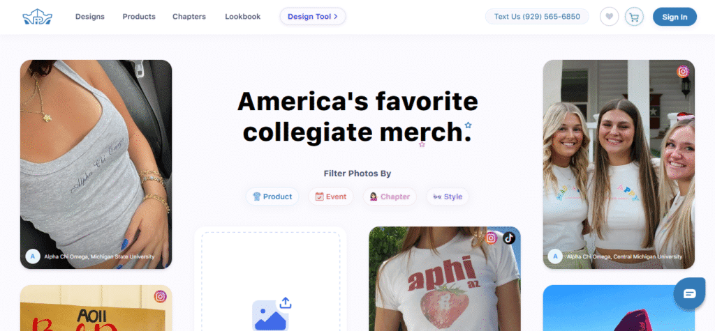
- Website: freshprints.com
- Description: This playful site uses light blue hues on a crisp white background to create a friendly, youthful look. The color pairing supports the brand’s energetic and creative identity, with subtle interactivity throughout.
8. Active Collab
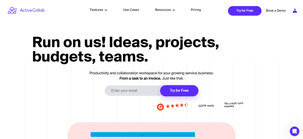
- Website: activecollab.com
- Description: A soft blue and white scheme supports the site’s focus on productivity and teamwork. Large headings, plenty of spacing, and elegant icons create a calm and motivational browsing experience.
9. Turbulent

- Website: turbulent.ca
- Description: This tech-focused website uses deep blues with white overlays and modern visuals. The combination gives off a sleek, high-performance vibe, appropriate for an innovation-driven brand.
10. Drone by harness

- Website: drone.io
- Description: The site embraces a bright white layout, with sharp blue used for buttons, headers, and data visuals. This minimalist approach reinforces the product’s streamlined and efficient software capabilities.
11. Azure Group
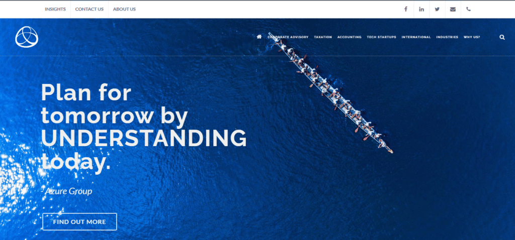
- Website: azuregroup.com.au
- Description: A gradient of blues is used thoughtfully across this site’s sections, enhanced by white text and backgrounds. This mix communicates financial credibility and innovation in a clean, easy-to-navigate format.
12. Box Clever

- Website: boxclever.ca
- Description: This creative agency uses white and blue as a canvas, with blocks of green and white across imagery and icons. The clean lines and contrasting elements make the portfolio visually compelling and organized.
13. My SMS
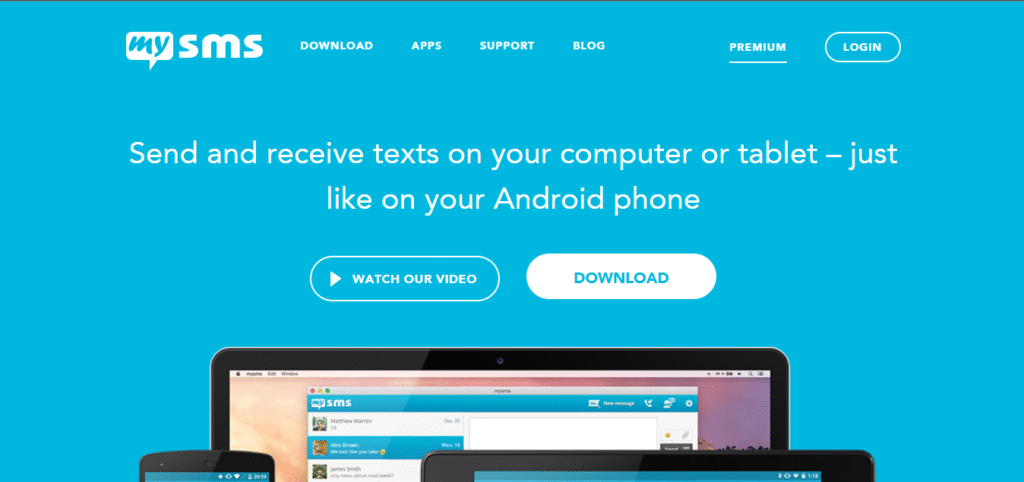
- Website: mysms.com
- Description: Light blue overlays and white backgrounds give this communication platform a user-friendly, calming aesthetic. It’s a great example of how color can enhance UX clarity without sacrificing brand personality.
Why Blue and White Work So Well in Web Design
- Trust & Simplicity: Blue naturally builds trust, while white supports clarity and focus.
- Versatility: The combo suits industries from SaaS and finance to health, wellness, and design.
- Accessibility: Blue contrasts well with white, making text and CTA elements easy to read.
- Modern Feel: Together, they give off a polished, professional aesthetic that feels current.
Tips for Using Blue and White Website Designs
- Choose a Dominant Blue Shade: Stick with one primary blue tone, navy for professionalism, sky blue for friendliness, and let it define your brand mood. Use white strategically for contrast and breathing room.
- Use Gradients & Subtle Animation: Enhance depth with smooth blue-to-white gradients or minimal animations like hover effects and microinteractions to keep users engaged without overwhelming the design.
- Maximize Whitespace for Clarity: Whitespace isn’t empty, it’s powerful. It improves readability, focuses attention on CTAs, and gives your design a clean, elegant feel.
- Ensure Strong Contrast & Accessibility: Test your text, buttons, and icons for visibility across all screen sizes. Blue and white must maintain legibility for users with visual impairments or on low-brightness devices.
Blue and white website not right for your organization?
Check out one of these:
Conclusion
These 13 examples show that blue and white website designs doesn’t have to be boring, it can be expressive, elegant, or playful, depending on the brand’s voice. Whether you’re designing a portfolio, e-commerce store, or corporate site, this timeless palette helps communicate trust, innovation, and clarity. Let these sites inspire your next design move and turn simplicity into sophistication. So, grab your design tools and start experimenting with blue and white!


