A great website can help people understand and support important causes—like protecting nature, fighting climate change, or living more sustainably. In this blog, we look at 16 of the best sustainability websites from around the world. These websites belong to environmental groups, green businesses, and eco-friendly projects.
We share what we like about each site’s design—like how easy it is to use, how it looks, and how clearly it explains its message. We also suggest small improvements to make the websites even better.
If you’re planning to build a green website or want inspiration for your own project, these examples will help you get started!
1. European Environment Agency (EEA)
- Website: eea.europa.eu
- What we like:
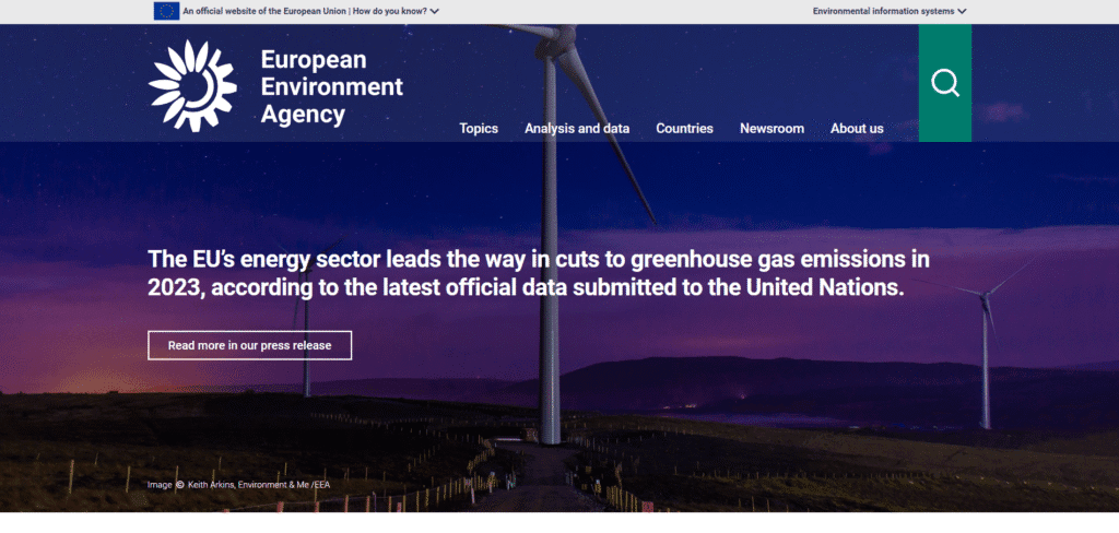
- It highlights data and facts clearly. The homepage has the agency’s mission and key reports at the top.
- The menu and icons for “What we do” help visitors find topics like climate, nature, or economy.
- Official maps and charts give the site an authoritative feel.
- What should be improved:
- There is a lot of text and data on each page, which can be hard to read quickly. It feels a bit busy.
- The look is clean but plain – adding more photos or videos could make it more engaging.
- Loading maps and data can be slow on mobile or slow connections.
2. European Commission – Environment Portal
- Website: environment.ec.europa.eu
- What we like:
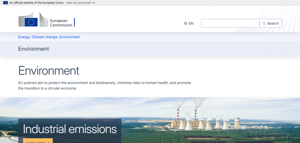
- The site uses simple icons and headings for topics (Air, Water, Plastics, etc.), so users can jump to what they care about.
- News and success stories are featured with images (for example, projects on pollution or nature). This makes it more interesting.
- It’s up-to-date and trustworthy since it’s from the European Commission.
- What should be improved:
- The homepage feels crowded with many links and images. It can be hard to find one story.
- Some pages read like press releases, with long paragraphs of text. Breaking text into smaller blocks or adding bullets would help.
- The design could be more modern – right now it uses lots of simple boxes and lists. A more visual style would draw in readers.
3. European Climate Pact
- Website: climate-pact.europa.eu
- What we like:
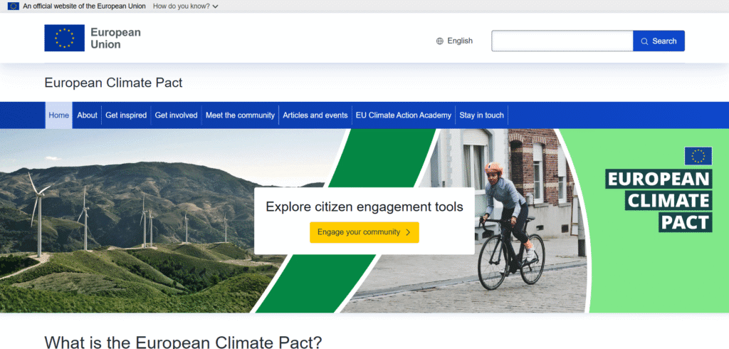
- It has a friendly, inviting look. Big call-to-action buttons (like “Engage your community”) stand out.
- The content speaks directly to citizens. It explains the Climate Pact clearly with engaging images and headings.
- Sections like “Get inspired” and “Meet the community” use photos and icons, which feel warm and accessible.
- What should be improved:
- Some pages could use more interactive features (for example, a map of community projects).
- The menu can be long, which might be confusing. A simpler menu layout could help visitors find things faster.
- On mobile, the many sections push content down – it could be streamlined for smartphone users.
4. World Wildlife Fund (WWF)
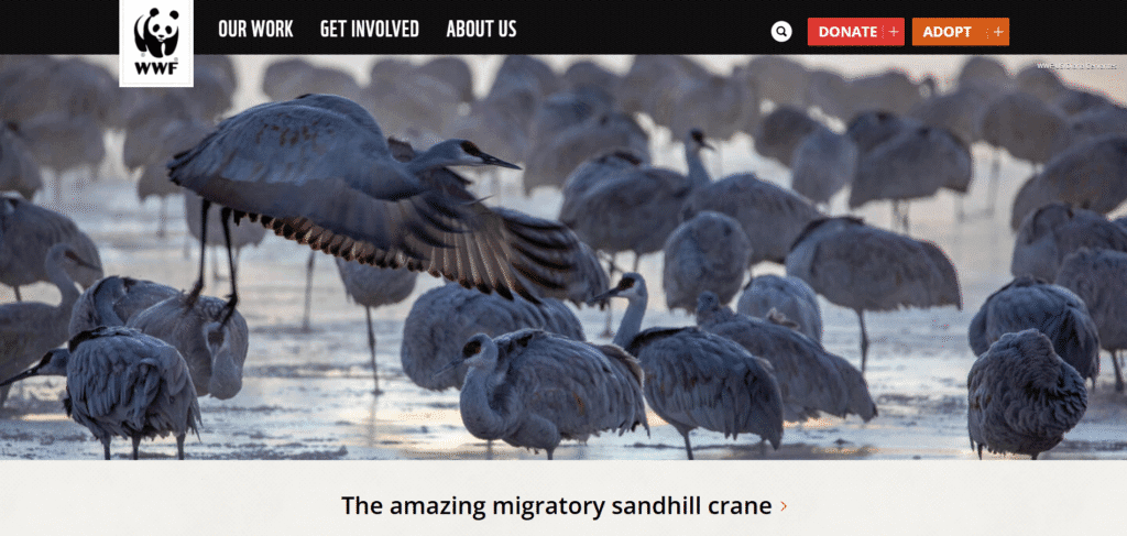
- Website: worldwildlife.org
- What we like:
- Striking wildlife photography and videos on the homepage immediately grab attention.
- Clear calls to action (“Donate”, “Adopt an Animal”) are easy to spot in the top menu.
- The content is well-organized with sections like “Conserve Nature” or stories of success, making it easy to navigate.
- What should be improved:
- The top menu has many options (donate, shop, etc.), which can feel overwhelming. Simplifying the menu could help.
- Some text can be long. Shortening paragraphs or using more white space would improve readability.
- The site can feel busy on small screens because of the content density – mobile navigation could be smoother.
5. BirdLife Europe & Central Asia
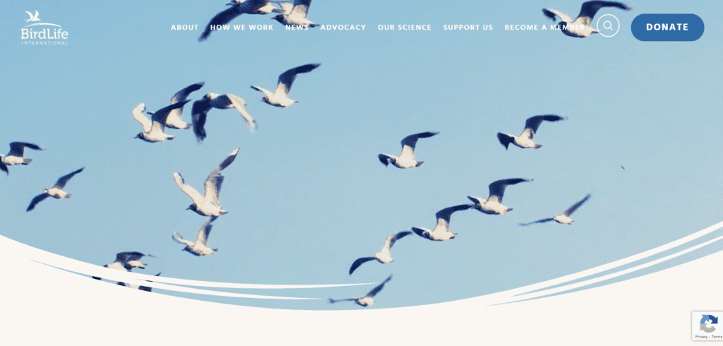
- Website: birdlife.org/europe-and-central-asia
- What we like:
- A big banner image and a simple title give a friendly introduction. The site explains BirdLife’s mission clearly right below.
- The layout is tidy. There are clear sections for “Our work”, “Our partners”, and recent news.
- Social media and language links are easy to find at the top.
- What should be improved:
- The site is mostly static text. Adding more images of birds or interactive maps could make it more engaging.
- The news section is text-heavy. Using short summaries with images could improve visual appeal.
- The “Visit English Site” banner at the top can be confusing. It might be streamlined for better user flow.
6. Friends of the Earth Europe
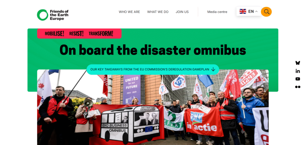
- Website: friendsoftheearth.eu
- What we like:
- Bold headings like “We campaign for justice in the EU” grab attention and explain the purpose right away.
- The bright green color and activist images match the organization’s brand well.
- The site highlights recent reports and news with large photos, which makes the content feel current.
- What should be improved:
- The layout can feel busy, with multiple boxes and images on one page. Breaking content into simpler sections would help.
- Some text (like the latest news summaries) is small. Larger fonts or bullet points would improve readability.
- On mobile, the menu and content can be confusing. A more compact mobile menu might make navigation easier.
7. Too Good To Go
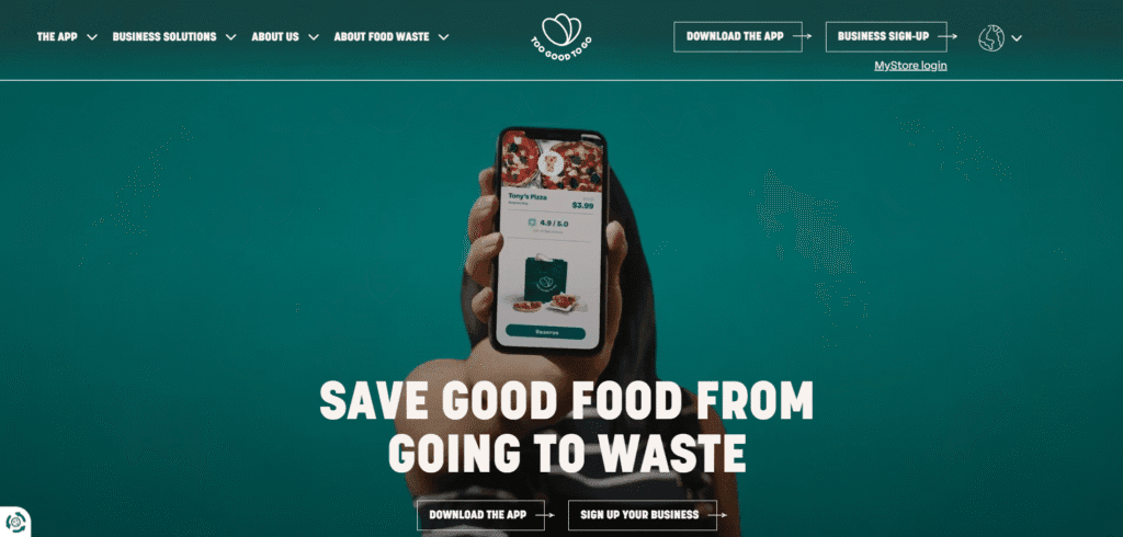
- Website: toogoodtogo.com
- What we like:
- Fun, colorful design with photos of food (pizza, cakes) makes the purpose clear: saving food from waste.
- Big buttons invite users to “Download the App” or “Sign up your business”. These calls to action are impossible to miss.
- The site explains the mission simply: “Save good food at ½ price”, with nice icons for categories (burgers, sushi, etc.).
- What should be improved:
- The navigation bar has repeated “Download the App” links, which looks like a bug. Cleaning that up would help.
- There are many calls to action on one page. It can feel overwhelming; focusing on one or two might be clearer.
- The site relies on visuals but could add more success stories or stats about waste reduction to deepen the message.
8. Climeworks
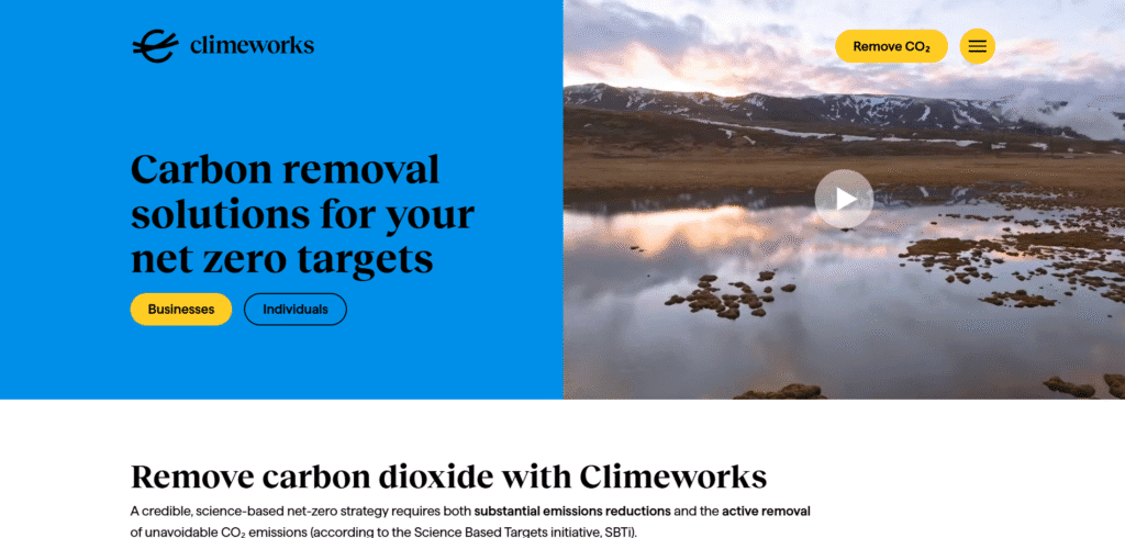
- Website: climeworks.com
- What we like:
- Sleek, modern design with a clear headline “Carbon removal solutions for your net zero targets.” It states the mission right away.
- The menu breaks content into sections for Business, Individuals, and Technology, which is logical and helpful.
- Quality photos (like machines in the field) and graphics make the site look professional.
- What should be improved:
- It feels very corporate; adding a bit more color or storytelling could make it friendlier.
- The content is text-heavy (many paragraphs). Using more bullet points or animations could break up the text.
- Some pages have many sub-pages (like detailed blog and news). Fewer, more focused highlights might help casual readers.
9. Sylvera
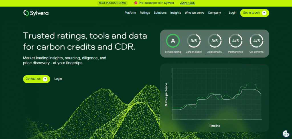
- Website: sylvera.com
- What we like:
- Clean, high-tech look with a strong headline: “Trusted ratings, tools and data for carbon credits.” It shows expertise.
- Plenty of links to resources (blog, reports, webinars) make it a rich resource for information seekers.
- The homepage has graphics and icons (not visible here) and logos of clients, adding credibility.
- What should be improved:
- The menu is very long, with many items under “Products”, “Solutions”, “Insights”. This can overwhelm first-time visitors.
- It reads like a complex dashboard. Simpler landing page with fewer choices might be easier to understand.
- Some buttons (like “Get in touch”) could be more prominent. Right now it’s easy to miss the call to action among all the links.
10. Global Forest Watch
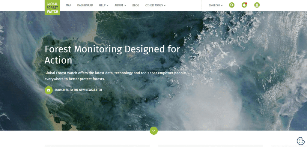
- Website: globalforestwatch.org
- What we like:
- A strong hero section (“Forest Monitoring Designed for Action”) with an inspiring satellite image grabs attention.
- The site uses clear callout blocks: “Discover data”, “Get alerts”, “Quick stats”, each with an image and link. This makes navigation visual and interactive.
- Bright green and blue colors feel natural, and the design emphasizes data in a friendly way.
- What should be improved:
- It can be confusing which part to click first – maybe a short intro explaining the blocks would help.
- The homepage is long, so some users might not scroll all the way down. A sticky menu or “back to top” button could help.
- The site relies on complex data tools. Adding a few short stories or examples of success could help new visitors connect with the impact.
11. Greenpeace
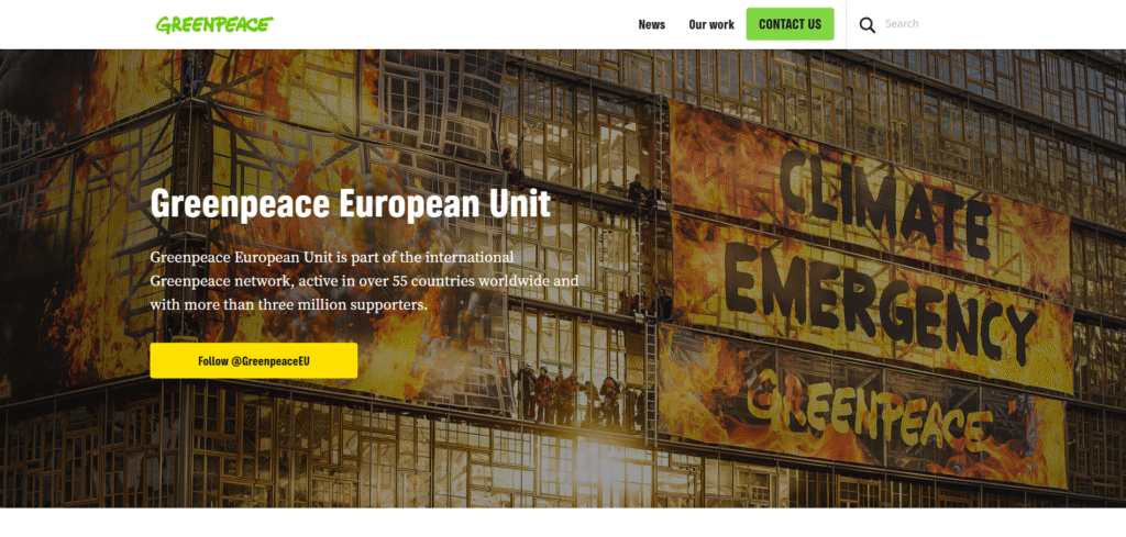
- Website: greenpeace.org
- What we like:
- Striking photography (for example, the famous “Rainbow Warrior” ship on the water) immediately shows the mission.
- Big green Donate and Sign-a-Petition buttons in the menu make it easy to support campaigns.
- Sections like “Our impact” and “Issues” use graphics and large text to highlight key projects (oceans, energy, climate, etc.).
- What should be improved:
- The menu is very large and packed with submenus. It can be hard to know where to click first. Simplifying or grouping items would help.
- Some pages scroll a lot. Shortening content or adding “back to top” links could improve navigation.
- The site could add more video or interactive features (like a climate countdown) to engage users beyond reading.
12. The Ocean Cleanup
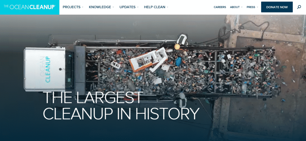
- Website: theoceancleanup.com
- What we like:
- A clear, inspiring headline: “The largest cleanup in history.” It immediately conveys purpose.
- The layout alternates images and text (“Cleaning the ocean”, “Intercepting in rivers”), which keeps the page dynamic and easy to follow.
- Calls to action (“Donate now”, “Become a Partner”) are repeated in the header and content, encouraging engagement.
- What should be improved:
- The homepage has a lot of text explaining the mission. This is important, but some users might prefer bullet points or an infographic summary.
- The menu has many items (updates, podcasts, donate, help, etc.). Grouping these or using a simpler menu bar could help first-time visitors.
- On mobile, the long page can feel lengthy. Adding a small “scroll down” animation or table of contents might keep readers engaged.
13. Patagonia

- Website: patagonia.com
- What we like:
- The brand’s site uses gorgeous photography of nature and outdoor life. This connects the products to the planet.
- Stories of campaigns (for example, fighting for Bears Ears National Monument) use full-screen images and minimal text, making them powerful.
- Earthy colors (greens, browns) and large, readable fonts give an organic, authentic feel.
- What should be improved:
- It is primarily an e-commerce site, so some advocacy content is buried. Making the environmental impact sections easier to find (like a highlighted menu link) could help.
- Some pages are very image-heavy and can take time to load on slow connections. Optimizing images would speed up the site.
- The shopping interface (product pages) could add a small note or badge highlighting “sustainable” products to reinforce the eco message.
14. Tesla
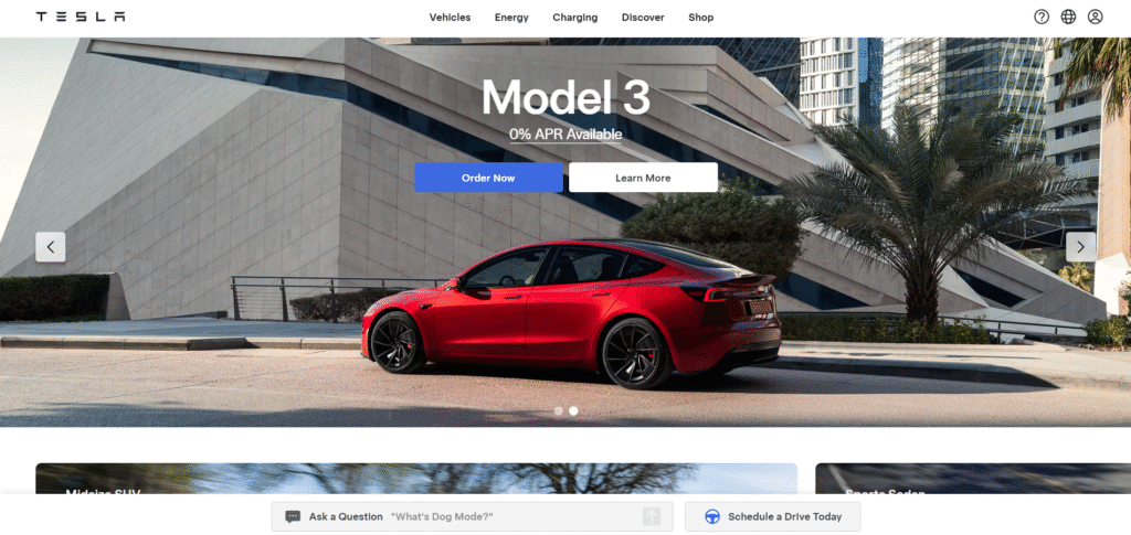
- Website: tesla.com
- What we like:
- Sleek, modern design with large photos and videos of cars and solar products. It feels high-tech and futuristic.
- Interactive features (like configuring a car model by color and wheels) make the site engaging and showcase the products well.
- Clear navigation separates vehicles, energy products, and support. Big calls to action (“Order Now”, “Test Drive”) drive user action.
- What should be improved:
- Because of all the media content, pages can be slow to load, especially on mobile. Cutting down on autoplay videos could help speed.
- Some information (like spec sheets) is hidden behind clicks or pop-ups. Making key stats visible without extra clicks would improve clarity.
- The site is very product-focused; adding a section about Tesla’s environmental impact or mission (like they do in the Impact Report) could strengthen the green message.
15. United Nations Environment Programme (UNEP)
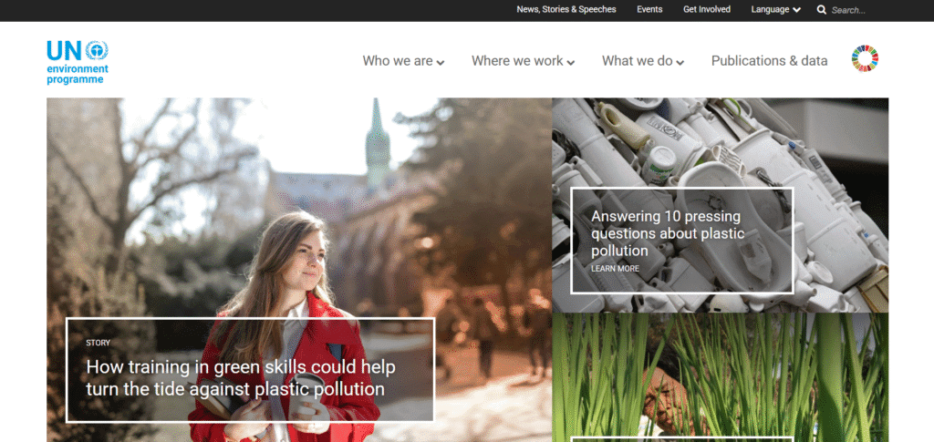
- Website: unep.org
- What we like:
- As a UN site, it has authority. The homepage features big story images and headlines about climate or pollution (for example, plastic or building emissions).
- The top menu offers multiple languages and topics (Climate, Nature, Environment). This global reach is great for international users.
- The design is clean and official, with a classic UN blue and bold headings that look trustworthy.
- What should be improved:
- The menu is huge with many sub-items. It can feel confusing; a simpler menu or dropdown could make navigation easier.
- Some pages are very text-heavy, similar to press releases. Breaking text into shorter sections and adding charts or icons would help readability.
- The site could use more visual storytelling. For example, infographics or short videos on environmental topics would engage visitors beyond reading.
16. Ecosia

- Website: ecosia.org
- What we like:
- A unique idea: Ecosia is a search engine that uses ad revenue to plant trees. The homepage proudly shows how many trees have been planted so far.
- Clean, modern design with a strong environmental message right at the top. The number counter of planted trees is engaging.
- It explains clearly how users contribute by searching, with simple language and infographics.
- What should be improved:
- The site could benefit from more case studies or success stories with images showing where trees were planted.
- The blog and project updates are a bit hidden. Featuring them more prominently on the homepage would be great.
- More interaction or animations might help first-time users explore the tree-planting impact in an exciting way.
Sustainability website not appropriate for your organization?
Check out our roundups of different aesthetics for unique website designs:
Work With Us
Are you an eco-conscious business or nonprofit? We love working on green website projects! Work With Us to bring your mission online in a fresh, inspiring way. Whether you need a new site or a redesign, we can help make it look great, tell your story clearly, and run efficiently (even on solar power!). Let’s team up to create an engaging sustainable website design that reflects your commitment to a sustainable future. Contact our web design team today and let’s build something green together!


