In today’s digital world, a Nonprofit website is more than just an online presence, it’s a vital tool for storytelling, donor engagement, and community building. The best non-profit websites blend accessibility, compelling visuals, and intuitive navigation to drive action and build trust. Whether you’re launching a new initiative or refreshing your organization’s digital presence, these website examples showcase how thoughtful design can make a real difference in achieving your mission.
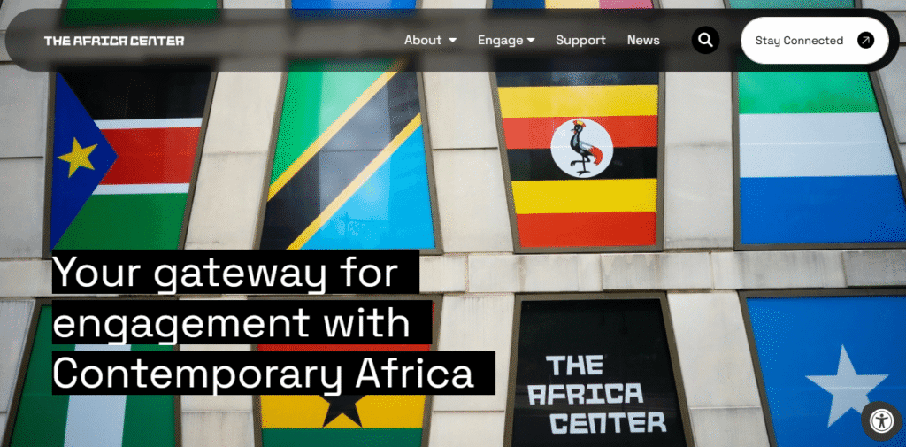
1. The Africa Center
- Website: theafricacenter.org
- Location: New York, NY, USA
- What We Like: Features an immersive video background, modern layout, and interactive elements. The design draws users in and encourages action with clear CTAs like “Donate” and “Join Us.”
- What Could Be Improved: Some sections could use more concise text, and additional language options would broaden accessibility.
2. Mercy-USA
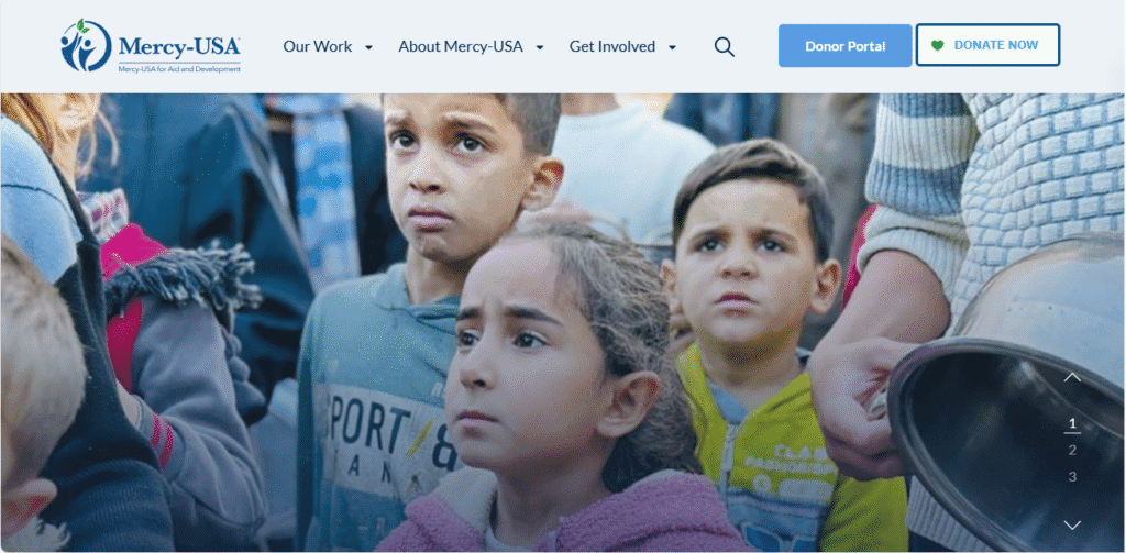
- Website: mercyusa.org
- Location: Plymouth, Michigan, USA
- What We Like: Clean, intuitive design with impactful imagery and a streamlined donation process. Visual storytelling and clear calls to action encourage support and showcase humanitarian work.
- What Could Be Improved: Adding more real-time updates and interactive impact metrics would further engage donors.
3. Global Health Innovations
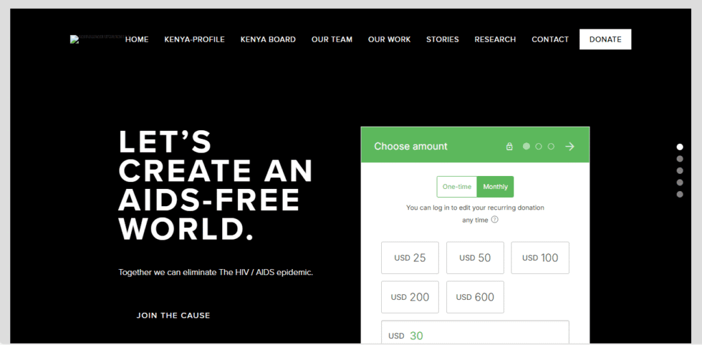
- Website: globalhealthinnovations.org
- Location: Dallas, Texas, USA
- What We Like: Unique framed layout with vertical slider navigation. Donation options are easily accessible above the fold, making it convenient for supporters to give.
- What Could Be Improved: Some navigation elements could be simplified, and more visuals could highlight fieldwork and impact.
4. Broad Foundation
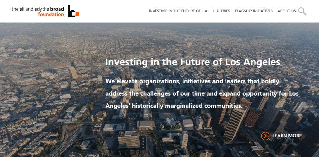
- Website: broadfoundation.org
- Location: Los Angeles, California, USA
- What We Like: Modern, clean design with a video background, sticky header, and an attractive masonry layout for presenting missions and stories.
- What Could Be Improved: The site could benefit from more interactive data visualizations and a clearer donation flow.
5. Girls Who Code
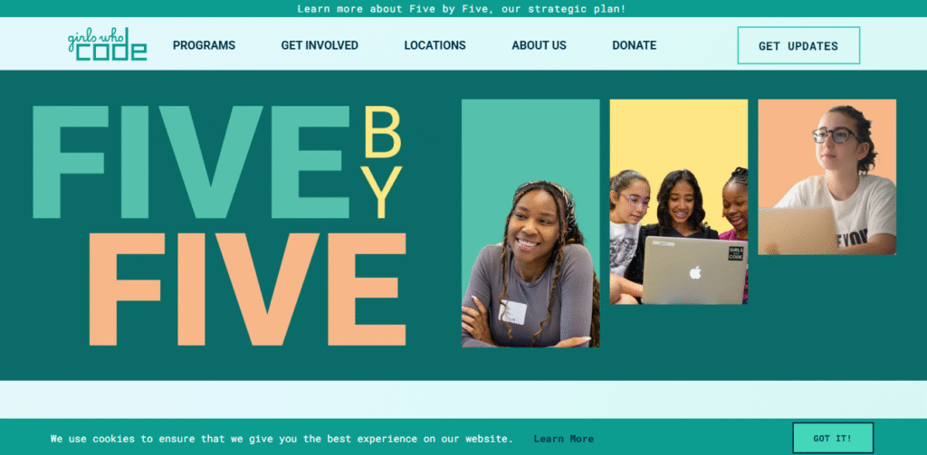
- Website: girlswhocode.com
- Location: New York, NY, USA
- What We Like: Bold colors, inspiring mission statement front and center, and a dedicated donation page with FAQs. The site is vibrant and highly engaging for its audience.
- What Could Be Improved: More multilingual resources and regional program highlights would expand reach.
6. California Wellness Foundation
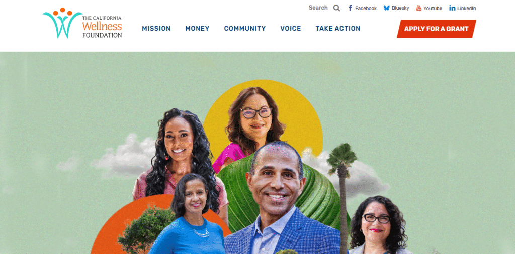
- Website: calwellness.org
- Location: Los Angeles, California, USA
- What We Like: Highly accessible design with strong branding, clear mission statement, and people-first visuals that build emotional connection.
- What Could Be Improved: A more prominent donation button and streamlined grant application process would improve usability.
7. David Suzuki Foundation
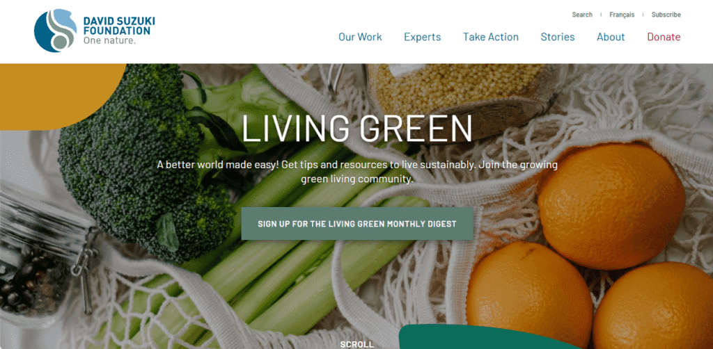
- Website: davidsuzuki.org
- Location: Vancouver, Canada
- What We Like: Accessible, action-oriented design with clear user journeys and multiple ways to give. The site is clean, modern, and easy to navigate.
- What Could Be Improved: More interactive educational tools and real-time environmental impact data would further engage advocates.
8. Covenant House
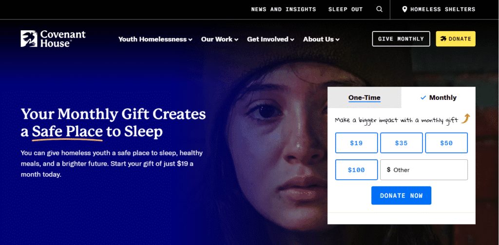
- Website: covenanthouse.org
- Location: New York, NY, USA
- What We Like: Award-winning design with multiple ways to get involved, strong storytelling, and a “Meet Our Kids” page for personal impact stories.
- What Could Be Improved: Some content could be condensed for easier navigation, and more regional program pages would help localize support.
9. Memphis Zoo
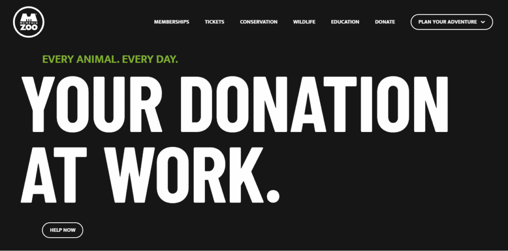
- Website: memphiszoo.org
- Location: Memphis, Tennessee, USA
- What We Like: Interactive features like live animal cams, detailed donation options, and high-quality visuals make this site engaging and fun.
- What Could Be Improved: Improved mobile optimization and more educational resources would enhance the user experience.
10. Malala Fund
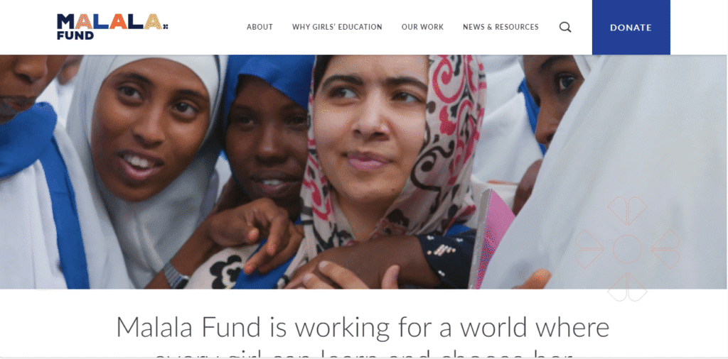
- Website: malala.org
- Location: Washington, D.C., USA
- What We Like: Eye-catching homepage video, compelling statistics, and a mix of white space with bright color pops for a sleek, modern look.
- What Could Be Improved: More localized content and language options would make the site even more inclusive.
11. Mobilize Recovery
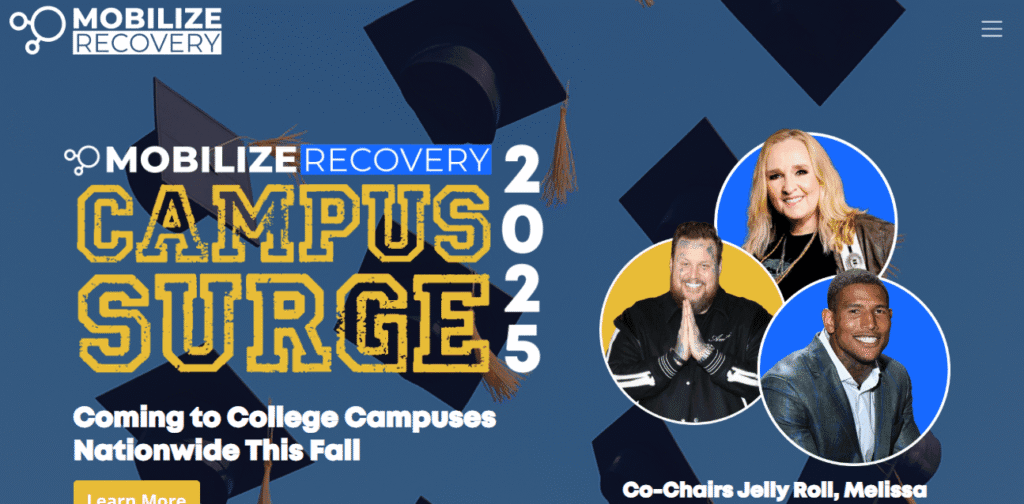
- Website: mobilizerecovery.org
- Location: USA
- What We Like: Clear navigation, sections for programs and news, and a focus on community and action. The site highlights the role of Naloxone and features strong calls to action.
- What Could Be Improved: More interactive program maps and user-generated stories would boost engagement.
12. Charity: Water
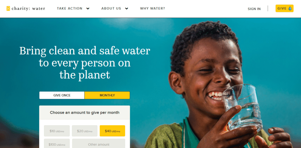
- Website: charitywater.org
- Location: New York, NY, USA
- What We Like: Beautiful photography, compelling storytelling, and a transparent donation process. The site is known for its emotional impact and clarity.
- What Could Be Improved: More real-time project updates and donor recognition features could deepen supporter involvement.
Final Thoughts
These nonprofit website design examples prove that great digital experiences can inspire action, build trust, and drive real-world impact. Each site demonstrates the importance of clear navigation, accessible design, and powerful storytelling. Whether your focus is on community, education, health, or advocacy, these examples offer valuable inspiration for creating a website that not only informs but also moves visitors to get involved and support your mission.
NonProfit website not appropriate for your business?
Check out our roundups of different aesthetics for unique website designs:
- Security Website Examples
- Natural Resources Website Examples
- Sustainability Website Examples
- Agriculture and Agritech Website Examples
Work With Us
Ready to elevate your nonprofit’s digital presence? Our team specializes in crafting visually compelling, user-friendly websites that drive donations and amplify your cause. Let’s work together to create a site that inspires action and builds lasting relationships, contact us today to get started!


