In today’s fast-paced digital world, a strong and engaging website is more than just a nice-to-have for any media company; it’s absolutely essential. It serves as the main hub for connecting with audiences, sharing compelling stories, and clearly showing what a brand stands for. A well-designed online presence helps a company stay competitive and relevant in the long run, as people will simply move on if a website is difficult to use or doesn’t look good.
To help you get inspired, this report explores some of the biggest and most influential media companies from around the globe. We have carefully looked at what makes their websites stand out, focusing on their design, how they present content, and the overall experience they offer to visitors. The goal is to provide practical ideas and valuable observations that can guide your own website projects, whether you’re building something new or looking to improve what you already have.
1. The Walt Disney Company

- Website: thewaltdisneycompany.com
- Location: Burbank, California, USA
- What We Like: Disney is a global leader in entertainment, well-known for its iconic characters, films, and theme parks. The company’s brand presence is truly immense, and its consumer-facing platforms, such as Disney+, are widely recognized for their engaging content.
- What Should Be Improved: During our research, the main corporate website was not consistently accessible for a detailed review. This situation highlights a crucial point: even a major global company like Disney, with vast resources and a strong digital presence through its various consumer platforms, can face challenges with basic website functionality and maintenance. While consumer-facing platforms might receive significant attention, corporate or informational sites can sometimes be overlooked, which impacts overall brand perception and the ability to share important company information. This shows that website functionality and accessibility are ongoing efforts, not just a one-time setup, even for industry giants.
2. Netflix

- Website: netflix.com
- Location: Los Gatos, California, USA
- What We Like: The Netflix streaming platform is excellent at providing personalized content suggestions, making it easy for users to discover new shows and movies they might enjoy. Their sign-up process is also very smooth, allowing users to quickly set up their viewing preferences and start watching.
- What Should Be Improved: While the streaming service is highly effective, the corporate website was not accessible for direct analysis during our review. On the main streaming platform, when a user searches for something that isn’t available, the suggestions for alternative content could be clearer about why they are being recommended. This situation reveals a potential difference in development focus: a company might invest heavily in its core product’s user experience while its corporate site might not receive the same level of attention. The point about search transparency on the streaming platform shows that even highly personalized systems can still improve their communication, helping users understand how content is presented or recommended and thereby building greater trust.
3. Warner Bros. Discovery

- Website: wbd.com
- Location: New York, New York, USA
- What We Like: The website features a clean, modern design with a dark background and bright text, which makes it very easy to read. It effectively showcases its many famous brands and the latest news using high-quality images and videos, providing a visually appealing and dynamic experience. For large media conglomerates with many sub-brands, a corporate website that clearly displays its diverse portfolio through strong visual branding and intuitive navigation is essential. This approach helps users understand the company’s vast reach and connect with its various properties.
- What Should Be Improved: The “Work With Us” section is well-designed, but it could become even more engaging by adding videos or personal stories from employees. This would truly show what it’s like to work there and create a more human connection for potential job seekers. This is a common best practice to make career pages more appealing and align with a human tone.
4. Comcast

- Website: corporate.comcast.com
- Location: Philadelphia, Pennsylvania, USA
- What We Like: This website is notably transparent about privacy, allowing users to easily control their cookie settings and understand how their data is used. It features a prominent “Cookie Preferences” section that provides granular control over data collection, which is a strong step towards building user trust in an era of increasing data privacy concerns. The site also uses appealing visuals that blend entertainment and technology, effectively showcasing their diverse services.
- What Should Be Improved: While the site contains a lot of information, it could make it easier for users to jump directly to specific services or content from the main page. Currently, users often need to click “Learn More” multiple times to access detailed information. Streamlining these navigation paths could enhance the user journey.
5. Sony Group Corporation

- Website: sony.com
- Location: Tokyo, Japan
- What We Like: Sony’s website has a very clean and modern appearance, featuring large, eye-catching images and videos for new products and company news. It is also very user-friendly for a global audience, offering important accessibility options like high contrast and multiple language selections. For global conglomerates like Sony, which operate across many countries and industries (electronics, entertainment, gaming), inclusive design is very important. Offering these accessibility features and language options shows a commitment to serving a diverse international user base.
- What Should Be Improved: There is a vast amount of information on the site, which can sometimes make it challenging to find specific details quickly. Adding a “quick links” or “most popular topics” section could help users navigate faster without feeling overwhelmed by the content.
6. BBC

- Website: bbc.com
- Location: London, England
- What We Like: The BBC website is outstanding for news, featuring a clear layout and intuitive navigation. It seamlessly integrates articles, videos, and audio, making it a rich and comprehensive source of information. The site also includes good accessibility features, demonstrating a commitment to broad public access. As a public service broadcaster, the BBC’s website serves as a model for effectively managing and presenting a huge volume of diverse content while prioritizing usability for a wide audience.
- What Should Be Improved: Sometimes the homepage can appear a bit crowded due to the sheer volume of news stories. Adding more visual space or a clearer way to highlight the very top stories could make it easier for readers to quickly digest the most important information. This is a common challenge for news sites: balancing the need to present a lot of information quickly with maintaining visual clarity.
7. The New York Times Company
- Website: nytimes.com
- Location: New York, New York, USA
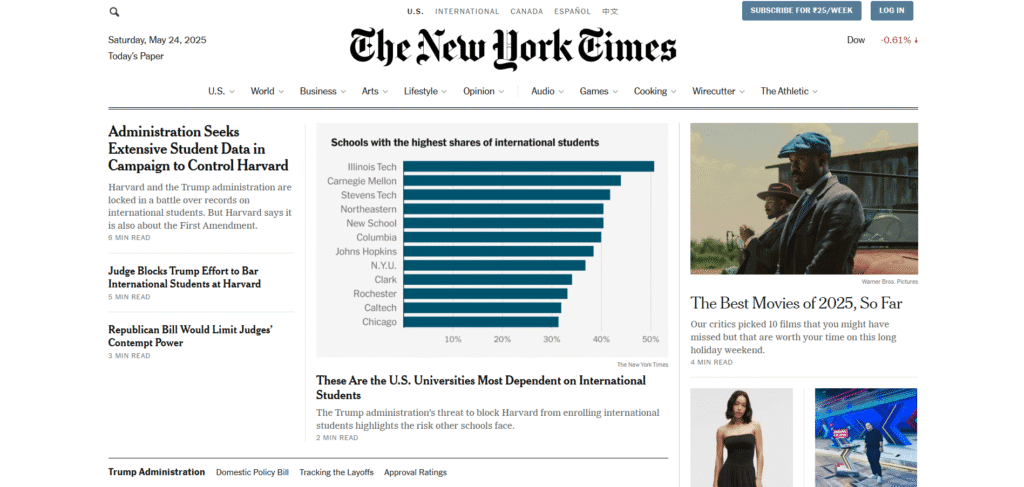
- What We Like: The New York Times website provides a formal, clean, and professional reading experience, much like its printed newspaper. It has a clear structure and a flexible layout that adapts well to various content needs. The site uses strong visual contrast for text and excels at displaying data in an understandable way. This shows how traditional news organizations can successfully translate their established brand and journalistic integrity into a digital format.
- What Should Be Improved: The corporate website was not consistently accessible during our research. This technical oversight is significant for a company of its stature. Additionally, while the content is excellent, the site could explore new ways to engage younger audiences, perhaps through more interactive or social-media-friendly content formats, as data suggests a struggle to reach this demographic. This highlights the ongoing challenge for traditional media to adapt to new audience behaviors.
8. Thomson Reuters

- Website: thomsonreuters.com
- Location: New York, New York, USA
- What We Like: This website is incredibly well-organized, making it easy for users to find specific information on complex topics such as legal or tax services. It also features excellent accessibility options and clearly highlights its main products and latest industry insights. For B2B-focused media and information companies like Thomson Reuters, clear information architecture and product-centric content presentation are vital, directly impacting client engagement.
- What Should Be Improved: To further build trust and demonstrate value, the site could include more real-world examples or direct testimonials from clients on the homepage. This would show how their services concretely help businesses succeed. Adding client stories is a common strategy to build social proof in professional services.
9. Bertelsmann SE & Co. KGaA
- Website: bertelsmann.com
- Location: Gütersloh, Germany
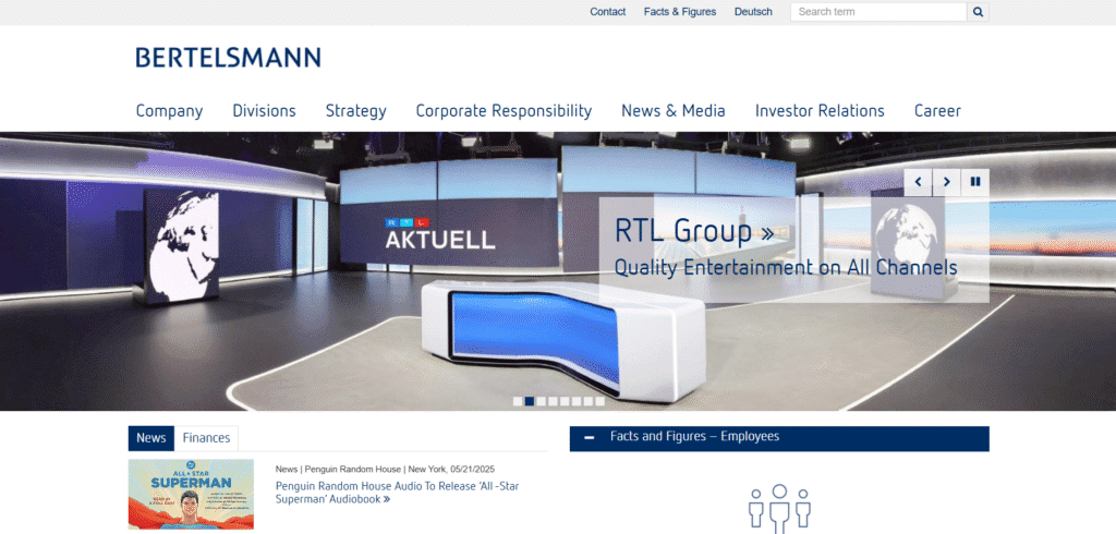
- What We Like: The website features a clean layout that clearly displays its different business areas with strong visuals for each division. It also presents news and financial updates in easy-to-read sections and effectively highlights its cultural projects, showing the company’s broader contributions beyond just business. For diversified media conglomerates like Bertelsmann, the corporate website acts as a central hub to communicate the breadth of their operations, from publishing to broadcasting.
- What Should Be Improved: While visually appealing, some parts of the website could benefit from more interactive elements, such as videos or dynamic charts. This would make the content even more engaging and less static, especially for presenting complex information.
10. News Corp

- Website: newscorp.com
- Location: New York, New York, USA
- What We Like: The website excels at showcasing its many famous brands with clickable logos, providing a clear visual representation of its wide reach across various media sectors. Its navigation is also very well-structured, with detailed menus for corporate information, making it easy for investors and stakeholders to find what they need. For a holding company like News Corp, whose primary function is to manage a portfolio of diverse media brands, the corporate website acts as a crucial central directory.
- What Should Be Improved: The homepage could be more dynamic by featuring highlights or top stories directly from their various media outlets, rather than primarily listing press releases and brand logos. This would offer a more engaging experience for a broader audience beyond just corporate inquiries, potentially cross-promoting content from its individual media properties.
11. Al Jazeera Media Network
- Website: aljazeera.com
- Location: Doha, Qatar
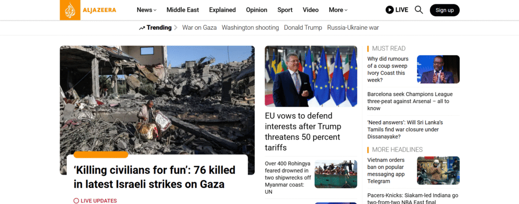
- What We Like: This website is excellent for breaking news and live updates, with clear timestamps that give users a sense of immediacy. It organizes news very effectively by region and topic, and makes strong use of videos and images to support its reporting. As a global news network, Al Jazeera’s website demonstrates the critical importance of real-time information delivery and clear content organization for a worldwide audience.
- What Should Be Improved: While packed with information, the design could be made a bit cleaner to reduce visual clutter, especially on busy news days. This would improve overall readability and prevent user fatigue when consuming large amounts of news.
12. Amazon Prime Video
- Website: primevideo.com
- Location: Washington, USA
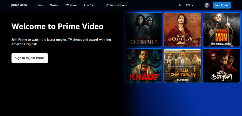
- What We Like: It offers one of the largest on-demand content catalogs, providing ample choice for viewers. A unique feature that allows users to access IMDb information about actors, music, and trivia related to the scene they are watching. Users can download content to watch offline, which is great for travel.
- What Should Be Improved: Compared to some competitors, the interface can sometimes feel cluttered, mixing included content with content that requires additional purchase or rental, which can be confusing for users. Despite the large library, finding new, relevant content within the included subscription can sometimes be challenging due to the sheer volume and varied availability (included vs. paid).
13. Spotify

- Website: spotify.com
- Location: New York, New York, USA and Luxembourg
- What We Like: The corporate and investor relations sections of Spotify’s website clearly explain their mission and their huge impact on audio streaming. They effectively showcase their wide range of content, including music, podcasts, and audiobooks. They also highlight their continuous focus on new ideas and innovation for both users and content creators. This illustrates how digital-first media companies often have distinct web properties for different audiences.
- What Should Be Improved: The main spotify.com website, which is the consumer-facing platform, was noted as inaccessible for detailed analysis during our research. It is important for all parts of a company’s web presence to be consistently accessible and functional. This situation emphasizes the need for continuous monitoring and maintenance across all digital assets to ensure a consistent and positive brand experience, even for highly innovative tech companies.
14. Axel Springer SE
- Website: axelspringer.com
- Location: Berlin, Germany
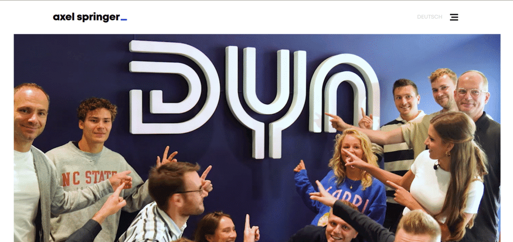
- What we like: Axel Springer is a major European digital publishing house known for its strong focus on digital transformation and its diverse portfolio of news media (like Bild and Die Welt), classifieds, and marketing services. Their corporate website is clear, professional, and highlights their digital-first strategy and journalistic values. They actively invest in technology and data to shape the future of media.
- What should be improved: While the corporate site is strong, the user experience across their vast array of individual brand websites can vary. Consistency in design and navigation across all their digital properties could enhance the overall user journey.
15. Meta Platforms, Inc.

- Website: meta.com
- Location: Menlo Park, California, USA
- What we like: While primarily a social technology company, Meta is an undeniable giant in content distribution, including news and media, through its platforms like Facebook, Instagram, and Threads. Its reach is global and its platforms facilitate immense user-generated content and news sharing. The “About Meta” website clearly articulates their vision for the metaverse and their various products.
- What should be improved: The sheer volume of content and news (both legitimate and otherwise) on Meta’s platforms can be overwhelming. Improvements are consistently needed in content moderation, addressing misinformation, and providing clearer mechanisms for users to discern credible news sources from less reliable ones. The user experience can also be fragmented across their many apps.
16. Nikkei Inc.

- Website: nikkei.co
- Location: Tokyo, Japan
- What we like: Nikkei is a leading media group in Japan, renowned for its financial news and economic reporting, notably with The Nikkei newspaper. Their English corporate site is clean and provides a good overview of their various media properties, including print, digital, broadcasting, and data services. They are a crucial source of business information for Asia and beyond.
- What should be improved: For non-Japanese speakers, access to the full breadth and depth of Nikkei’s content can be limited outside of Nikkei Asia. While Nikkei Asia is excellent, more widespread English-language integration or translation across their broader digital offerings would be beneficial for a global audience. The design, while functional, could also be modernized slightly to align with current global digital media trends.
17. The Guardian
- Website: theguardian.com
- Location: London, UK
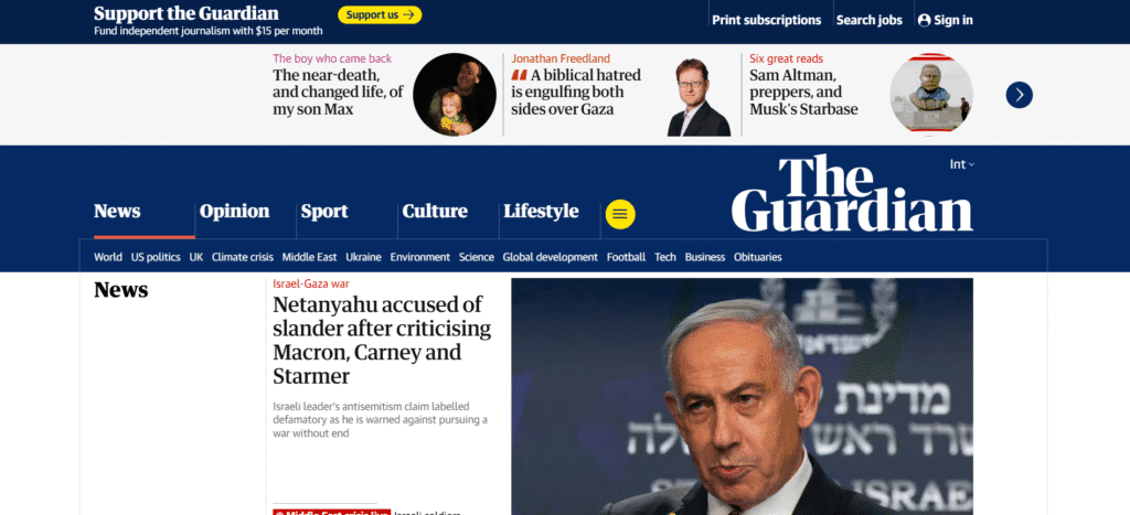
- What we like: The Guardian is a globally respected news organization known for its independent journalism and strong digital presence. Their website is a masterclass in news presentation: clean, highly readable, and well-organized with excellent use of typography and whitespace. It prioritizes content, offers a seamless reading experience across devices, and effectively integrates multimedia. Their clear “Support the Guardian” call to action is also very transparent.
- What should be improved: While mostly excellent, the sheer volume of content can sometimes make deeper navigation a bit challenging for new users trying to find specific niche topics. Like many news sites, the balance between subscription prompts and free access can sometimes interrupt the flow, though they manage it better than most.
18. Grupo Globo

- Website: grupoglobo.globo.com
- Location: Rio de Janeiro, Brazil
- What we like: Grupo Globo is the largest media conglomerate in Latin America, with extensive operations in television, radio, publishing, and digital media. Their corporate website is well-designed with a clear, modern aesthetic that reflects their status as a major player. It effectively showcases their diverse business areas and commitment to innovation and sustainability. The use of strong visuals and an easy-to-navigate structure makes it accessible.
- What should be improved: While the English version is good, sometimes the depth of information available in Portuguese is not fully mirrored, which could be expanded for international investors or partners. More case studies or detailed project showcases for their digital innovations could further highlight their leadership.
19. Paramount Global
- Website: paramount.com
- Location: New York, USA
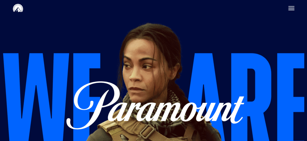
- What we like: The website effectively uses the iconic Paramount mountain logo and a clean, modern design with a vibrant blue and white color palette, which gives it a fresh yet classic feel. It clearly highlights its vast portfolio of studios, networks, and streaming services, emphasizing the compelling content they produce.
- What should be improved: For a company with such a diverse range of brands and content, the overall navigation could be more intuitive to help users quickly find specific information about individual properties or detailed content offerings.
20. NBC Universal

- Website: nbcuniversal.com
- Location: New York, USA
- What we like: TNBCUniversal’s corporate website is well-structured, offering a clear overview of its vast media and entertainment empire, from television networks and film studios to theme parks. It effectively uses visuals and a clean layout to present its diverse portfolio of brands.
- What should be improved: While the site provides a good overview, the sheer number of brands and business segments can make it challenging to dive deeply into specific areas without clicking through multiple layers.
Media company website not appropriate for your company?
Check out our roundups of different aesthetics for unique website designs:
Work With Us: Let’s Build Your Next Great Media Company Website
Feeling inspired by these amazing media company website examples? We certainly hope so!
Creating a powerful online presence is absolutely key for any media company today. It’s not just about looking good; it’s about connecting deeply with your audience, effectively sharing your unique story, and growing your brand in the dynamic digital world. A well-crafted website can transform how people interact with your content and perceive your brand.
If you’re thinking about building a new website or making your current one even better, our team is here to help. We understand what truly makes a media website shine, from outstanding design and intuitive navigation to a smooth and engaging user experience. We can help you apply the lessons learned from these top examples to your own digital strategy.


