Venture Capital Website Design: 14 of the Best VC Websites

These are 14 venture capital websites, from Sequoia, a16z and Founders Fund to smaller firms such as Space Cadet Ventures and The Artemis Fund, with what each does well and what could be better.
A VC site has two readers who want different things. Founders are deciding whether to pitch you and whether you will be good to work with, so they look for your thesis, stage, cheque size and the companies you already back. Limited partners and co-investors are judging the team and the record. It is also often the first thing a founder checks after an introduction, so the firm’s point of view has to be clear in seconds. The checklist after the examples covers what that takes.
1. Sequoia Capital - Iconic Venture Firm

- Website: sequoiacap.com
- Location: Menlo Park, California, USA
- What we like: Sequoia’s website features punchy headlines and an animated “marker pen” effect that creates bold statements. The use of colorful tiles and animated gifs adds a dynamic and engaging touch, making the site visually appealing and memorable.
- What should be improved: While the design is striking, adding more interactive elements, such as an interactive timeline of their investment history, could enhance user engagement and provide deeper insights into their legacy.
2. Andreessen Horowitz - Simple and Insightful

- Website: a16z.com
- Location: Menlo Park, California, USA
- What we like: The simplicity of a16z’s design makes it easy to digest news, podcasts, and trends. The interactive portfolio page is a highlight, allowing visitors to explore their investments effortlessly, which aligns with their reputation for thought leadership.
- What should be improved: The site could benefit from more visual appeal or dynamic content to match the innovative nature of their investments, such as more vibrant imagery or animations.
3. Atomico - Sleek and Modern

- Website: atomico.com
- Location: London, UK
- What we like: Atomico’s website boasts a sleek, modern design with large immersive imagery and high-quality typography. The clean and professional layout reflects the firm’s focus on technology and innovation, making it easy to navigate.
- What should be improved: Providing more detailed information on their investment focus areas could help visitors better understand their strategy and priorities.
4. Heartcore Capital - Playful and Creative

- Website: heartcore.com
- Location: Copenhagen, Denmark
- What we like: Heartcore’s site stands out with its playful dreamy illustrations and slightly retro font, giving it a unique personality. The animated artwork adds a creative and engaging touch that differentiates it from more traditional VC websites.
- What should be improved: The navigation could be clearer, and the content could be more structured for easier reading, especially for first-time visitors.
5. Founders Fund - Bold and Minimalistic

- Website: foundersfund.com
- Location: Los Angeles, California, USA
- What we like: Founders Fund’s minimalistic approach is bold and visually striking. The site includes branded content like podcasts and videos, which add value to visitors and showcase their thought leadership in the VC space.
- What should be improved: More transparency on their investment process or criteria could be beneficial for potential founders seeking to understand how to approach the firm.
6. Playground Global - Stunning and Interactive

- Website: playground.vc
- Location: Palo Alto, California, USA
- What we like: The stunning slideshow of portfolio companies and engaging motion graphics make Playground’s website visually appealing. The search filters are a nice touch for navigating their investments, enhancing user experience.
- What should be improved: A more comprehensive blog or resources section could provide additional value to visitors, such as insights into deep tech trends.
7. Union Square Ventures - Clear and Concise

- Website: usv.com
- Location: New York, New York, USA
- What we like: USV’s website is crystal clear with concise content structured in columns and rows. The search button makes it easy to find specific information, ensuring a seamless user experience.
- What should be improved: Adding more visual elements could help break up the text-heavy sections and make the site more engaging for a broader audience.
8. Balderton Capital - Bold and Stark

- Website: balderton.com
- Location: London, UK
- What we like: Balderton’s use of bold letters and stark colors creates a strong visual impact. The slideshow of founders aligns well with their “Our beliefs” page, reinforcing their brand message and commitment to founders.
- What should be improved: Incorporating more interactive features or tools for founders, such as a submission portal, could enhance the user experience.
9. Lightspeed Ventures - Visionary and Edgy

- Website: lsvp.com
- Location: Menlo Park, California, USA
- What we like: Lightspeed’s website is visionary with edgy animations and a grid portfolio layout. The blog, news, and newsletter sections keep visitors informed, making it a hub for industry insights.
- What should be improved: A clearer call-to-action for potential founders could encourage more engagement and streamline the investment inquiry process.
10. Industry Ventures - Animated and Elegant

- Website: industryventures.com
- Location: San Francisco, California, USA
- What we like: Industry Ventures’ website features animated explainer graphics and subtle animations that make learning about the firm a delightful experience. The elegant page-to-page transitions are smooth and professional.
- What should be improved: More detailed information on specific investment areas could help visitors understand their focus better, especially for niche sectors.
11. Space Cadet Ventures - Futuristic and Energetic

- Website: spacecadet.ventures
- Location: New York, New York, USA
- What we like: Space Cadet’s website is futuristic and energetic with bright colors and space-themed creative illustrations. The design is modern and attention-grabbing, reflecting their innovative approach.
- What should be improved: More information on the team or their investment thesis could provide better insight into the firm’s operations and values.
12. Trust Fund - Modern and Trendy

- Website: trustfund.vc
- Location: Los Angeles, California, USA
- What we like: Trust Fund’s website has a modern, trendy look with feminine touches, pastel colors, and elegant typography. It’s visually appealing and easy to navigate, appealing to a diverse audience.
- What should be improved: A more professional tone or more detailed investment criteria could be beneficial to establish credibility with potential founders.
13. PJC Ventures - Lively and Artsy

- Website: pjc.vc
- Location: Boston, Massachusetts, USA
- What we like: PJC Ventures’ website has a lively mix of profile pictures and testimonials, along with artsy illustrations that make it stand out. The design feels personal and approachable.
- What should be improved: More structured content or easier navigation could improve the user experience, especially for first-time visitors.
14. The Artemis Fund - Modern and Feminine

- Website: theartemisfund.com
- Location: Houston, Texas, USA
- What we like: The Artemis Fund’s website is modern and feminine with soft colors and elegant typography. It’s sophisticated and inviting, aligning with their mission to support female founders.
- What should be improved: More information on past investments or success stories could showcase their impact and attract more interest from founders.
Work with us
Building or rebuilding your fund’s website before the next raise?
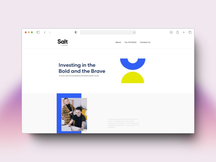
We designed and built the site for Salt Ventures, a venture capital firm in the UAE, and led with the portfolio, because in venture the companies are the argument. Send us your current site, your thesis and who the site has to convince (founders, LPs or both), and we will reply within one business day.
What a good venture capital website needs
- Thesis, stage and cheque size up front. A founder should know within one screen whether they fit.
- A portfolio that tells you something. Filterable by sector and stage, with founder names and a line on each company, not a logo wall.
- A route for pitches. A clear way to send a deck, or an honest note that the firm only takes introductions.
- Team pages that say who covers what. Each partner’s sectors and how to reach them.
- Founder voices. Quotes from portfolio founders with their names on them, and what the firm actually does after the cheque: hiring help, introductions, platform support.
- Content only if you will keep it up. Essays, a podcast or a newsletter build a reputation. An insights page last updated two years ago does the opposite.
- A separate route for LPs. Fund reporting belongs in a secure portal linked from the site, not on public pages.
Venture Capital website not appropriate for your company?
Check out our roundups of different aesthetics for unique website designs:


