In today’s digital world, a good website can make a big difference—especially for environmental and environmental technology comapnies. Whether it’s sharing important data, telling powerful stories, or helping people take action, websites are key to building a greener future.
In this blog, we’ve put together a list of 12 of the best environmental website designs. These sites come from NGOs, startups, and government bodies, and all of them are available in English. We looked at what makes each site stand out, what could be improved, and why they’re great examples of web design with a purpose.
If you’re looking for inspiration for your own environmental website, this list is a great place to start!
1. European Environment Agency (EEA)
Website: eea.europa.eu
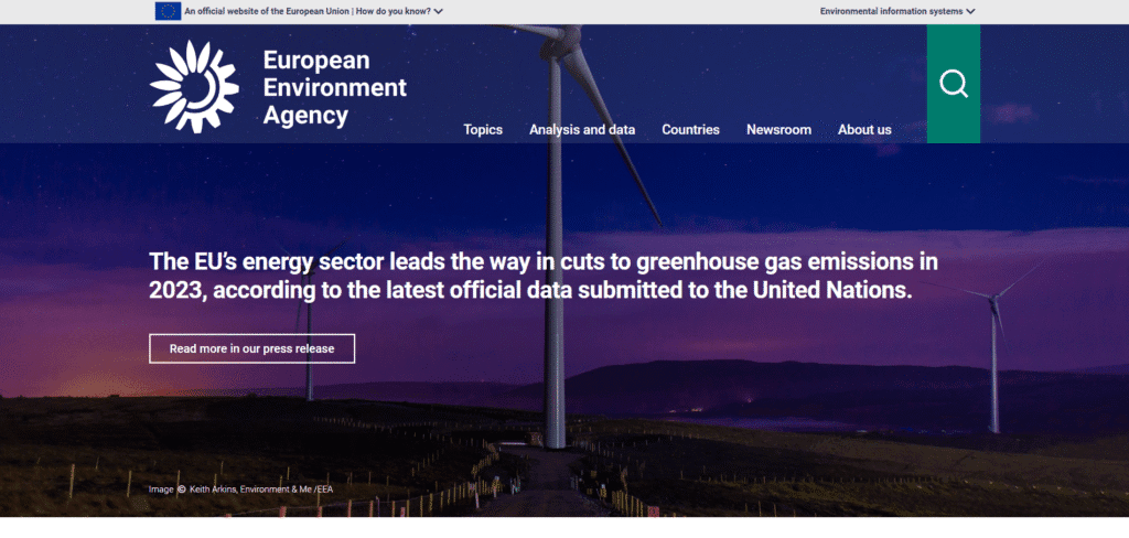
What we like: The EEA site is packed with authoritative data and news on sustainability. It clearly states its mission: “We provide the knowledge and the data needed to achieve sustainability in Europe”. The layout highlights reports and maps, and it has engaging infographics and sections on topics like climate, nature, and economy. The navigation menus help find information easily.
What should be improved: The site feels a bit dense. Some pages have lots of text and government style, which can be overwhelming. The design is clean but somewhat basic – more visual elements (pictures or charts) might make it more engaging. It can also be slow to load due to heavy data and interactive maps.
2. European Commission – Environment Portal
Website: ec.europa.eu/environment
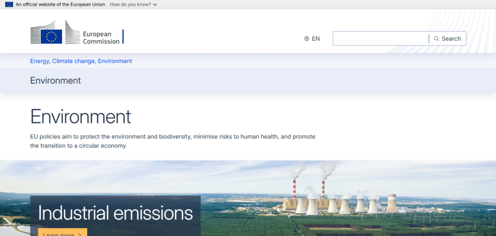
What we like: This official EU site offers up-to-date news and stories about Europe’s environment policies. It features sections on Natura 2000, pollution, and green awards. The “Success Stories” and news blog show real projects (for example, a Belgian awareness campaign) which inspires readers. It’s directly managed by the European Commission’s DG Environment, giving it credibility.
What should be improved: The homepage can feel busy with lots of links and images. Some page layouts look like press releases rather than a modern blog. The English is clear but the writing is sometimes technical. A more consistent design style and a simpler layout would help. It could also add more interactive tools or apps to engage visitors beyond text articles.
3. European Climate Pact
Website: climate-pact.europa.eu
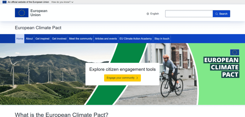
What we like: The Climate Pact is a community-driven site by the European Commission. It describes itself as “a movement of people united around a common cause” (part of the Green Deal). The homepage is lively, with color photos and clear calls to “Get involved” or “Get inspired.” It has useful guides on how citizens, cities, or groups can take climate action. The language is friendly and encouraging, making climate action feel accessible to everyone.
What should be improved: The site has many menus and sections, which can be a bit confusing. It is also translated into many languages; sometimes the English text layout shifts. Some pages are heavy with text (like EU climate documents) and could use more visuals. The site relies on user contributions, so content quality can vary.
4. World Wildlife Fund (WWF)
Website: worldwildlife.org
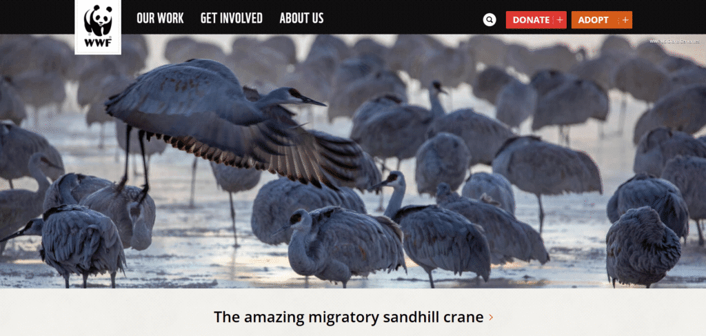
What we like: WWF’s site highlights its global mission: to sustain the natural world for people and wildlife. It has striking images of animals and nature, and clear sections about people, places, and wildlife. The navigation is logical, leading to topics like climate or forests. Calls to action (donate, adopt an animal) are visible but not too pushy. We like the mix of stories, scientific facts, and resources like the Living Planet Report.
What should be improved: The site can be a bit heavy on fundraising buttons and ads for gifts. Some content is dense, and pages sometimes require scrolling through a lot. A few areas could be more interactive (for example, maps of species or dynamic infographics). Overall it’s content-rich but occasionally feels like a long brochure.
5. Greenpeace
Website: greenpeace.org
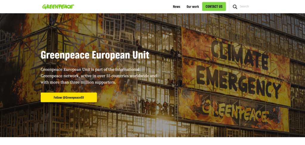
What we like: Greenpeace’s website has a strong activist tone. It clearly says “Greenpeace is a global network of independent campaigning organizations”. The design is bold, with campaign images and urgent headlines. The menus make it easy to find news stories, actions, and research. The site effectively invites visitors to get involved (“Take action” or “Donate”). It also features up-to-date campaign news and reports, making the content feel current and engaging.
What should be improved: The homepage can feel busy with slides and multiple stories. Some pages have long text with few graphics. A more modern layout or more visuals could help break up information. It also has many pop-ups asking for donations or newsletter sign-ups, which can interrupt the reading experience. Simplifying navigation and reducing clutter would improve usability.
6. BirdLife Europe & Central Asia
Website: birdlife.org/europe-and-central-asia
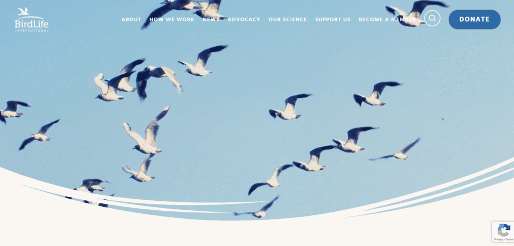
What we like: This site focuses on bird and biodiversity conservation in Europe. It states: “BirdLife Europe & Central Asia works to conserve birds and biodiversity…”. The homepage is clean, with big photos (birds and nature) and news headlines. It has sections on work, science, policy, and a news feed. The layout is simple and easy to read. Users can quickly see key reports and press releases.
What should be improved: The design is minimal, which is good for focus, but it could be more visually exciting. There are not many interactive tools or maps. Some pages feel like plain text reports. Also, the site is quite specialized (birds and habitats), which is great for its audience but may not grab general readers. It might add graphics or stories to make it more engaging for newcomers.
7. Friends of the Earth Europe
Website: friendsoftheearth.eu
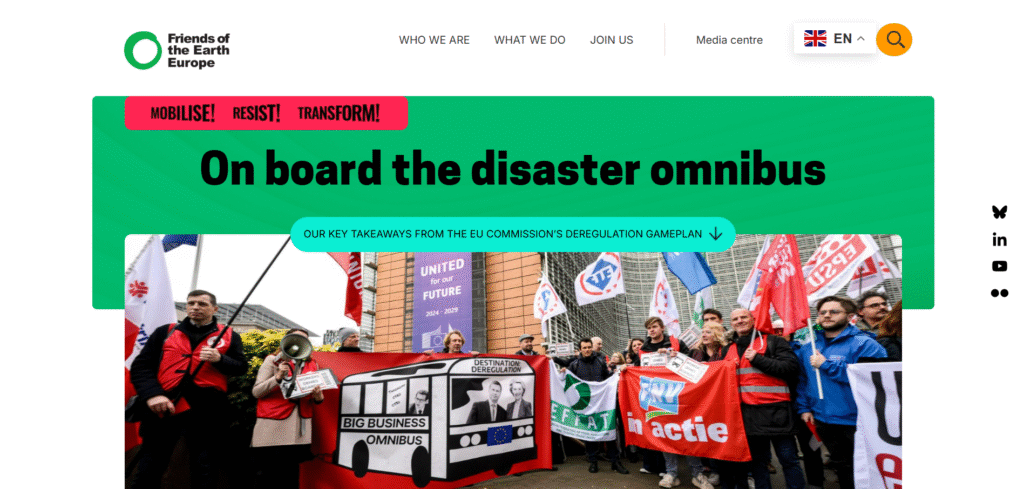
What we like: Friends of the Earth Europe is the continent’s largest grassroots environmental network. The site shows their news and campaigns clearly on the front page, with latest updates in simple tiles. The tone is direct and people-centered (with words like “mobilize, resist, transform”). It also lists groups across Europe, helping local communities connect. We like the straightforward, activist style and how it highlights current issues (like mining or democracy).
What should be improved: The homepage layout is a bit fragmented with small text and images. It might be confusing for first-time visitors. There’s little visual branding (mostly plain backgrounds and standard layouts). Some important sections (like About Us or Publications) are buried behind menus. The site could use more consistent design elements and maybe video or graphics to modernize its look.
8. Too Good To Go
Website: toogoodtogo.com
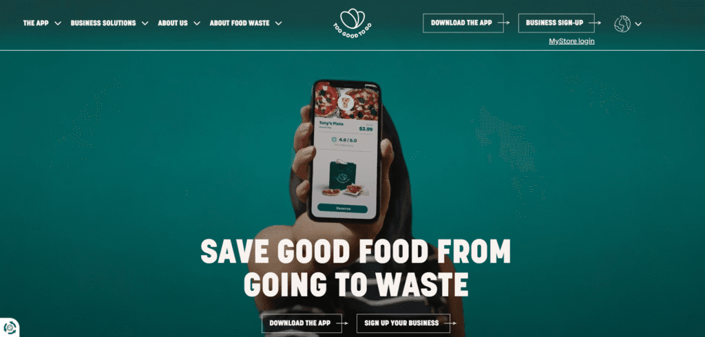
What we like: Too Good To Go is a Danish startup fighting food waste. Its site starts with a clear mission: to fight food waste and “rescue good food from going to waste”. The landing page is bright and friendly, with big images of food and apps. It explains the concept simply: buy surplus meals at low cost (food waste reduction and cheap food!). The buttons to download the app are prominent. We like the upbeat tone and how it shows many types of food you can get.
What should be improved: The homepage has many repeating sections (lots of “Download the App” prompts and food categories). This repetition makes it a bit cluttered. Non-app content (like sustainability stats or environmental impact) is harder to find. Also, some text overlaps in the HTML (as seen by the developer view), which suggests minor coding issues. A clearer hierarchy and less redundancy would make it easier to read.
9. Climeworks
Website: climeworks.com
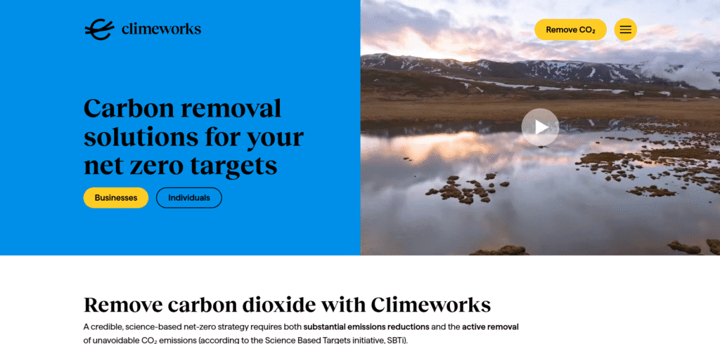
What we like: Climeworks is a Swiss startup using direct air capture to remove CO₂. The site reads like a lab breakthrough: “Cutting-edge Direct Air Capture (DAC) technology, the most reliable and durable way to remove carbon from the atmosphere”. It explains services for businesses and individuals, with clean design and clear calls to action (buy carbon removal or get in touch). The science is presented with good clarity, using bold headings and short intro text for each section.
What should be improved: The site requires JavaScript to work properly, which can be a problem for some users. The design is sleek but somewhat corporate; it might feel too technical for casual readers. There are lots of small buttons and drop-down menus, which can be overwhelming. More visuals or animations (for example, showing a DAC plant) could make it more engaging. Also, prices and impact calculators (if any) could be more obvious to encourage public interest.
10. Sylvera
Website: sylvera.com
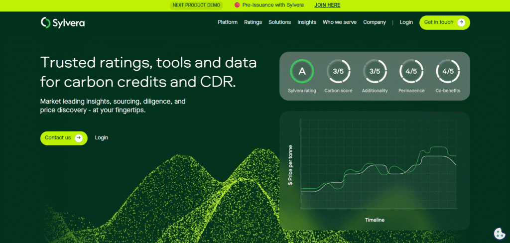
What we like: Sylvera provides ratings and data for carbon credits. Its front page boldly says: “Trusted ratings, tools and data for carbon credits and CDR”. It has a modern, techy design with lots of imagery and a dark header. Key selling points (project visibility, policy insights) are broken into bullet points and icons, making it easy to scan. The focus on “enterprise-grade” suggests professionalism and quality.
What should be improved: The site is clearly aimed at businesses, not general audiences. It has many graphics but little introduction text, so a new visitor might be confused. The homepage has many images but not much explanation of how their tool works. It also has login and contact buttons, which feel like an enterprise app. To appeal more broadly, they could add a simple explainer video or section showing use cases in plain language.
11. Global Forest Watch (GFW)
Website: globalforestwatch.org
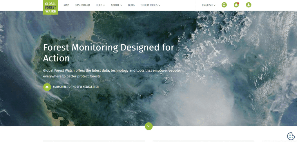
What we like: GFW offers a wealth of forest data to anyone. The site states it provides “data, technology and tools that empower people… to better protect forests”. It has clear calls to action like “Explore our data” or “View deforestation alerts”. The homepage is visual, with large banner images and sections on data sets, maps, and alerts. It’s impressive how much information is accessible (like 100+ data layers on forests). This tool-rich approach is very innovative.
What should be improved: Because it’s data-heavy, the site can be complex. Some pages have lots of technical detail that might deter casual visitors. The main navigation is more like an app menu than a blog. Also, the homepage has multiple overlapping sections (like repeated “Discover the world’s forests” panels) which might confuse readers. Simplifying the interface and adding short introductions for general users would make it more user-friendly.
12. The Ocean Cleanup
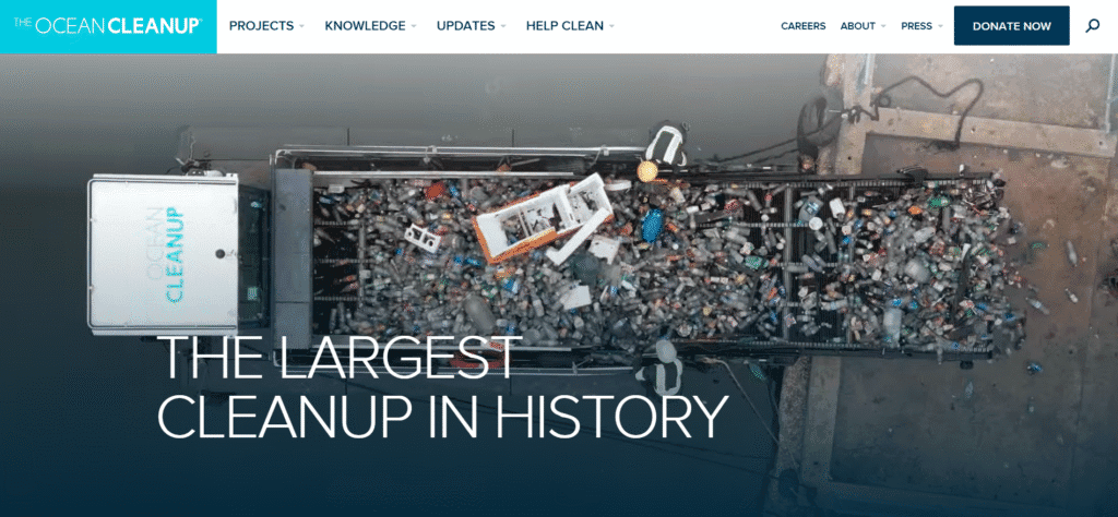
Website: theoceancleanup.com
What we like: The Ocean Cleanup is a Dutch non-profit tackling plastic in oceans. It clearly says it’s “developing and scaling technologies to rid the oceans of plastic”. The site has a very modern look with large photos and a clean menu. It has sections on projects (oceans and rivers), research, impact dashboards, and updates. We like the blog-style updates (e.g. “2024: A record-breaking year…”) that make visitors feel part of the journey. It’s also visually appealing with icons and a light color scheme.
What should be improved: The site shows a cookie consent pop-up and a newsletter signup that can interrupt the user experience. The many social links and follow buttons can be distracting. Also, the homepage has a lot of navigation links at the top, which takes up space. Some sections (like podcasts and news) are hidden behind menus. A bit more introductory text on the main page (the home banner just says “The Ocean Cleanup”) would help explain the mission immediately.
Environmental website not appropriate for your company?
Check out our roundups of different aesthetics for unique website designs:
Work With Us
Inspired by these great environmental websites? We’re here to help you build one just like them! Whether you’re a nonprofit, a government group, or a green startup, our team can create a website that looks great and works well. We know how to showcase your mission, make content easy to find, and add fun tools or visuals to engage visitors. Feel free to reach out if you need a friendly hand in designing an eco-friendly website that makes an impact!


