In the fast-paced world of Software as a Service (SaaS), your landing page is often the first interaction potential customers have with your brand. A well-designed landing page can be the difference between capturing a lead and losing a prospect. With this in mind, we’ll explore a practical framework to help you optimize your SaaS landing page, convert more visitors, and boost your bottom line.
Understanding the Importance of Landing Pages
Landing pages serve a crucial role in your overall digital marketing strategy. Unlike your homepage, which serves as a broad introduction to your brand, a landing page is designed with a single, focused goal: conversion. This could mean getting visitors to sign up for a free trial, book a demo, or download an e-book. The clarity of this goal is what makes landing pages so powerful.
- The Role of Landing Pages in Digital Strategy: Landing pages are a pivotal component of any digital marketing strategy because they allow you to direct your audience’s attention to a specific action. By minimizing distractions and focusing on a single offer, landing pages can significantly increase the chances of conversion. They are also invaluable for tracking the effectiveness of individual marketing campaigns, providing insights that can be used to refine and optimize future efforts.
- Distinguishing Features from Homepages: While homepages provide a comprehensive overview of your company, landing pages are crafted for specificity and impact. They are designed to resonate with a particular audience segment or respond to a specific marketing message. This precision allows you to craft personalized experiences that speak directly to the needs and interests of your visitors, thereby enhancing engagement and conversion rates.
- The Impact on Conversion Rates: A well-optimized landing page can dramatically increase your conversion rates. By focusing on a single, clear call-to-action (CTA), you reduce friction and make it easier for visitors to convert. This targeted approach not only boosts conversions but also improves the return on investment for your marketing efforts, as resources are directed towards the most effective strategies.
Why You Need a Dedicated Landing Page
A dedicated landing page is essential because it allows you to tailor the message, design, and call-to-action (CTA) to the specific audience you are targeting. This level of specificity increases the likelihood that visitors will take the desired action, thereby improving your conversion rates.
- Personalizing the User Experience: Dedicated landing pages offer the unique opportunity to personalize the experience for different audience segments. By using targeted messaging and visuals, you can create a more relevant and engaging experience that resonates with your visitors. Personalization also involves using dynamic content that adjusts based on user behavior or preferences, further enhancing the relevance of the page.
- Enhancing Message Consistency: Consistency in messaging is crucial for building trust and credibility with your audience. A dedicated landing page ensures that the messaging aligns with the expectations set by the ad or email that led the visitor to the page. This alignment helps reinforce the value proposition and encourages visitors to take the next step in their journey.
- Improving Campaign Tracking and Insights: With a dedicated landing page, you can effectively track the performance of individual marketing campaigns. This allows you to gather valuable data on visitor behavior, conversion rates, and other key metrics. By analyzing this data, you can gain insights into what is working and what needs improvement, enabling you to make informed decisions and optimize future campaigns.
Key Elements of an Effective SaaS Landing Page
To build an effective SaaS landing page, there are several key elements you should consider. These elements work together to create a seamless user experience that guides visitors toward conversion.
Clear and Compelling Headlines
Your headline is the first thing visitors see and should clearly communicate the benefit of your product. It needs to be both compelling and clear to capture attention immediately. Use action-oriented language and focus on the unique value proposition of your SaaS product.
- Crafting Headlines that Capture Attention: A strong headline grabs the attention of visitors within seconds. It should be concise yet powerful, highlighting the core benefit of your product. Use engaging language that speaks directly to the needs or problems of your audience, making them feel understood and eager to learn more.
- Emphasizing Unique Selling Points: Your headline should clearly convey what sets your SaaS product apart from the competition. Focus on the unique selling points that make your product the best choice for your target audience. This could be a specific feature, benefit, or solution that directly addresses a common pain point.
- Testing Variations for Optimal Impact: Experimenting with different headline variations through A/B testing can reveal which resonates most with your audience. Test different phrasing, lengths, and styles to determine what drives the highest engagement and conversions. Regularly updating your headlines based on these insights ensures they remain effective and relevant.
Engaging Visuals

Visuals play a critical role in engaging visitors. Whether it’s images, videos, or infographics, make sure they are high-quality and relevant to your product. Demonstrating how your SaaS product works through a short video or animated graphic can significantly enhance understanding and interest.
- The Power of Visual Storytelling: Visual storytelling can transform complex information into easily digestible content. Use images and videos to tell a story about your product, illustrating how it solves problems and delivers value. Visuals can evoke emotions and create a connection with your audience, making them more likely to engage with your content.
- Choosing the Right Visuals for Your Audience: Selecting visuals that resonate with your target audience is crucial. Consider the demographics, preferences, and needs of your audience when choosing images and videos. Ensure that your visuals align with your brand’s tone and message, creating a cohesive and authentic experience for visitors.
- Incorporating Interactive Elements: Interactive elements such as sliders, quizzes, or animations can enhance user engagement and provide a more dynamic experience. These elements invite visitors to interact with your content, increasing the time spent on your page and the likelihood of conversion. Ensure that interactive features are intuitive and add value to the overall user experience.
Strong Call-to-Action (CTA)
The CTA is the linchpin of your landing page. It should be prominently displayed, easy to find, and communicate exactly what you want visitors to do next. Use contrasting colors to make your CTA stand out and use direct language such as “Start Free Trial” or “Get Started Today.”
- Designing CTAs that Stand Out: A well-designed CTA button catches the eye and encourages clicks. Use contrasting colors and strategic placement to make your CTA stand out from other elements on the page. Ensure that the button is large enough to be easily clickable on both desktop and mobile devices.
- Crafting Persuasive CTA Text: The text of your CTA should be direct and action-oriented, clearly conveying the next step you want visitors to take. Use compelling language that creates a sense of urgency or excitement, motivating visitors to act immediately. Test different text variations to find what resonates best with your audience.
- Optimizing CTA Placement for Maximum Conversions: The placement of your CTA can significantly impact conversion rates. Position it prominently on the page, ideally above the fold, where it is immediately visible to visitors. Consider multiple CTAs throughout the page, particularly after key sections that reinforce your value proposition, to capture interest at different stages of the visitor journey.
Social Proof and Testimonials
Including social proof elements like testimonials, reviews, or case studies can help build trust and credibility. Showcase quotes from satisfied customers or highlight any notable companies that use your product to reassure new visitors of your product’s value.
- Building Credibility through Customer Stories: Customer stories and testimonials provide authentic insights into the benefits and impact of your product. Highlight specific results or experiences shared by customers to build credibility and trust. Consider featuring video testimonials for a more personal and relatable touch.
- Leveraging Influencer and Partner Endorsements: Endorsements from industry influencers or partners can add significant weight to your social proof. Showcase any partnerships or collaborations with well-known organizations to enhance your brand’s credibility. Highlighting these endorsements can reassure potential customers about the quality and reliability of your product.
- Displaying Metrics and Achievements: Quantifiable metrics and achievements can serve as powerful social proof. Display statistics that demonstrate the success and reach of your product, such as the number of users, customer satisfaction ratings, or industry awards. These metrics provide tangible evidence of your product’s value and effectiveness.
User-Friendly Design
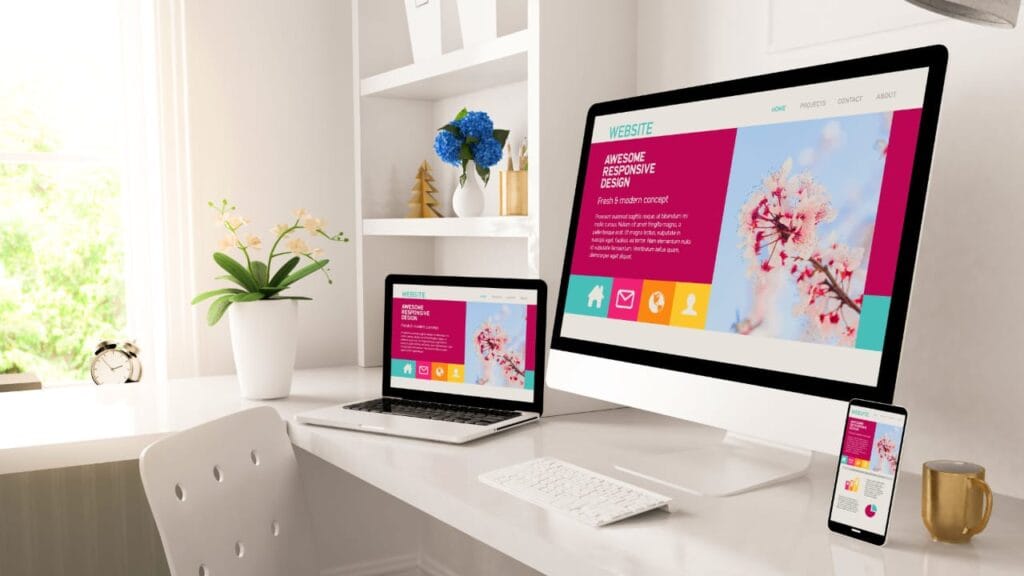
A user-friendly design is essential for keeping visitors on your page. Ensure that your landing page is responsive, meaning it looks great on both desktop and mobile devices. Use plenty of white space to avoid overwhelming visitors and make sure navigation is intuitive.
- Enhancing Readability and Accessibility: Readability and accessibility are key components of user-friendly design. Use a clear and legible font, and ensure adequate contrast between text and background. Incorporate alt text for images and provide accessible navigation options to ensure all visitors can easily engage with your content.
- Prioritizing Mobile Responsiveness: With the increasing use of mobile devices, ensuring your landing page is mobile-responsive is crucial. A responsive design adapts seamlessly to different screen sizes, providing a consistent and user-friendly experience. Test your page on various devices to ensure it functions and displays correctly.
- Streamlining Navigation and Layout: A clean and intuitive layout makes it easy for visitors to find information and take action. Limit navigation options to avoid distractions and focus on guiding visitors toward conversion. Use visual hierarchy to organize content logically, ensuring key information and CTAs are easily accessible.
Best Practices for SaaS Landing Page Optimization
Now that we’ve covered the key elements, let’s look at some best practices for optimizing your SaaS landing page.
A/B Testing
A/B testing is a powerful method for understanding what works best on your landing page. By testing different headlines, images, or CTA buttons, you can gather data on what elements are most effective in converting visitors. Implement changes based on the results to continually improve your page performance.
- Structuring Effective A/B Tests: Effective A/B testing begins with a clear hypothesis and goal. Identify specific elements to test, such as headlines, images, or CTAs, and create variations to compare. Ensure your tests are structured to isolate the impact of individual changes, providing accurate insights into what drives conversions.
- Analyzing and Interpreting Test Results: Accurately analyzing test results is crucial for making informed decisions. Look beyond simple conversion rates to understand how changes impact user behavior and engagement. Use statistical significance to validate results and ensure changes are based on reliable data.
- Implementing Continuous Improvement: A/B testing should be an ongoing process of continuous improvement. Regularly test new ideas and variations to keep your landing page fresh and effective. Use insights gained from tests to refine your overall strategy and optimize for long-term success
Fast Loading Times
Page load speed is critical for retaining visitors. A slow-loading page can lead to high bounce rates, meaning potential customers leave before even seeing your content. Optimize images, leverage browser caching, and minimize CSS and JavaScript to ensure your page loads quickly.
- Identifying and Addressing Speed Bottlenecks: Begin by identifying elements that slow down your page load speed. Use tools like Google PageSpeed Insights to pinpoint issues such as large image files, excessive scripts, or server response times. Address these bottlenecks to enhance the overall performance of your landing page.
- Implementing Speed Optimization Techniques: Implement various techniques to improve page load speed, such as compressing images, using asynchronous loading for scripts, and enabling browser caching. These optimizations reduce the time it takes for your page to load, improving the user experience and reducing bounce rates.
- Monitoring Performance for Ongoing Optimization: Regularly monitor your page’s performance to ensure it continues to load quickly. Use analytics tools to track loading times and user behavior, and identify areas for further optimization. Continuous monitoring allows you to maintain optimal performance and provide a seamless experience for visitors.
Clear and Concise Messaging
Keep your messaging clear and concise. Avoid jargon or overly technical language that may confuse visitors. Your goal is to communicate the benefits of your product quickly and effectively.
- Simplifying Complex Concepts: Simplify complex concepts by breaking them down into easily understandable terms. Use plain language and avoid industry jargon that may alienate or confuse visitors. Focus on the key benefits and solutions your product offers, making it easy for anyone to grasp the value you provide.
- Aligning Messaging with Audience Needs: Ensure your messaging aligns with the needs and pain points of your target audience. Speak directly to their challenges and aspirations, emphasizing how your product addresses their specific requirements. Tailor your language and tone to resonate with your audience’s preferences and expectations.
- Reinforcing Key Benefits and Value: Consistently reinforce the key benefits and value of your product throughout your messaging. Highlight unique features, advantages, and outcomes that differentiate your product from competitors. Use persuasive language to emphasize the positive impact your product can have on your audience’s lives or businesses.
Leverage Analytics
Using analytics tools to monitor your landing page performance is essential for making informed decisions. Track metrics such as conversion rates, bounce rates, and visitor behavior to identify areas for improvement.
- Choosing the Right Analytics Tools: Select analytics tools that align with your business goals and provide comprehensive insights into your landing page performance. Tools like Google Analytics, Hotjar, or Crazy Egg can offer valuable data on user behavior, engagement, and conversion rates. Ensure the tools you choose can track the specific metrics you need to optimize your page.
- Interpreting Data for Actionable Insights: Interpreting analytics data involves looking beyond surface-level metrics to uncover actionable insights. Analyze user behavior, such as click patterns or scroll depth, to understand how visitors interact with your page. Use these insights to identify areas of friction or opportunities for improvement.
- Implementing Data-Driven Changes: Use the insights gained from analytics to drive data-informed changes to your landing page. Whether it’s adjusting your messaging, redesigning elements, or optimizing your CTAs, base your decisions on real data to maximize the impact on conversions. Continuously monitor the results of these changes to ensure ongoing improvement.
Real-Life Landing Page Examples for Inspiration
Looking at successful landing pages can provide valuable insights into what works well. Here are a few examples of SaaS landing pages that effectively incorporate the elements and best practices we’ve discussed.
Example 1: Dropbox
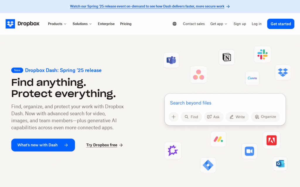
Dropbox’s landing page is a great example of simplicity and focus. It uses a clean design with a clear headline that highlights its core benefit: “Keep life organized and work moving—all in one place.” The CTA is straightforward, encouraging visitors to “Sign up for free.”
- Simplicity and Clarity in Design: Dropbox’s landing page excels in simplicity, presenting a clean and uncluttered design that directs attention to the core message. The use of ample white space ensures that the headline and CTA stand out, making it easy for visitors to understand the primary benefit and take action.
- Highlighting Core Benefits with Brevity: The headline succinctly communicates the primary value proposition of Dropbox, emphasizing organization and productivity. By focusing on the core benefit, Dropbox effectively communicates what users can achieve with their service, encouraging them to explore further.
- Encouraging Action with a Direct CTA: The straightforward CTA, “Sign up for free,” eliminates any ambiguity about the next step. The use of the word “free” adds an element of appeal, inviting visitors to try the service without any initial commitment. This approach lowers barriers to entry and encourages conversions.
Example 2: Slack
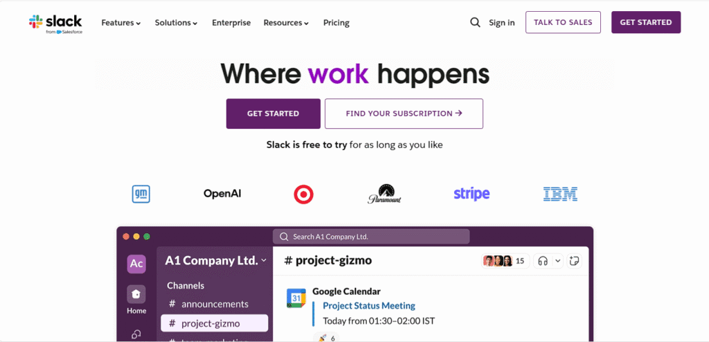
Slack’s landing page makes excellent use of visuals and social proof. It features a compelling video that showcases the product in action, along with testimonials from well-known companies. The headline, “Where Work Happens,” is both catchy and descriptive, and the CTA invites users to “Get Started.”
- Leveraging Visuals to Demonstrate Value: Slack’s landing page uses engaging visuals, including a video, to demonstrate the product in action. This approach allows visitors to see firsthand how Slack facilitates collaboration and productivity, providing a compelling reason to explore the service further.
- Building Trust with Well-Known Testimonials: The inclusion of testimonials from reputable companies reinforces Slack’s credibility and trustworthiness. By showcasing endorsements from well-known brands, Slack assures potential customers of the product’s effectiveness and reliability.
- Creating a Memorable and Impactful Headline: The headline, “Where Work Happens,” succinctly encapsulates Slack’s value proposition. It positions Slack as the central hub for workplace collaboration, making it memorable and impactful. The headline’s simplicity and clarity encourage visitors to explore the service.
Example 3: Trello

Trello’s landing page uses engaging visuals and a strong value proposition headline: “Trello helps teams move work forward.” The page includes a demo video and a CTA that stands out with the text “Sign Up — It’s Free!”
- Engaging Visitors with Dynamic Visual Content: Trello’s landing page effectively uses visuals, including a demo video, to engage visitors and illustrate the product’s capabilities. This dynamic content provides a clear demonstration of how Trello can enhance team productivity and collaboration.
- Communicating Value with a Clear Headline: The headline, “Trello helps teams move work forward,” clearly communicates the primary benefit of the product. By focusing on team collaboration and productivity, Trello effectively conveys the value users can expect, encouraging them to explore further.
- Encouraging Sign-Ups with a Compelling CTA: The CTA, “Sign Up — It’s Free,” emphasizes the ease and accessibility of getting started with Trello. The use of the word “free” adds an element of appeal, reducing barriers to entry and encouraging visitors to take the next step.
Conclusion
Creating an effective SaaS landing page involves combining several key elements and following best practices to optimize for conversions. By using clear headlines, engaging visuals, a strong CTA, social proof, and a user-friendly design, you can create a landing page that not only attracts visitors but also converts them into customers.
- The Continuous Process of Optimization: Remember to continuously test and refine your page using A/B testing and analytics to ensure it performs at its best. Optimization is an ongoing process, and staying informed about changes in audience preferences and industry trends is crucial for maintaining and improving conversion rates.
- Aligning with Customer Needs and Expectations: A successful landing page aligns with the needs and expectations of your target audience. Regularly update your messaging, visuals, and CTAs to reflect changes in customer preferences and market dynamics, ensuring your page remains relevant and impactful.
- Achieving Growth and Success in SaaS: With these strategies in place, you’ll be well on your way to increasing conversions and growing your SaaS business. An effective landing page serves as a powerful tool for attracting, engaging, and converting visitors, ultimately driving business success and growth.


