Pharmaceutical Website Design: 15 Examples and What They Get Right

This is a review of 15 pharmaceutical company websites, from global groups such as Novartis, Takeda and Johnson & Johnson to specialists such as Alnylam, Grifols and Dechra, with what each does well and what could be better.
A pharma website is read by people who need different things and are allowed to see different things: patients and carers, healthcare professionals, investors, regulators, partners and job applicants. It has to route each of them quickly, keep promotional content within the rules of every market it serves, and make safety information easy to find. Use the examples for ideas, and the checklist after them for what the build has to include.
1. Novartis

- Website: novartis.com
- Location: Basel, Switzerland
- What We Like: The site features a modern, clean design with a focus on innovation, research, and global health impact. The navigation is intuitive, and the use of high-quality visuals and infographics helps communicate complex topics clearly.
- What Could Be Improved: Some users note that customer service and responsiveness could be enhanced, and that the price level is perceived as high. Streamlining content for easier access to patient resources would also improve usability.
2. Alexion Pharmaceuticals

- Website: alexion.com
- Location: Boston, USA
- What We Like: Alexion’s website is patient-centric, with a clear focus on rare diseases and impactful storytelling. The layout is clean, and the navigation makes it easy to find information about therapies and research.
- What Could Be Improved: The site could benefit from more interactive features and additional resources for healthcare professionals.
3. Gilead Sciences

- Website: gilead.com
- Location: Foster City, USA
- What We Like: Gilead’s site is fast-loading, mobile-optimized, and mission-driven, with well-organized content and a strong focus on innovation and medical research. The design is simple yet effective, making complex information accessible.
- What Could Be Improved: Adding more interactive visuals and patient stories could make the site more engaging for a broader audience.
4. BioMarin Pharmaceutical

- Website: biomarin.com
- Location: San Rafael, USA
- What We Like: BioMarin’s site is driven by a clear purpose and features engaging video content, modern design, and a strong focus on genetic discovery. The “BioMarin 8” operating principles are woven throughout, giving a sense of company culture.
- What Could Be Improved: The homepage could be more streamlined, and site navigation could be simplified for faster access to key sections.
5. Alnylam Pharmaceuticals

- Website: alnylam.com
- Location: Cambridge, USA
- What We Like: Alnylam’s website highlights groundbreaking RNAi therapeutics and showcases how generative AI is used for operational efficiency. The site is modern, with clear calls to action and strong compliance messaging.
- What Could Be Improved: Some technical content could be made more accessible for non-specialist audiences, and more interactive elements would enhance engagement.
6. Bluebird bio

- Website: bluebirdbio.com
- Location: Somerville, USA
- What We Like: bluebird bio’s site is visually appealing with a focus on curative gene therapies, patient stories, and a people-centric culture. The design feels fresh and community-driven.
- What Could Be Improved: More detailed information on therapies and clinical trials would benefit researchers and healthcare professionals.
7. Grifols

- Website: grifols.com/en/home
- Location: Barcelona, Spain
- What We Like: Grifols uses high-quality video, persuasive storytelling, and a modern layout to highlight plasma and transfusion medicine. The site is visually immersive and informative.
- What Could Be Improved: Some sections could be condensed for easier navigation, and more patient resources would be helpful.
8. Johnson & Johnson

- Website: jnj.com
- Location: New Brunswick, USA
- What We Like: J&J’s comprehensive site features easy navigation, strong global health messaging, and a wealth of resources for patients, professionals, and investors.
- What Could Be Improved: The homepage can feel dense; simplifying the layout would help users find key information faster.
9. Qiagen

- Website: qiagen.com/in
- Location: Hilden, Germany
- What We Like: Qiagen’s site is visually appealing, easy to navigate, and focused on molecular diagnostics. The design is clean, and the product information is well-organized.
- What Could Be Improved: More interactive demos and educational content would enhance the user experience.
10. McKesson

- Website: mckesson.com
- Location: Irving, USA
- What We Like: McKesson’s site features sleek design, custom graphics, and easy access to healthcare solutions. The navigation is intuitive, and the site feels professional and trustworthy.
- What Could Be Improved: Adding more case studies and client testimonials would build further credibility.
11. Collegium Pharmaceutical

- Website: collegiumpharma.com
- Location: Stoughton, USA
- What We Like: Collegium’s website is straightforward, with clear information about their products and a focus on responsible pain management.
- What Could Be Improved: The design could be more visually engaging, and more resources for patients would be helpful.
12. Cambrian Bio

- Website: cambrianbio.com
- Location: New York, USA
- What We Like: Cambrian Bio’s site is modern, well-organized, and features appealing color gradients and custom graphics. The navigation is smooth, and the content is concise.
- What Could Be Improved: More interactive visuals and detailed research updates would enhance engagement.
13. Takeda

- Website: takeda.com
- Location: Tokyo, Japan
- What We Like: Takeda’s site boasts high-quality visuals, clear content sections, and intuitive navigation. The site effectively communicates the company’s commitment to innovation and patient care.
- What Could Be Improved: Some sections could use more visual storytelling to highlight impact and success stories.
14. Hikma Pharmaceuticals

- Website: hikma.com
- Location: London, UK
- What We Like: Hikma’s site is approachable, accessible, and features a warm color palette. The global focus and patient-centric messaging are clear strengths.
- What Could Be Improved: More interactive tools and patient education resources would add value.
15. Dechra Pharmaceuticals

- Website: dechra.com
- Location: Northwich, UK
- What We Like: Dechra’s clean, professional design emphasizes veterinary pharmaceuticals and sustainability. The site is easy to navigate and visually appealing.
- What Could Be Improved: More case studies and detailed product information would benefit veterinary professionals and clients.
Work with us
Commissioning a pharma site that has to pass medical and legal review?
Tell us which markets you serve, who the site is for (patients, healthcare professionals, investors or all three) and how content is approved today, and send the current site if there is one. Corporate and multi-language sites usually fall in our €7,000 to €14,000 band. We reply within one business day.
Recent builds
EU College Group · Education
Website Redesign for an International Education Consultancy
- Web design
- Web development
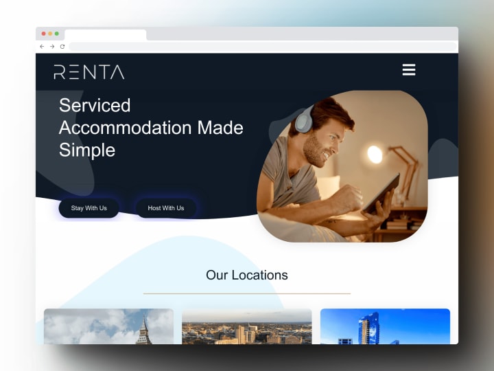
Renta Properties · Property
Website Redesign for a UK Property Management Company
- Web design
- Web development
Beanburg · E-commerce
E-commerce Website for a Specialty Coffee Brand
- Web design
- Web development


What a good pharmaceutical website needs
- Audience routing from the homepage. Separate, clearly labelled paths for patients, healthcare professionals, investors, media and careers.
- HCP-gated content. Prescribing and product information for professionals behind a self-declaration or a verified login, as each market’s rules require.
- Adverse-event reporting from every page. A visible route to report a side effect, with the right contact for each country.
- A review workflow in the CMS. Medical, legal and regulatory sign-off before anything publishes, with a record of who approved which version.
- Clinical-trial listings. Current studies by condition and location, linked to their registry entries (ClinicalTrials.gov, the EU’s CTIS), so patients and investigators can find them.
- Country versions, not just translations. Product availability and labelling differ by market, so content has to be managed per country.
- Current product documents. Summaries of product characteristics, prescribing information and patient leaflets as downloads with version dates.
- Investor and sustainability reporting. Results, filings and ESG reports in one place, kept up to date.
Pharmaceutical Company websites not appropriate for your company?
Check out our roundups of different aesthetics for unique website designs:


