Hedge Fund Website Design: 14 Examples for Investment Firms

These are 14 websites from hedge funds and the firms around them, from Marshall Wace, Citadel and Bridgewater to administrators and asset managers such as Citco and BlackRock, with what each does well and what could be improved.
Most hedge fund sites are deliberately quiet. Marketing rules limit what a fund can say in public, and the people who matter (allocators, consultants, prime brokers and prospective hires) usually know the firm or have been referred to it. So the site’s job is narrow: show that the firm is real and well run, route professional investors to the right gated material, and recruit. The checklist after the examples sets out what that involves.
1. Marshall Wace

- Website: www.mwam.com
- Location: London, UK
- What We Like: A sleek, minimalist design with bold typography and a crisp color palette. The site exudes confidence and professionalism, with interactive elements that make complex financial information accessible.
- What Could Be Improved: Navigation can feel a bit sparse, and adding more investor resources or insights could enhance engagement.
2. Citadel

- Website: www.citadel.com
- Location: Miami, FL, USA (global)
- What We Like: Dynamic video backgrounds and strong headlines create an immersive first impression. The site is bold, modern, and easy to navigate, with clear calls to action and a focus on innovation.
- What Could Be Improved: Some sections are content-heavy; a more streamlined approach could improve the mobile experience.
3. Capstone Investment Advisors

- Website: www.capstoneco.com
- Location: New York, NY, USA
- What We Like: A clean, straightforward layout with a blue and white palette that communicates reliability. The homepage features a strong call-to-action and immersive video, creating a memorable experience.
- What Could Be Improved: Could benefit from more interactive features or investor education content.
4. ExodusPoint Capital Management

- Website: www.exoduspoint.com
- Location: New York, NY, USA
- What We Like: Vibrant, contemporary design with fluid animations and intuitive navigation. The use of bright colors and engaging visuals support the firm’s innovative narrative.
- What Could Be Improved: “Some users may find the animations distracting; slightly toned-down effects could improve usability.
5. Platinum Asset Management

- Website: www.platinum.com.au
- Location: Sydney, Australia
- What We Like: Minimalist design with subtle animations and a cohesive color palette. The focus on international equities is clear and the site feels modern and engaging.
- What Could Be Improved: Additional investor resources or interactive tools would add further value.
6. Fortress Investment Group

- Website: www.fortress.com
- Location: New York, NY, USA
- What We Like: Bold imagery and a contemporary aesthetic. The site is structured for easy access to investment strategies, with integrated case studies that showcase success.
- What Could Be Improved: Navigation could be simplified for quicker access to key sections.
7. Squarepoint Capital

- Website: www.squarepoint-capital.com
- Location: London, UK
- What We Like: Data-driven and technology-focused design with interactive elements that highlight automated trading systems. Responsive layout adapts well across devices.
- What Could Be Improved: Could offer more insight into team and culture to humanize the brand.
8. Rokos Capital Management

- Website: www.rokoscapital.com
- Location: London, UK
- What We Like: Modern, sophisticated design with high-quality imagery and a refined color scheme. Investment philosophy is presented through engaging, accessible content.
- What Could Be Improved: Deeper insights into portfolio or performance could enhance transparency.
9. Citco

- Website: www.citco.com
- Location: Amsterdam, Netherlands (global)
- What We Like: Professional, corporate design with a focus on fund services. The site is well-organized, with clear navigation and a strong emphasis on client engagement.
- What Could Be Improved: Visual storytelling could be enhanced with more case studies or success stories.
10. BNY Mellon

- Website: www.bny.com
- Location: New York, NY, USA
- What We Like: Modern, bold use of whitespace and color. The homepage features a prominent search bar and easy filtering, making information accessible.
- What Could Be Improved: Some content sections are dense; more visuals could improve readability.
11. BlackRock

- Website: www.blackrock.com
- Location: New York, NY, USA (global)
- What We Like: Bold, modern design with strong color contrasts. The site is easy to navigate, with helpful search and filtering tools for investors.
- What Could Be Improved: Homepage could be streamlined for a quicker overview of services.
12. York Capital Management

- Website: www.yorkcapital.com
- Location: New York, NY, USA
- What We Like: Clean, sophisticated layout with a neutral color palette and strong use of whitespace. The mobile-style menu and logo transitions add a unique touch.
- What Could Be Improved: Could benefit from more interactive elements or investor insights.
13. Bridgewater Associates

- Website: www.bridgewater.com
- Location: Westport, CT, USA
- What We Like: Thoughtful use of space and content, with a focus on leadership and research. The site feels authoritative and trustworthy.
- What Could Be Improved: More visual storytelling or interactive graphics could enhance engagement.
14. Two Sigma Investments

- Website: www.twosigma.com
- Location: New York, NY, USA
- What We Like: Sleek, tech-forward design with interactive features and a focus on data-driven investment strategies. The site is visually engaging and easy to navigate.
- What Could Be Improved: Some sections could be more concise for faster browsing.
Work with us
Need a fund website that clears compliance and still says something?
Send us your current site, the jurisdictions you market in and what sits behind your investor login today, and we will tell you how we would structure it. We work at €25 to €45 an hour with a €1,000 minimum, and we reply within one business day.
Recent builds
EU College Group · Education
Website Redesign for an International Education Consultancy
- Web design
- Web development
Renta Properties · Property
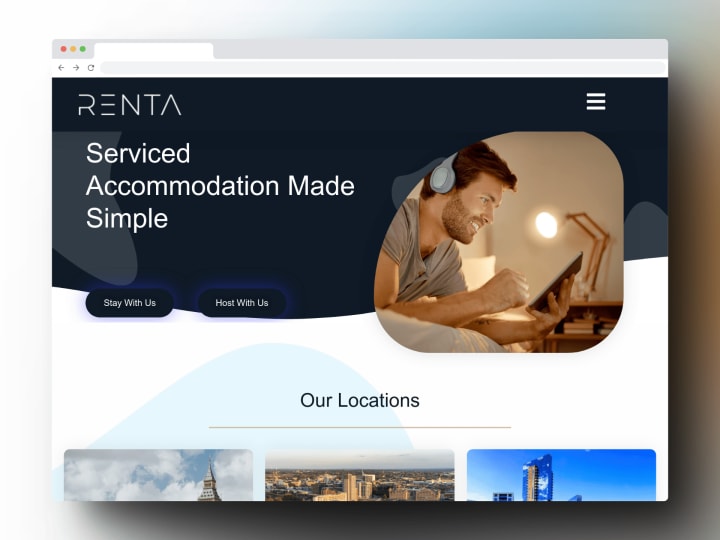
Website Redesign for a UK Property Management Company
- Web design
- Web development
Beanburg · E-commerce
E-commerce Website for a Specialty Coffee Brand
- Web design
- Web development


What a good hedge fund website needs
- Investor gating that matches the rules. A jurisdiction and investor-type check before any fund information, worded with compliance (the SEC marketing rule in the US, AIFMD and the FCA’s financial-promotion rules in Europe and the UK).
- Complete disclaimers that stay out of the way. The legal text every page needs, without burying the content under it.
- A secure route to the investor portal. Letters and reports live with the administrator or a portal provider. The site links to it and never hosts them on public URLs.
- A short, specific description of the firm. Strategy, history and leadership in plain words, with performance figures kept off public pages unless compliance has approved them.
- Careers as a main section. For many funds, recruiting engineers and researchers is the site’s busiest job: roles, teams and how hiring works.
- Research only if you will publish it. Papers and commentary build credibility for macro and quant funds. An empty insights page does the opposite.
- Security and privacy basics. HTTPS everywhere, no third-party trackers on gated pages, and a privacy notice that matches what the site collects.
Hedge Fund website not appropriate for you?
Check out our roundups of different aesthetics for unique website designs:


